
Articles / Home Pages and Navigation
Website navigation best practices: what our A/B tests show
What we found
Showing more of the menu helped. Giving mid-size screens the full desktop menu lifted conversion 43.3%. But a full menu redesign lost 14.5%, so test menu changes 1 at a time.
Navigation is how shoppers find what they came for. When it works, nobody notices it. When it does not, they leave. Most sites still get it wrong: Baymard rates about 6 in 10 sites mediocre or worse on navigation.
61% of desktop and 65% of mobile sites rate mediocre or worse on navigation; 22% don't make product categories the first level of mobile navigation.
Edward Scott 2026 · baymard.com ↗
Our biggest navigation win came from showing mid-size screens the full desktop menu, so more categories were visible at once.
Here are 3 of our navigation tests: 2 wins and 1 redesign that visitors rejected.
Showing the full desktop menu on mid-size screens lifted conversion 43.3%
On collection pages, screens from 1024 to 1279 pixels wide got the mobile menu, a single icon that hid every category. We lowered the breakpoint so those screens got the full desktop menu. Conversion rate rose 43.3% and revenue per visitor rose 35.3% over 19 days.
Evidence · Collection page · Won
Does a lower navigation breakpoint lift collection page conversion?
19 days · desktop · We moved the desktop menu breakpoint from 1280 down to 1024 pixels.

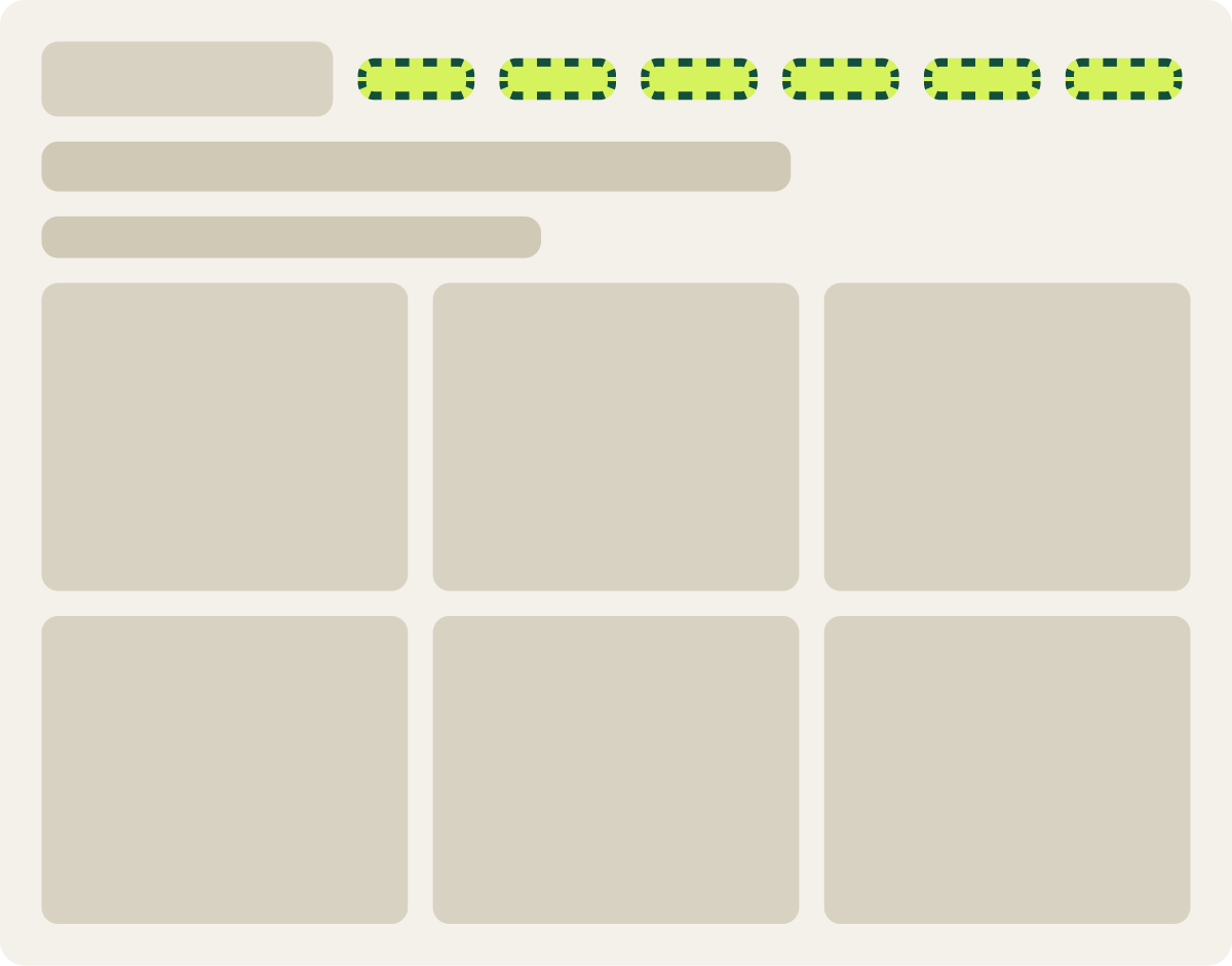
+43.3% conversion, +35.3% revenue per visitor
Read the full testMany laptops and tablets fall in that range. Those shoppers had to open a menu to see any category. With the full menu in view, every main category was 1 click away.
A shortcut to how shoppers browse lifted conversion 14.1%
On mobile, shoppers who wanted to browse by color had to dig through the menu. We added color swatches to the menu and a direct link to the shop by color page. Conversion rose 14.1% over 18 days.
Evidence · Homepage · Won
Do color swatches in the mobile menu lift homepage conversion?
18 days · mobile · We added color swatches to the mobile menu and tested a color link.



+14.1% conversion, +9.6% revenue per visitor
Read the full testWe implemented it as a do no harm change. I keep a change like that when it serves the brand or business direction, even when the lift alone would not decide it. Here, it gave shoppers a way to browse that matched how they already shopped.
Shoppers preferred the original menus by 14.5%
The desktop menus for 2 product lines were hard to scan. We restructured both to help shoppers find products. Visitors preferred the original menus: with the redesign, conversion was 14.5% lower and revenue per visitor 14.2% lower over 11 days in December.
Evidence · Homepage · Lost
Do restructured kit and ready made menus lift homepage conversion?
11 days · desktop · We restructured the ready made and DIY kit menus on desktop.

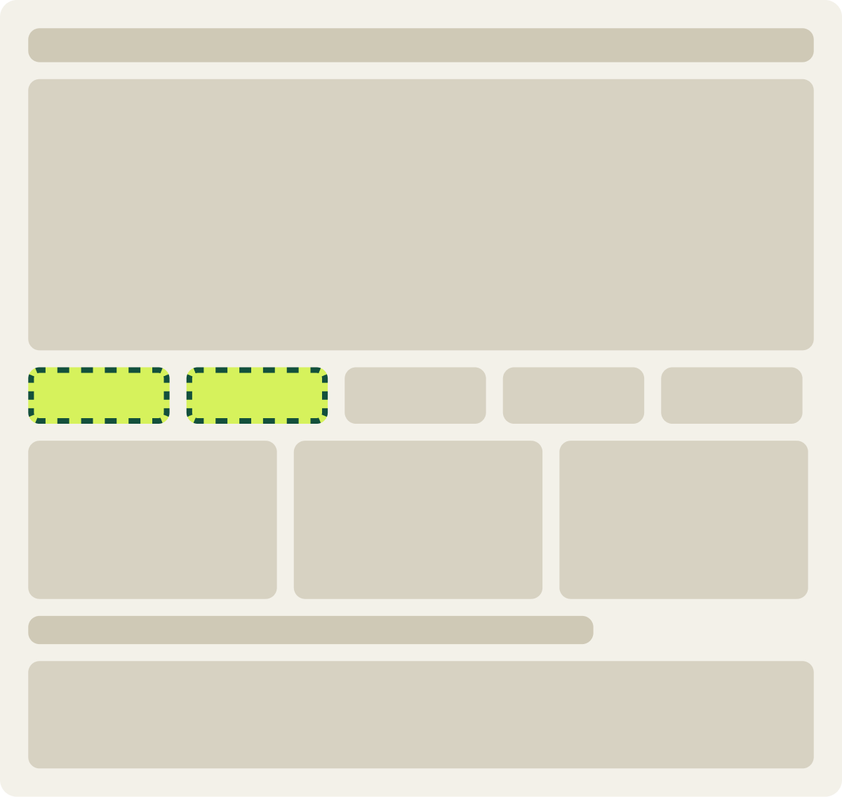
-14.5% conversion, -14.2% revenue per visitor
Read the full testA likely reason: shoppers had learned the old menus, and peak-season shoppers often know where they are going. A redesign makes them relearn the path at the busiest time. We paused the test.
Retest anything you learn during peak weeks.
Peak shoppers behave differently from the rest of the year. A result from a peak week gets retested once the audience returns to normal.
Website navigation best practices from our tests
- Show categories, don’t hide them. If a screen has room for the full menu, use it.
- Add shortcuts for the way people already browse. By color, by use or by price.
- Change 1 thing at a time. A full redesign mixes good and bad changes in 1 result.
- Avoid big menu changes during your busiest weeks. Test them when traffic is normal.
Menus are a core part of user experience optimization, and they are worth testing like any other page element. For the pages your menu leads to, see Ecommerce homepage best practices: what our A/B tests show and Ecommerce category page design: what our A/B tests show.
Good navigation doesn’t get noticed. Shoppers just find things.
Frequently asked questions
What are website navigation best practices?
Show your main categories clearly, add shortcuts for common ways people browse and keep menus easy to scan. Test changes 1 at a time.
Should I use a hamburger menu on desktop?
Usually not. In our test, showing the full desktop menu instead of a hidden menu on mid-size screens lifted conversion 43.3%.
How many items should be in a navigation menu?
Baymard suggests keeping groups to about 10 subcategories or fewer, so shoppers can scan them quickly.
Should I redesign my navigation all at once?
No. A full redesign can bury what works. In our test, shoppers preferred the original menus by 14.5%.
When is the best time to test navigation changes?
Outside your peak season. Peak shoppers act differently, so results from those weeks should be retested.
The evidence
The 3 tests this article leans on
Evidence · Collection page · Won
Does a lower navigation breakpoint lift collection page conversion?
+43.3% conversion, +35.3% revenue per visitor
Read the full testEvidence · Homepage · Won
Do color swatches in the mobile menu lift homepage conversion?
+14.1% conversion, +9.6% revenue per visitor
Read the full testEvidence · Homepage · Lost
Do restructured kit and ready made menus lift homepage conversion?
-14.5% conversion, -14.2% revenue per visitor
Read the full test