
Articles / Research and Testing
How to do a CRO audit
What we found
A CRO audit is worth doing when it ends in a ranked list of fixes and tests, not a report. In our tests, fixing a menu built for phones lifted desktop conversion 43.3%, and cutting 2 competing menus to 1 lifted conversion 30.2%.
A CRO audit is a close review of your website that finds where visitors drop off and why. It checks your analytics, watches real people use the site, and looks for the technical problems that get in their way. A good audit does not end with a long list of problems. It ends with a ranked list of fixes and tests, starting with the ones most likely to move revenue.
This guide covers the 6 areas a full audit reviews, the 5 steps we follow, and 4 published tests that show what happens when audit findings get tested. It ends with a 10-point CRO audit checklist you can run on your own site.
A CRO audit answers 2 questions: where and why
Most teams already know their conversion rate. What they do not know is where the sale is lost, or why. An audit answers both.
The “where” comes from your numbers. Funnel reports show which step loses the most visitors. Page reports show which templates convert worse than they should. Device and traffic source splits show who struggles most.
The “why” comes from watching people. Usability tests, session recordings and a careful hands-on review show what visitors were trying to do when they gave up. As I see it, data tells you what happened. Insight connects that behavior to an explanation you can act on.
You need both halves. Numbers alone lead to guesses about the cause. Observation alone can chase problems that touch very few visitors.
7 signs your site is due for a CRO audit
- Conversion has softened and nobody can say why.
- Organic traffic has dropped, or you suspect technical SEO problems.
- The site carries years of templates, apps and technical debt.
- You are getting ready for a redesign or a replatform.
- Mobile performance feels weaker than desktop.
- Your team has competing theories about what to fix first.
- You want an independent view before you commit developer time.
A full CRO audit covers 6 areas
Many audits stop at a heuristic review of a few pages. A full audit looks wider, because the cause of a lost sale is often outside the page where it shows up. A slow script, a broken filter or a menu that fails on certain screens can all look like a “conversion problem.”
- Conversion performance. Funnels, calls to action, key templates, user flow, and the places where visitors hesitate, abandon or fail to move forward.
- User experience. Navigation, page hierarchy, content clarity, interaction design and mobile behavior.
- Technical health. Problems with functionality, rendering, mobile usability or overall site reliability.
- Page speed and performance. How pages load, and the common performance problems that slow visitors down.
- Technical SEO. Crawlability, indexability, internal linking, metadata, schema and canonical tags.
- Accessibility. Barriers that stop some visitors from fully using the site.
Technical SEO is 1 part of the review, not the whole thing. An SEO audit tells you whether people can find the site. A CRO audit also tells you what happens after they land.
For most online stores, the conversion review carries the most weight, and the last steps of the funnel are where a lot of money is lost. Outside research backs this up.
Across 50 studies, Baymard puts the average online cart abandonment rate at 70.22%. Its checkout testing finds the average large ecommerce site could gain a 35.26% increase in conversion rate through better checkout design.
updated September 22, 2025 · baymard.com ↗
Our tests agree that the gains are real, but not every cleanup pays off on its own. A simpler mobile checkout came back flat on its own, so we paused it to retest inside a consistent funnel.
How to do a CRO audit in 5 steps
This is the order we run an audit in. Each step feeds the next, so skipping ahead usually means fixing the wrong thing.
Step 1: Gather the evidence
Start with analytics, search data, technical signals, and the templates and funnels that matter most to the business. Read-only analytics access is usually enough.
Map your funnel from landing page to order confirmation. For each step, note how many visitors move on and how many leave. Then split the same report by device and by traffic source. A step that looks fine overall can be broken on mobile, or for visitors from 1 ad campaign.
Click maps and scroll maps belong in this step too. Our guide to reading heatmaps before you test shows what to look for.
Step 2: Watch the experience
Next, find out why visitors leave. Run usability tests on desktop and mobile, watch session recordings, and go through the key paths yourself on real devices.
Check each device on its own. The same change can behave very differently. In 1 published test, moving a service choice into a dropdown lifted mobile homepage form conversion 10.4%, while the same idea on desktop brought no improvement. A small screen made the long form feel harder, so the fix only helped there.
Step 3: Connect the findings
Now bring the conversion, UX, technical, speed, accessibility and SEO findings together. Look for overlap. A product page that loads slowly, hides the price below the fold and has a contrast problem on its button is 1 problem with 3 causes, not 3 separate tickets.
This is also where you tie each finding back to the funnel data from Step 1. A finding on a page that sees little traffic should not outrank a smaller finding on your busiest template.
Step 4: Prioritize the opportunities
Not every issue deserves equal attention. Rank each finding by likely impact, urgency and effort. Then decide the next step for each one:
- Fix it when the problem is clear and the solution is low risk, like a broken link or a missing image.
- Investigate it when you can see the drop-off but not the cause yet.
- Test it when the best answer is uncertain or could change how people buy.
That last choice matters. When a change could move conversion either way, I would rather test it than treat an opinion as fact.
Step 5: Walk your team through it
An audit only helps if people act on it. Present the findings, explain why each one matters, and leave the team with a clear set of next steps. A report dropped into an inbox with no walkthrough is easy to set aside.
A finished CRO audit should hand you 9 things
Whether you run the audit yourself or hire it out, the output should be specific enough that your team can start work the next day. Here is what a full audit should include:
- A prioritized findings deck, ranked by impact, urgency and effort
- Conversion and funnel observations, step by step
- UX and usability findings from desktop and mobile
- Technical and performance issues
- Technical SEO findings
- Accessibility observations
- Screenshots and examples of each problem
- Recommended next steps for each finding: fix, investigate or test
- A walkthrough with your team
If an audit hands you a list of 200 problems with no order and no screenshots, it has done half the job. The ranking is where most of the value sits.
The 4 tests below show what happens next: problems an audit is built to catch, put through an A/B test, with real numbers.
A menu built for phones cost desktop shoppers 43.3% of conversions
Navigation problems are some of the most common audit finds, and some of the easiest to miss. Your team likely checks the site on a big monitor and a phone. Few people check the sizes in between.
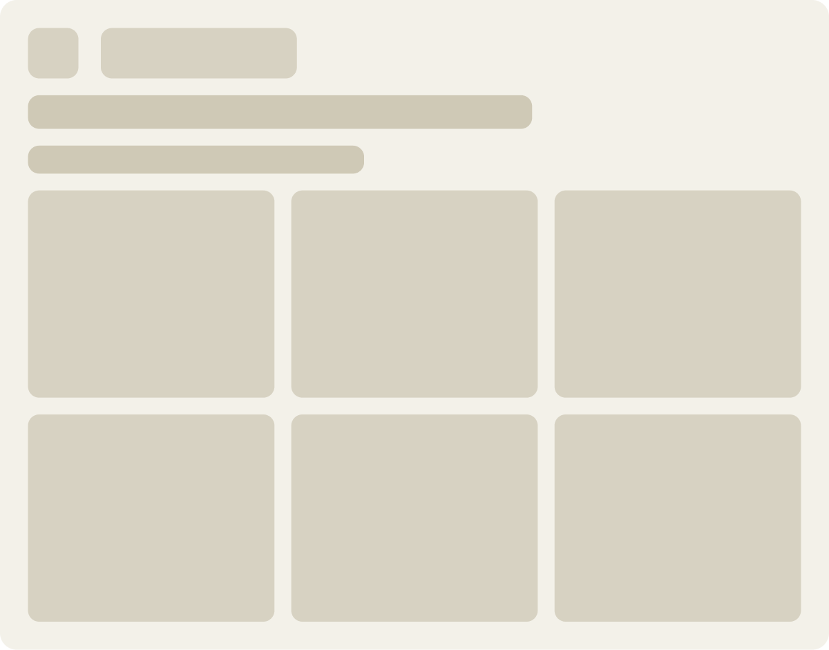
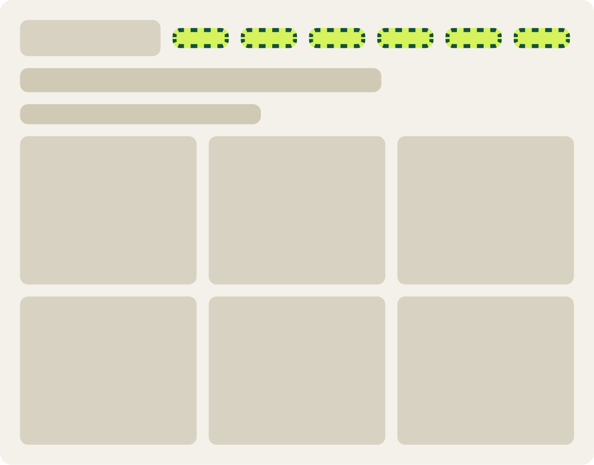
On 1 store, any screen narrower than 1,280 pixels got the mobile menu. That meant shoppers on many laptops and small monitors saw a menu built for phones, with the categories tucked behind an icon. We tested a lower breakpoint: the full desktop menu on screens 1,024 pixels and wider, with font sizes and spacing adjusted to fit.
Evidence · Collection page · Won
Does a lower navigation breakpoint lift collection page conversion?
19 days · desktop · We moved the desktop menu breakpoint from 1280 down to 1024 pixels.
+43.3% conversion, +35.3% revenue per visitor
Read the full testOver 19 days on desktop, conversion rose 43.3% and revenue per visitor rose 35.3%. Nothing about the products or the offer changed. Shoppers could simply see the categories, so they browsed faster and bought more.
To catch this on your own site, resize your browser slowly from phone width to full desktop and watch the header. Then check your analytics for the screen widths your visitors actually use. If a large share falls in a gap your design never planned for, that is a finding.
2 competing menus cut to 1 lifted conversion 30.2%
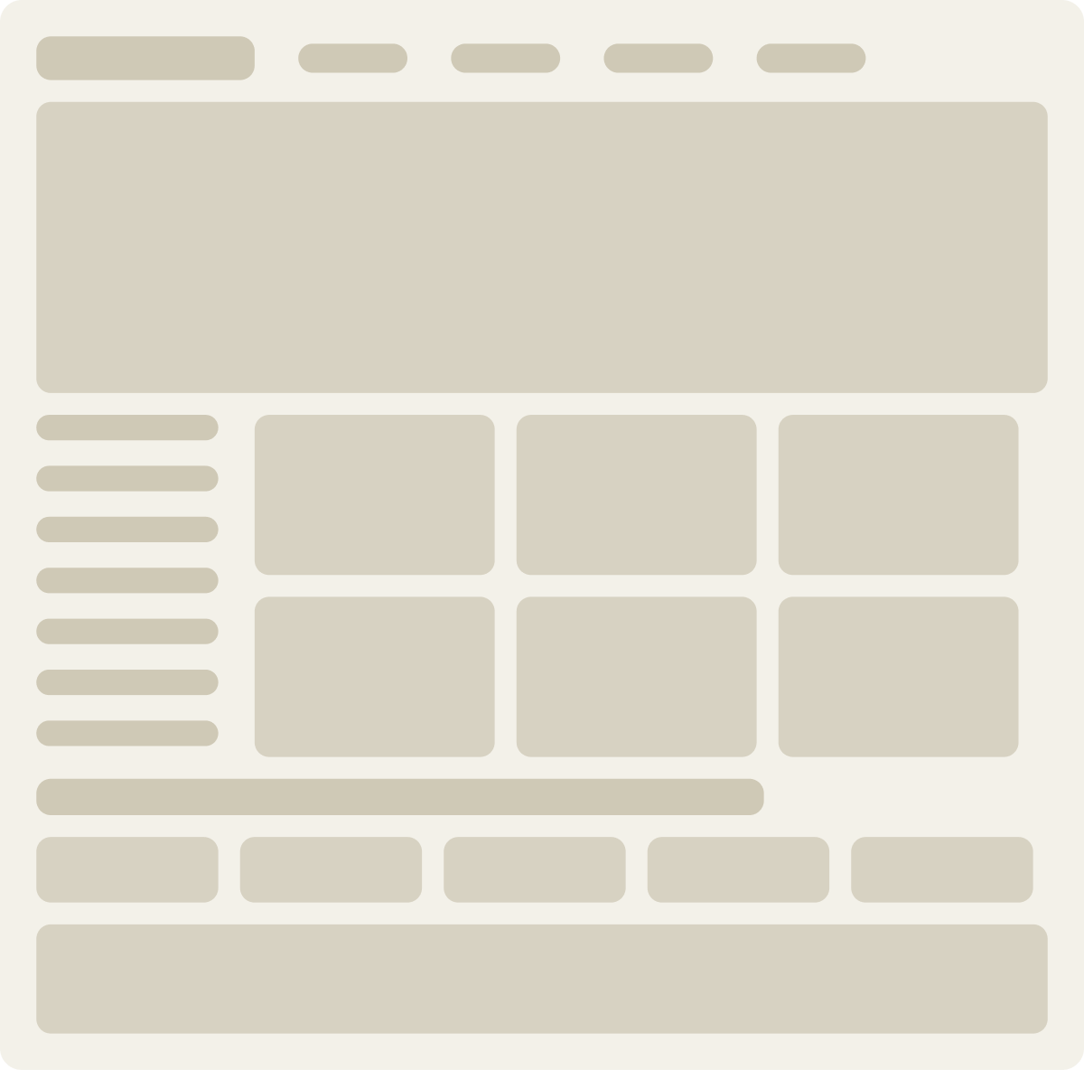
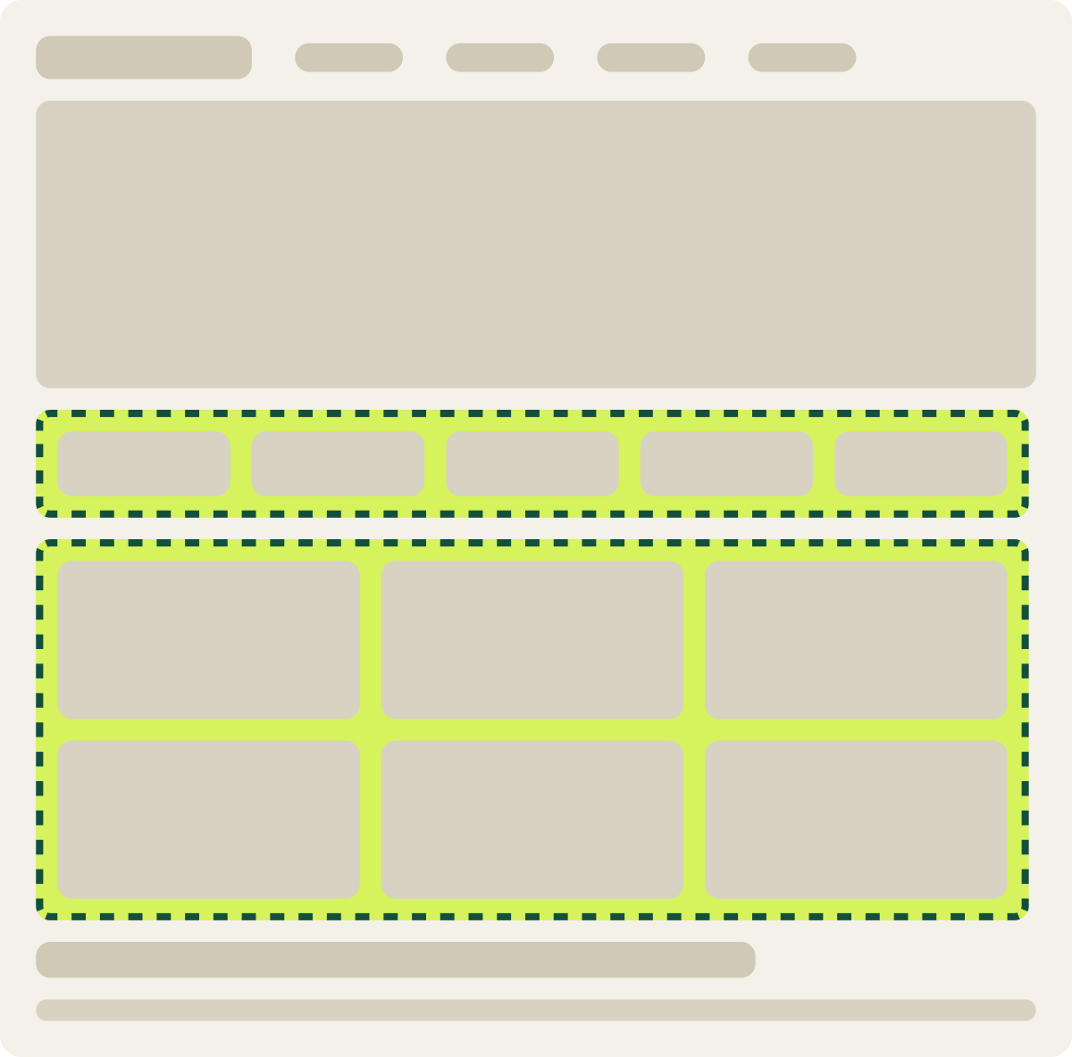
A second common find is too many choices at the start of the visit. On 1 ecommerce homepage, shoppers saw a header menu and a left navigation menu at the same time. 2 menus meant 2 places to look, and a lot of the page spent on links instead of products.
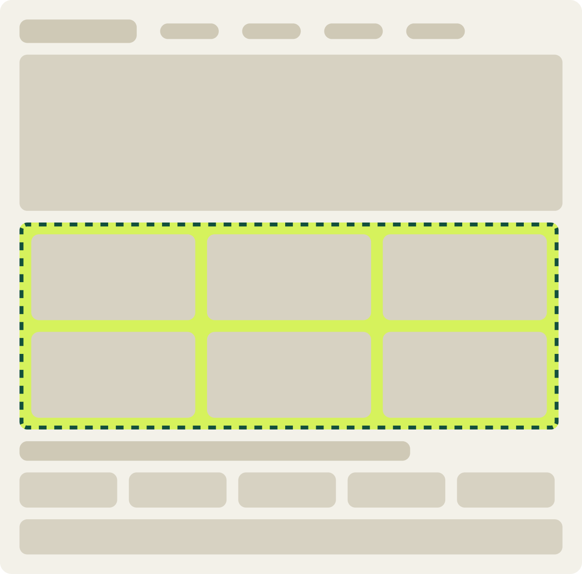
We tested 2 versions against the original. Version A removed the left menu and kept only the header. Version B removed the left menu and moved social proof higher on the page.
Evidence · Homepage · Won
Does removing the homepage left navigation lift conversion?
14 days · desktop · We removed the left navigation and, in Var B, raised social proof.
+30.2% conversion, +11.4% revenue per visitor
Read the full testVersion A won. Over 14 days on desktop, conversion rose 30.2% and revenue per visitor rose 11.4%. Removing the left menu on its own helped more shoppers buy.
The result also carried a warning. The average order was smaller, which is why revenue per visitor grew less than conversion did. That is the reason to judge every audit fix on revenue, not on conversion alone. A change that brings in more buyers who spend less can still be a win, but you should know it before you implement it.
A progress bar with a percentage lifted form completion 25.7%
Long forms are a classic audit finding. Funnel data shows visitors starting the form and quitting partway. Session recordings often show them scrolling ahead to see how much is left.
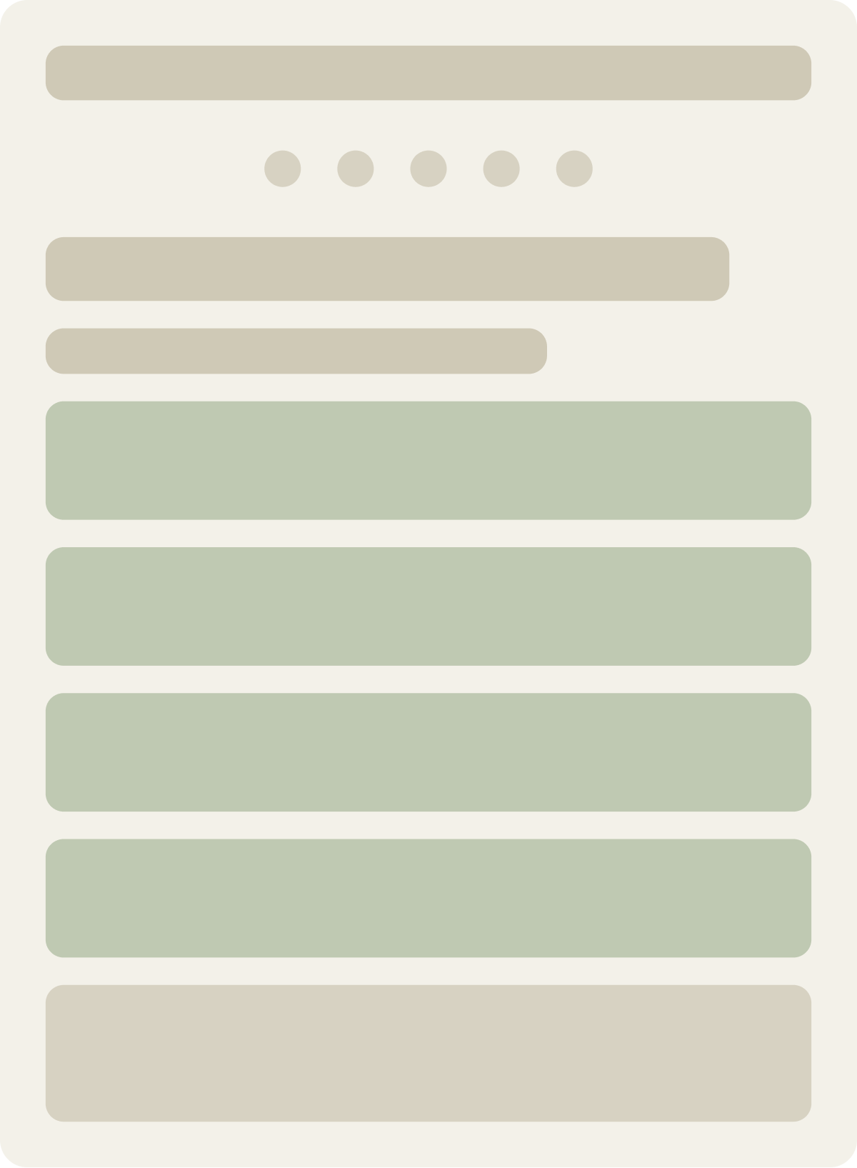
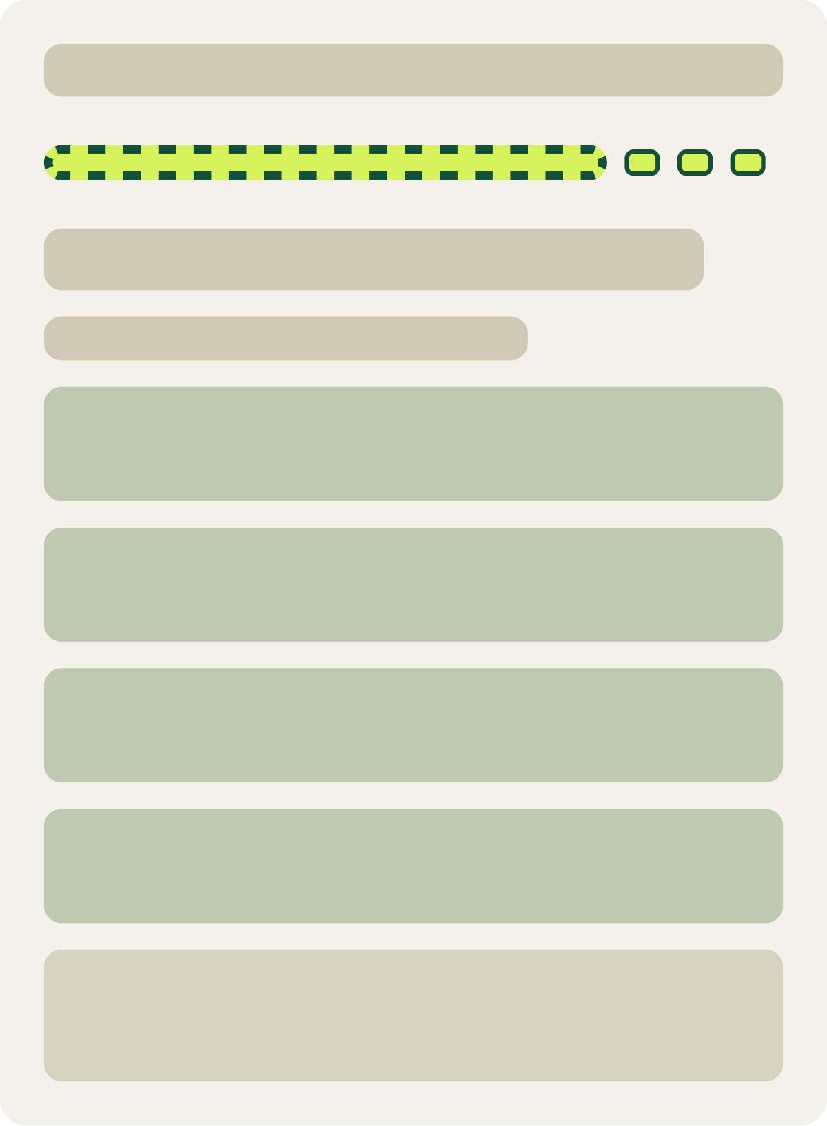
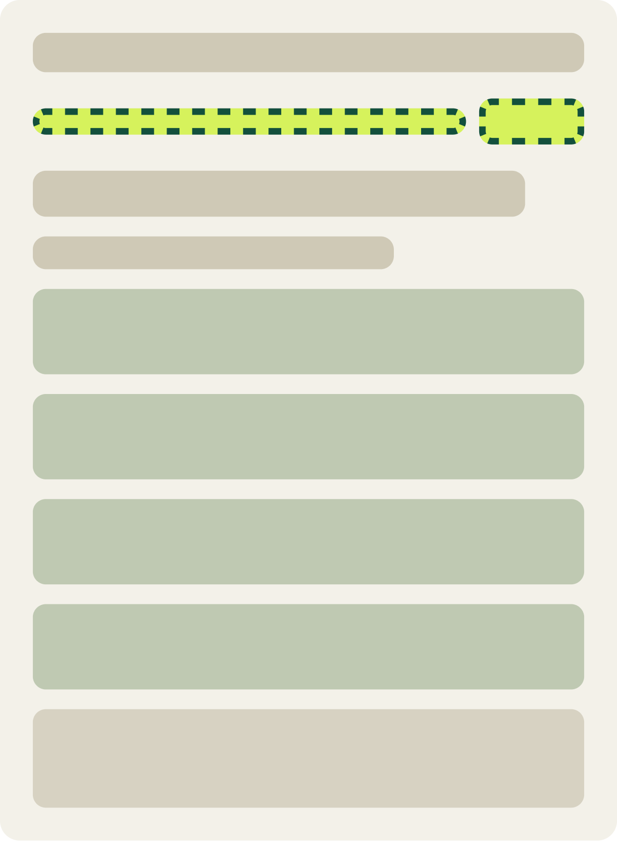
On a multi-step lead form, the original showed progress with small stepping stones. We tested 3 alternatives: an animated progress bar, a progress bar with a percentage, and larger stepping stones.
Evidence · Lead form · Won
Does a progress bar with a percentage lift lead form completion?
37 days · responsive · We tested 3 new ways to show progress through the form.
+25.7% conversion
Read the full testThe progress bar with a percentage won, lifting form completion 25.7% over 37 days across all devices. Motion did not do it. Bigger markers did not do it. A percentage tells visitors exactly how close they are to the end, and that kept them going.
The lesson for an audit is to note the problem precisely. “The form is too long” leads to a debate. “Visitors cannot tell how much is left” leads to a test you can run next week.
A cleaner mobile checkout came back flat at 3.5%
Not every audit finding turns into a win, and an honest audit should say so up front. On 1 store, the mobile checkout was busy, with a lot of design competing with the form. Stripping it back looked like an easy gain.
The simplified mobile checkout showed a 3.5% lift after 13 days, and a matching desktop test showed 2.0%. Neither was strong enough to call. We paused the test early on purpose. The cleaner checkout did not match the pages before it, so we were testing 1 step in isolation. The better next step was to retest it inside a consistent full funnel, so visitors see 1 design from start to finish.
That is why Step 3 matters. Findings that touch the same journey should be tested together, or at least in the right order.
Your first test goes where the funnel loses the most visitors
An audit is the research phase. The first tests come straight from what it finds.
My rule for choosing where to start is simple. I go after the funnel step with the highest drop-off. If the funnel data is not clear enough to point at 1 step, I start with the landing pages that get the most traffic, because a lift there reaches the most visitors.
From there, each finding marked “test it” in Step 4 becomes a hypothesis: what you will change, what you expect to happen, and why. Run 1 change at a time where you can, so you know what earned the result. If you sell online, our guide to ecommerce conversion optimization strategies covers what to test on product pages, cart and checkout once the audit is done.
If you would rather have an outside team run the full review, our comprehensive website audit covers all 6 areas and ends with a team walkthrough. The scope is fixed after an initial evaluation and depends on the size and complexity of the site.
4 audit mistakes that waste the findings
The tests above point to the same few mistakes. Each one can turn a good audit into a list nobody acts on.
- Reading blended reports. Desktop and mobile visitors behave differently. The dropdown that lifted mobile form conversion 10.4% did nothing on desktop. Always split by device before you draw a conclusion.
- Only checking the screens your team uses. The menu problem that cost 43.3% of conversions lived on mid-size screens. Nobody on a big monitor or a phone would have seen it.
- Judging fixes on conversion alone. Cutting to 1 menu lifted conversion 30.2%, but smaller orders held revenue per visitor to 11.4%. Revenue per visitor tells you what the change is really worth.
- Fixing 1 step in isolation. The cleaner checkout was paused because it did not match the pages before it, so its result could not be read on its own. Plan fixes that touch the same journey together.
An audit tells you where the sale is lost. A test tells you whether your fix wins it back.
CRO audit checklist: 10 points to cover
Use this list to run your own audit or to judge one someone else has done for you.
- Write down the business question. Know which goal, funnel or page you are trying to improve before you open a report.
- Map the funnel and find the biggest drop-off. Note how many visitors leave at each step, from landing page to order.
- Split every report by device and traffic source. A step that looks fine overall can be broken for 1 group.
- Check navigation at every screen width. Resize slowly from phone to desktop and look for gaps, like a mid-size screen getting the phone menu.
- Count the menus and choices on key pages. 2 menus, or 5 buttons of equal weight, split attention.
- Review every form and the checkout. Look for extra fields, unclear progress and design that competes with the form.
- Watch real visitors. Run usability tests on desktop and mobile, and review session recordings and heatmaps.
- Check speed, technical health and accessibility. Note slow templates, broken features, rendering errors and barriers for some visitors.
- Check technical SEO. Crawlability, indexing, internal links, metadata, schema and canonical tags.
- Rank findings and mark each one fix, investigate or test. Weigh impact, urgency and effort, and judge every test on revenue per visitor.
Then walk your team through the results and start the first test at the step that loses the most visitors.
Frequently asked questions
What is a CRO audit?
A CRO audit is a review of your website that finds where visitors drop off and why. It combines analytics with usability testing and technical checks, and ends with a ranked list of fixes and tests.
How do you do a CRO audit?
Work in 5 steps: gather the evidence from analytics and funnels, watch real visitors on desktop and mobile, connect the findings across areas, rank them by impact, urgency and effort, then walk your team through the next steps.
Why does an ecommerce site need a CRO audit?
Because small problems cost real revenue at scale. In 1 of our tests, shoppers on laptops were getting a menu built for phones. Giving them the desktop menu lifted conversion 43.3% and revenue per visitor 35.3%.
What does a CRO audit cost?
It depends on the size and complexity of the site. We set a fixed scope after an initial evaluation, based on how deep the analysis needs to go.
How long does a CRO audit take?
It depends on the size of the site and the agreed scope. An audit needs enough time to review the data, check the site across devices, and turn the findings into a plan rather than a raw checklist.
The evidence
The 3 tests this article leans on
Evidence · Collection page · Won
Does a lower navigation breakpoint lift collection page conversion?
+43.3% conversion, +35.3% revenue per visitor
Read the full testEvidence · Homepage · Won
+30.2% conversion, +11.4% revenue per visitor
Read the full testEvidence · Lead form · Won
Does a progress bar with a percentage lift lead form completion?
+25.7% conversion
Read the full test