
Test archive / Collection page
Does a lower navigation breakpoint lift collection page conversion?
Screens from 1024 to 1279 pixels wide got the mobile menu on collection pages. We tested lowering the breakpoint so those screens got the full desktop menu. Conversion rate rose 43.3% and revenue per visitor rose 35.3% over 19 days.
Won Desktop 19 days Called at 90% Reviewed
The hypothesis
By lowering the navigation breakpoint from 1280 to 1024 pixels, we will give mid-size screens the desktop menu, resulting in more engagement and more purchases.
The site switched to its mobile menu below 1280 pixels wide. That meant many laptop and small desktop screens, between 1024 and 1279 pixels, saw a collapsed menu built for phones.
The desktop menu shows categories at a glance, while the mobile menu hides them behind a tap. Shoppers on those mid-size screens had more room than the mobile menu used, and fewer visible paths to browse.
What we changed
We moved the desktop menu breakpoint from 1280 down to 1024 pixels.
In the control, any screen narrower than 1280 pixels got the mobile menu, a collapsed icon in the header. In the variation, the full desktop menu appeared on screens from 1024 pixels up. We also adjusted menu font sizes and spacing so the full menu fit cleanly at those narrower widths.
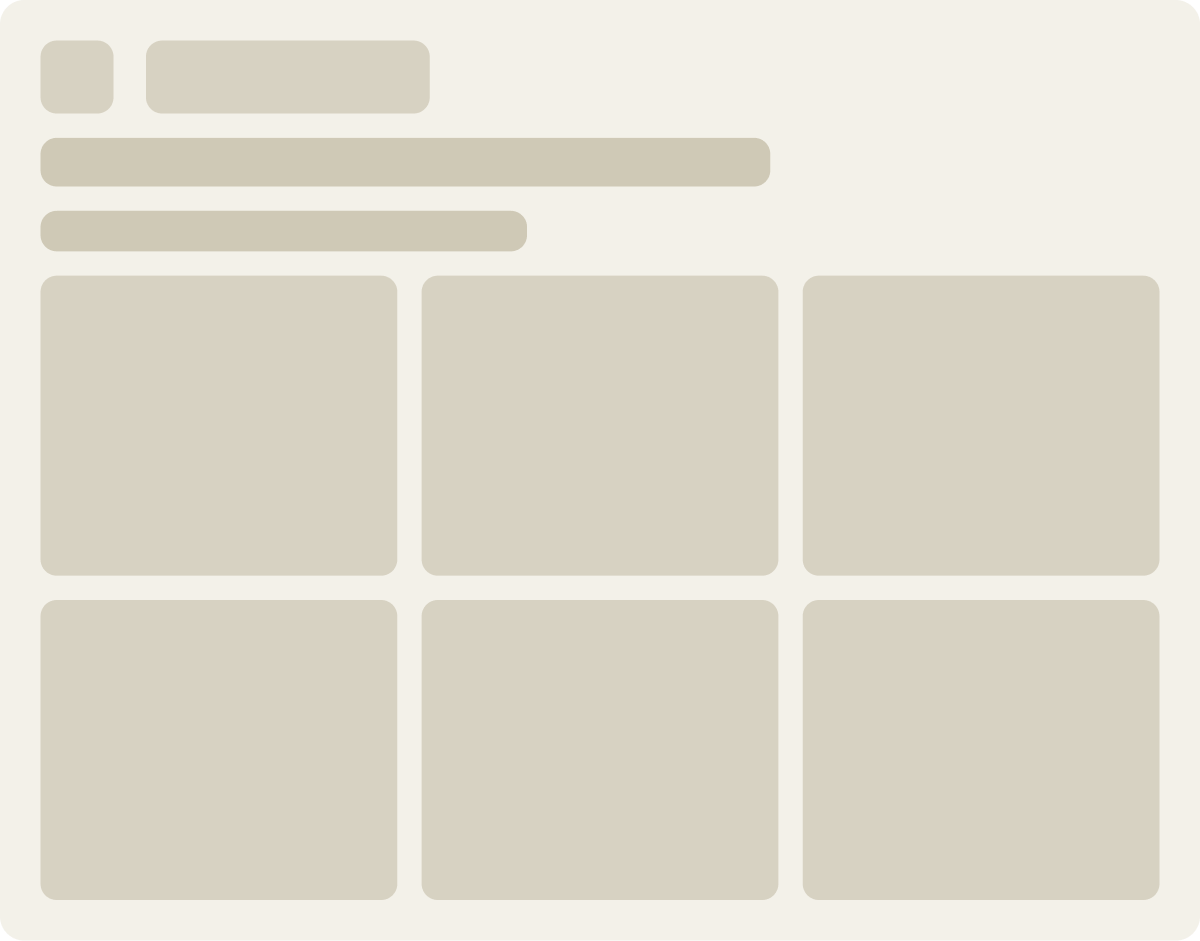
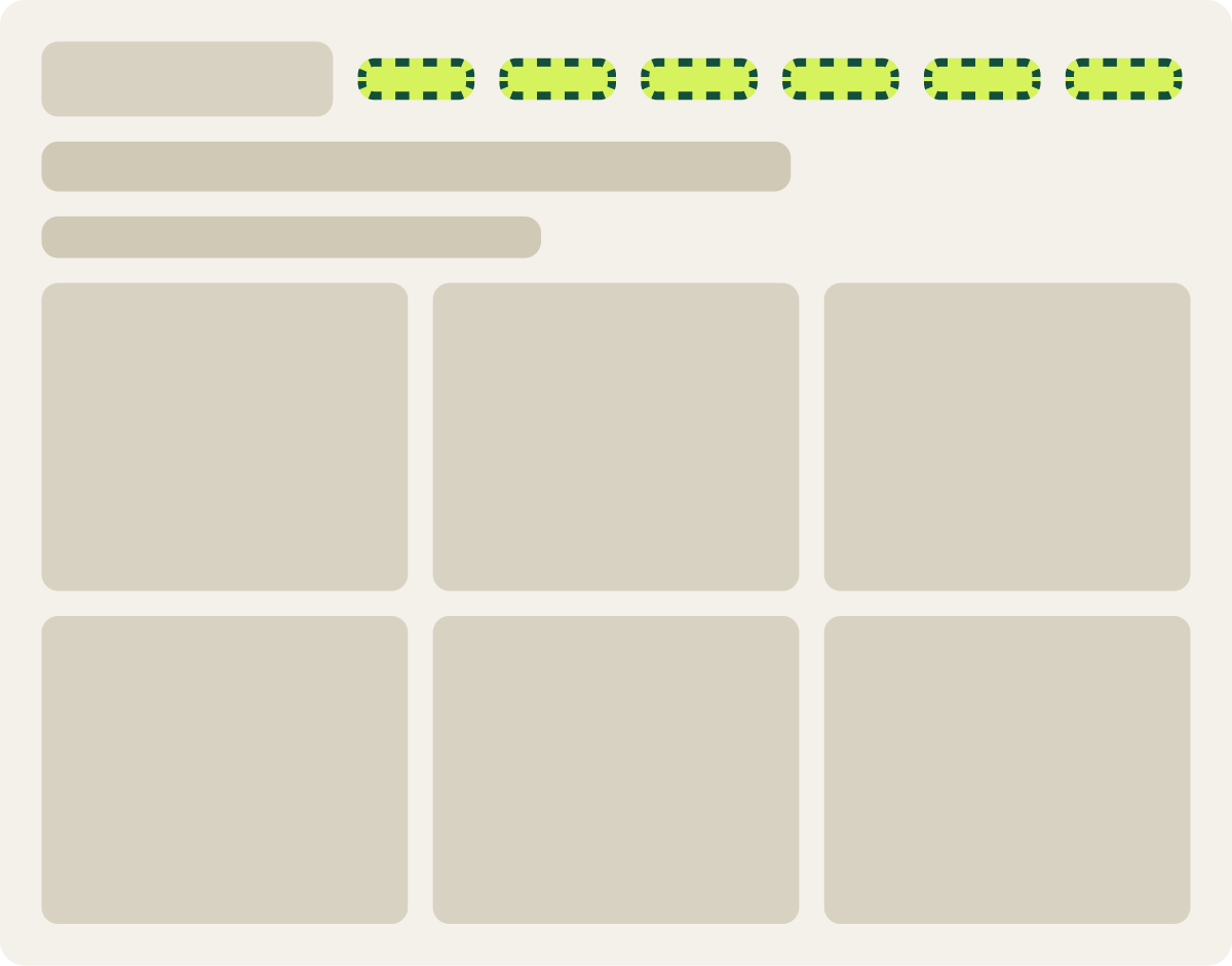
- Desktop menu shown from 1024 pixels wide
- Mobile menu kept below 1024 pixels
- Menu font sizes and padding adjusted
The result
Conversion rate rose 43.3% when mid-size screens got the desktop menu.
Over 19 days on desktop collection pages, conversion rate rose 43.3% and revenue per visitor rose 35.3%. The lift was strong enough to call a win after just over 2 weeks.
The variation included 2 unusually large orders. With those removed, the variation still won on conversion rate, and average order value stayed steady, so the result does not rest on a couple of big purchases.
What we took from it
Mid-size screens converted better with the full desktop menu.
Shoppers on laptops and small monitors were getting a menu built for phones. Giving them the desktop menu put the categories in view and made browsing faster on this site. Since the menu is shared across the site, the same breakpoint is worth checking on other page types here.