
Test archive / Collection page
Does a separate learn more link lift collection page conversion?
Our collection page cards sent shoppers to the product page from the image and to the cart from the button. We tested adding a separate learn more link or button. Over 14 days, conversion fell 7.8% with the learn more link.
Lost Responsive 14 days Called at 90%
The hypothesis
By making it clearer where each link on a product card goes, we will increase engagement, resulting in more purchases.
Each product card had a strong add to cart button, yet shoppers went to the product pages at twice the rate they went to the cart. Mobile had a higher exit rate than desktop, but also a 15% higher rate of reaching the cart.
We wanted to see if a clear learn more path would help shoppers who were not ready to buy.
What we changed
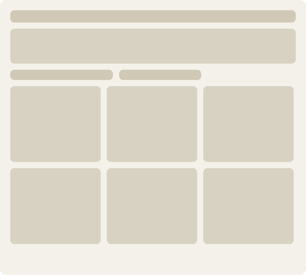
A learn more link or button added below each card's buy button
Var A removed the product link from the card image and added a learn more link below the buy button. Var B kept the image link and added a learn more button as a second call to action, linking to the product page.
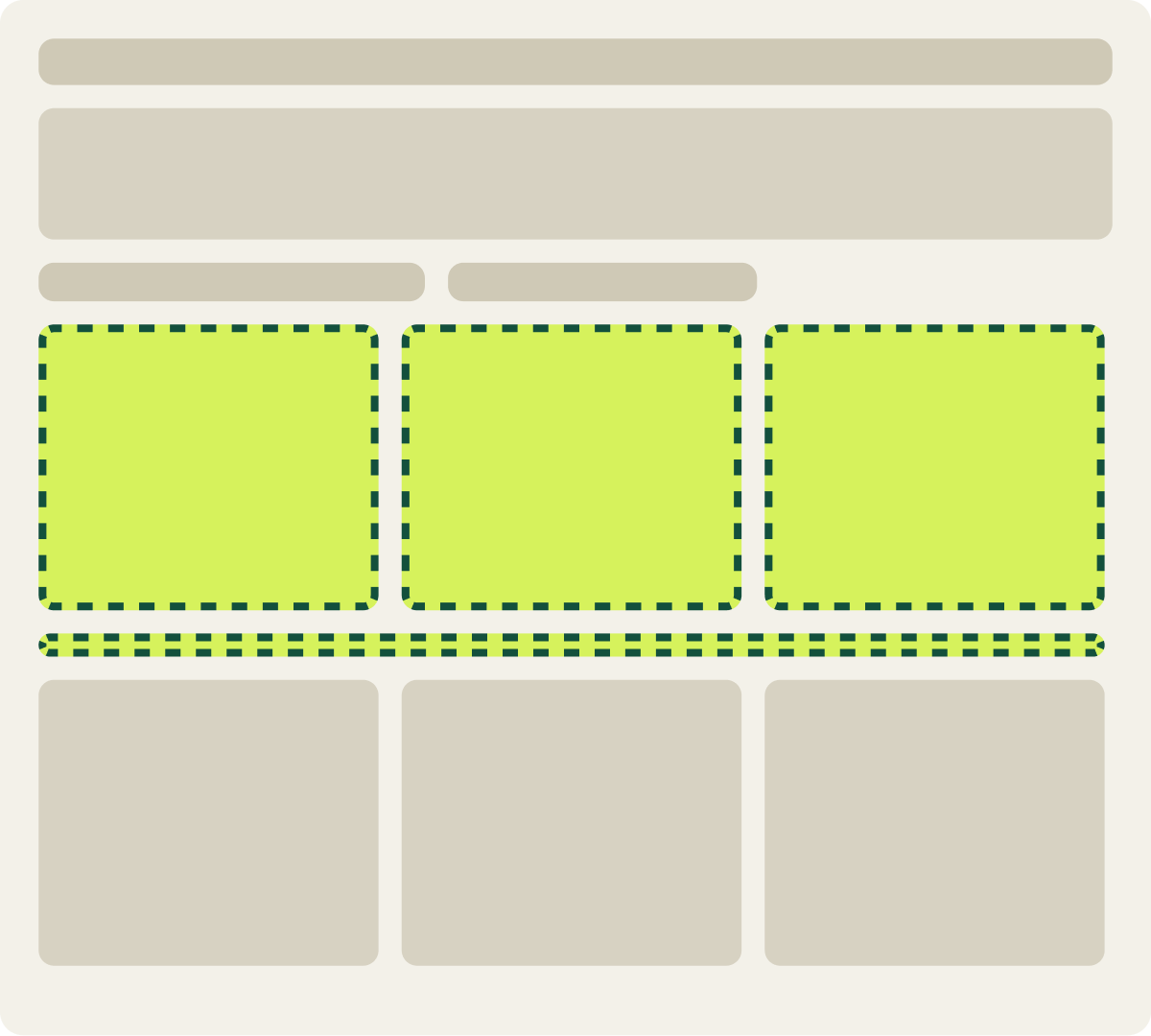
- Product link removed from the image
- Learn more link added below the button
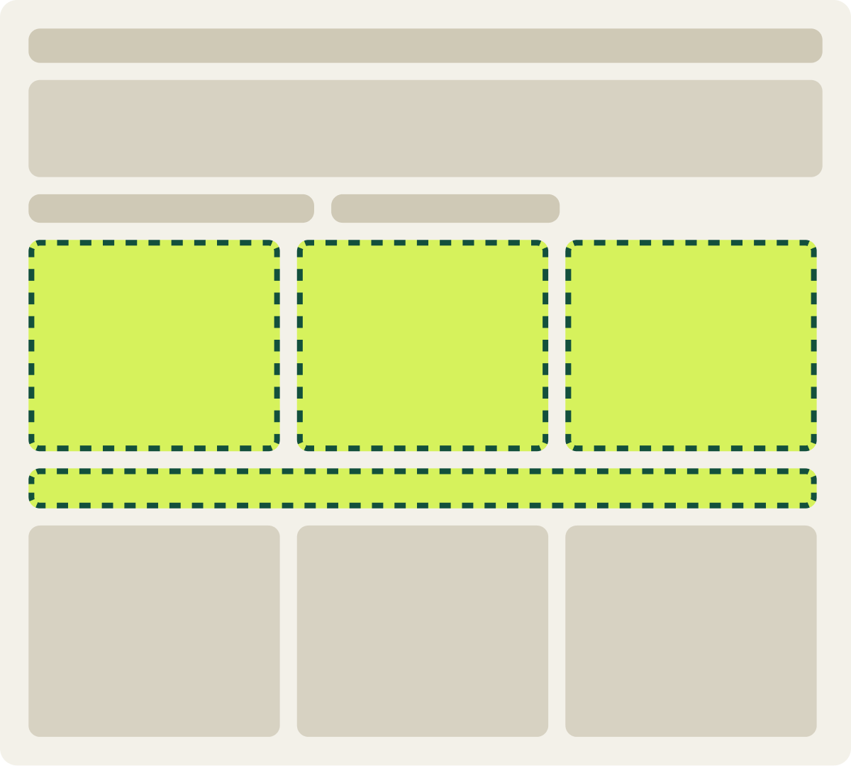
- Learn more button added below buy button
- Button links to the product page
The result
Conversion fell 7.8% with the learn more link
Over 14 days, the learn more link (Var A) cut conversion 7.8%, and the loss cleared our confidence bar. Revenue per visitor was 1.0% lower. The learn more button (Var B) cut conversion 4.3% and revenue per visitor 1.1%.
What we took from it
Users preferred cards with a clickable image and 1 button
Shoppers were already using the card image to reach the product page. Taking that link away, or adding a second button, gave them more to think about on each card. The original card offered 1 clear button and an image to click.
Read next
Where this test fits
What is ecommerce conversion rate optimization?
Ecommerce conversion rate optimization gets more of your current visitors to buy, proven with A/B tests. 4 real tests show what moved sales, and…
Read the article →Conversion Rate Optimization
We research, build and run collection page tests like this one inside your team.
See the service →