
Articles / Home Pages and Navigation
CTA best practices: what our A/B tests show
What we found
A CTA works when it stands out from everything around it and its words tell the right visitors what they get. In our tests, a high-contrast button lifted conversion 10.1%, and softer wording won clicks but cut revenue per visitor 21.4%.
CTA best practices come down to 2 things: the button has to stand out from everything around it, and its words have to tell the right visitor what they get. I have been running conversion tests since 2007, and those 2 rules hold up far more often than any advice about a specific color or size.
Here are the 5 practices we follow, then the published tests behind them.
- Make it the highest-contrast element in its section. Contrast matters more than the color itself.
- Name what the visitor gets. “Get my free quote” beats “Submit.”
- Give each section 1 primary action. Secondary actions can stay, styled as plain links.
- Make it easy to tap on mobile. At least 44px tall and within reach of a thumb.
- Judge every CTA change on revenue per visitor. More clicks can mean fewer buyers.
A high-contrast button lifted conversion 10.1%
The pattern I see most is simple: a CTA wins when it stands out. A green button on a green page disappears. The same green button on a white page gets clicked.
On a collection page, product cards had a plain button. We tested a high-contrast orange button against it, and against removing the button altogether.
Evidence · Collection page · Won
Does card button color lift collection page conversion?
22 days · desktop · We made the card button orange in Var A and removed it in Var B.
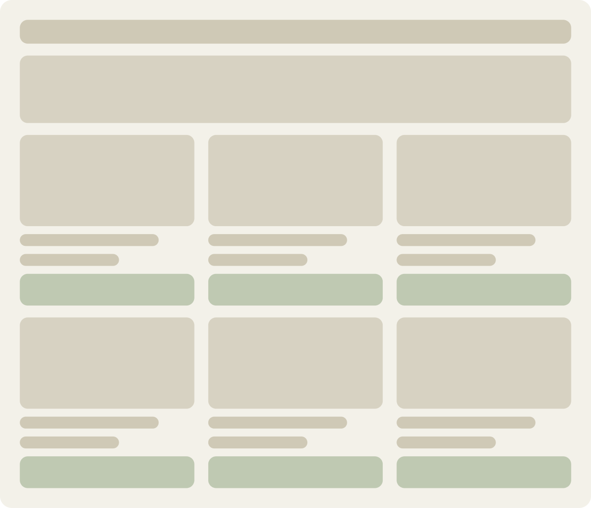

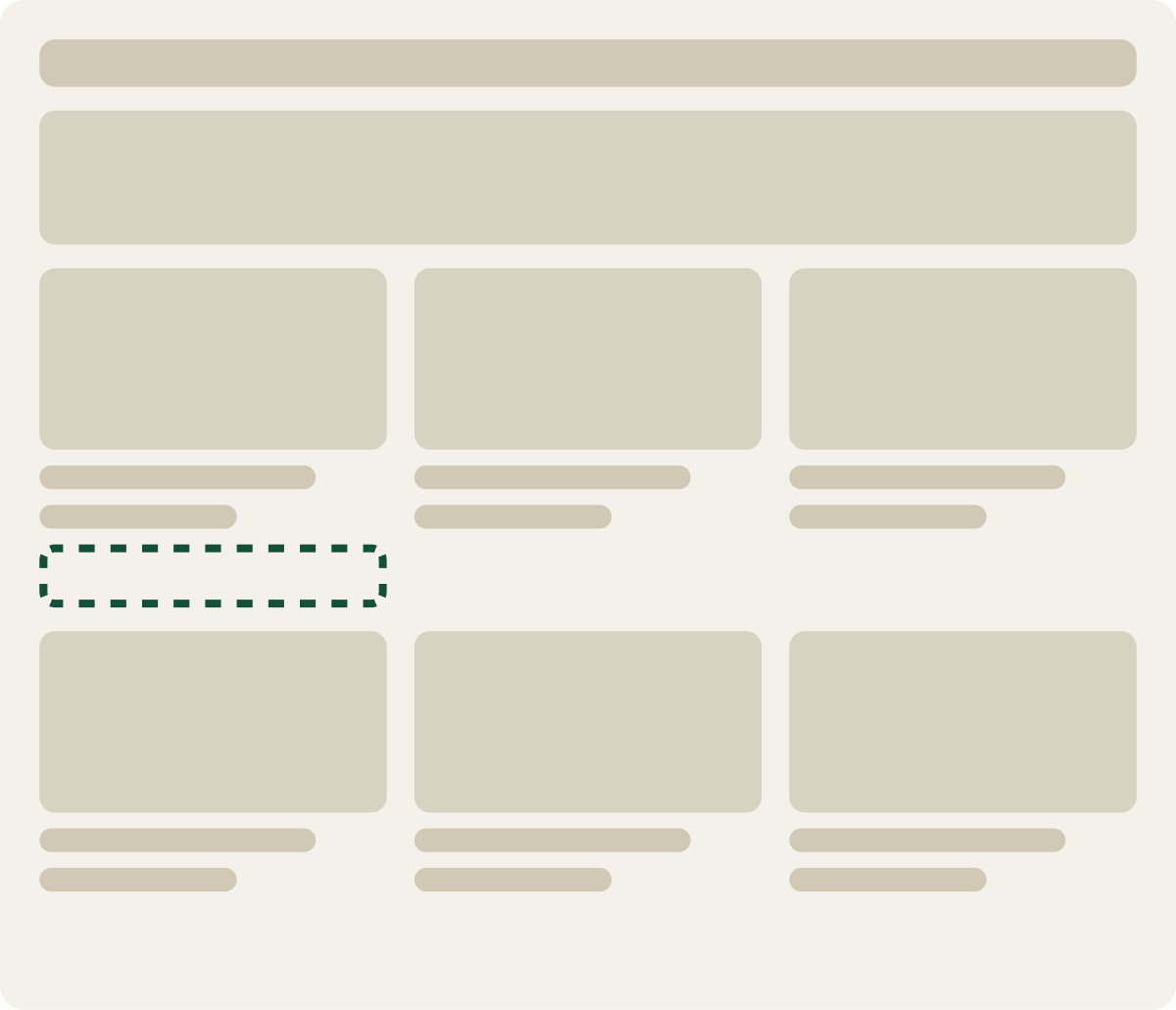
+10.1% conversion, +19.9% revenue per visitor
Read the full testThat result does not mean “use orange.” Orange stood out on that page. On a page already full of orange, it would not. We cover how to find the right contrast on any page in using contrast to increase conversion rates.
It is not the color. It is the contrast against everything around it.
Orange has won for us. So has green. So has black. What they had in common was standing apart from the rest of the page, not the hue itself. A color that wins on 1 site loses on another that already uses it everywhere.
CXL reviewed published button color studies and found that no single color converts best everywhere. What mattered was how much the button contrasted with the area around it.
Ott Niggulis, updated September 2026 · cxl.com ↗
We got to the same place by testing. The buttons that won for us were the ones that stood apart, whatever the color.
A winning button dropped 4.1% without its copy
Button tests often change more than the button, which makes it easy to credit the wrong thing. On one homepage, a new CTA had already won with a 25% lift. That test changed both the button and the copy around it, so we ran the button on its own.
Evidence · Homepage · Not significant
Does a winning homepage CTA button work without its copy?
15 days · mobile · We reused the winning button without its copy and tested 2 landing pages.

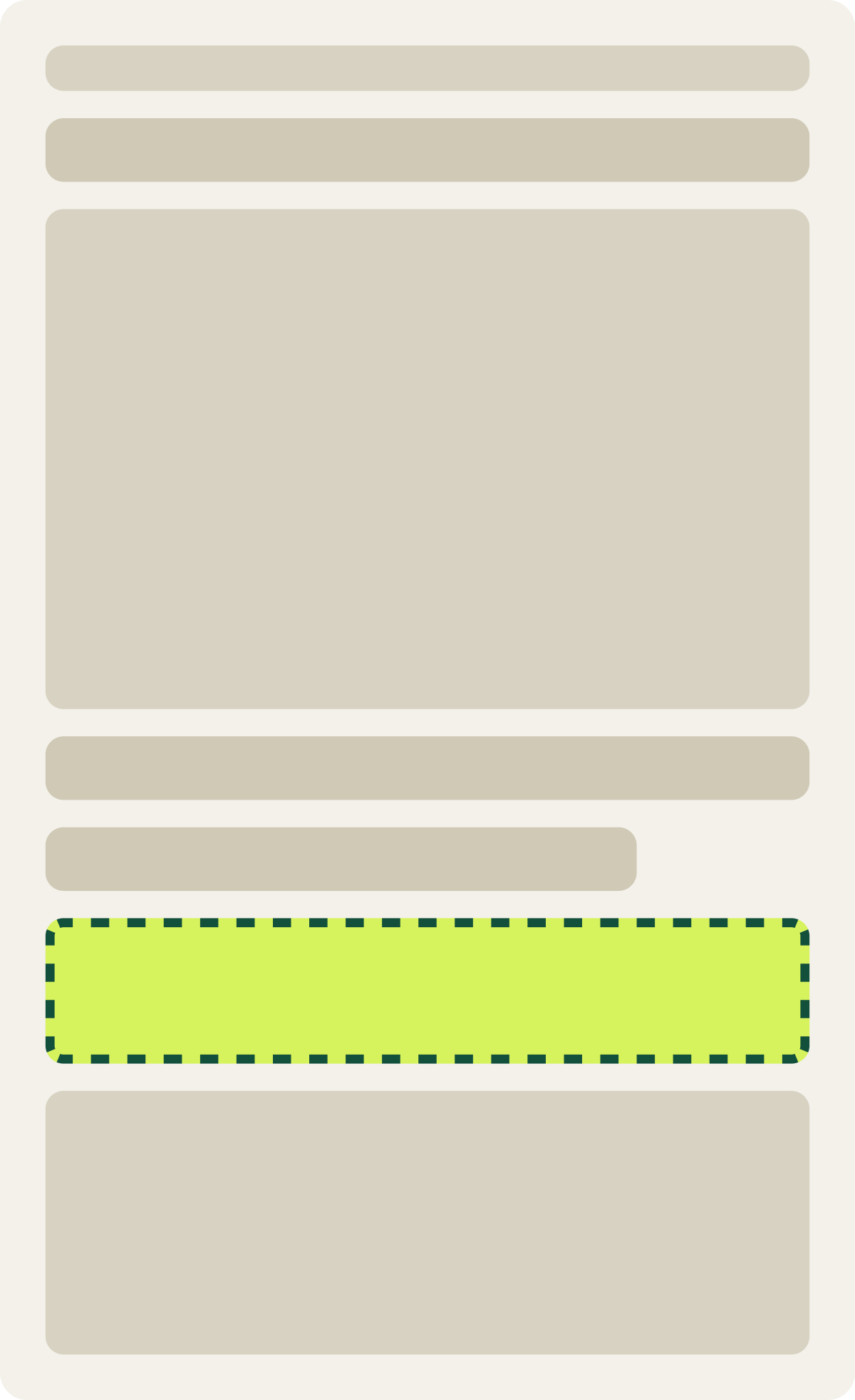
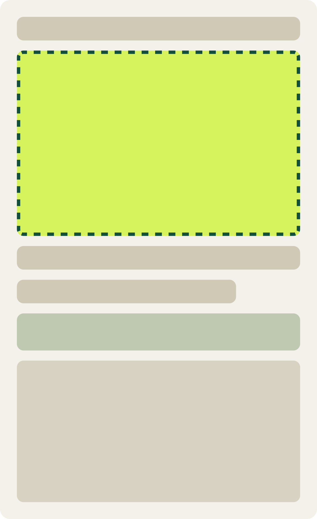
+2.2% conversion, -3.1% revenue per visitor
Read the full testThe version that kept the winning button but dropped its copy lost 4.1% of conversions. None of the 3 versions beat the control; the best, a focused landing page, lifted conversion 2.2%, too little to call. The copy, not the button, had carried the earlier win.
When a CTA test wins, find out which part won before you copy it to other pages. Otherwise you may roll out a new button style everywhere and get none of the lift.
Softer wording lifted conversion 5.2% and cut revenue 21.4%
Lower-commitment wording, like “Get an estimate” instead of “Buy now,” usually gets more clicks. That is not always good news. On a mobile homepage, a softer button brought in more starts and fewer paying customers.
Evidence · Homepage · Lost
Does a lower commitment button lift mobile homepage conversion?
14 days · mobile · We changed the main mobile homepage button to Get Estimate.

+5.2% conversion, -21.4% revenue per visitor
Read the full testThe original wording was filtering for buyers. That is why our conversion rate optimization work judges CTA tests on revenue per visitor, not clicks.
The button gets the click. The words decide who clicks.
Labels that name the outcome beat vague ones
Visitors decide in a few seconds whether a click is worth it, so the label has to answer 1 question: what happens when I click? “Get my free quote” beats “Submit.” “See how it works” beats “Learn more.” “Book a 20-minute call” beats “Click here.”
If you use a number near the button, use the exact one. In my tests, exact figures like 193,536 customers earn more trust than rounded ones like 193,000, which can look made up.
More CTAs only help when the first one was hard to find
A common fix for a weak CTA is to add more of them: a sticky bar, a second button, a pop-up. That works when visitors truly could not find the action. When they could, it adds nothing, and extra buttons can split attention.
Check your clicks and scroll depth first. Our guide to reading heatmaps before you test shows what to look for. If people reach the button and still do not click, the problem is the offer or the wording, not the number of buttons.
How to test your own CTA in 4 steps
Best practices tell you where to start. A test tells you whether they hold on your site, with your visitors.
- Start where people drop off. Pick the page in your funnel that loses the most visitors before the next step. If you do not know yet, start with your highest-traffic landing page.
- Change 1 thing at a time. Test the button, the wording and the offer as separate changes, so you know which one earned the result.
- Run it for full weeks. Weekday and weekend visitors behave differently. We run most tests for at least 2 full weeks before we call them.
- Judge it on revenue per visitor. If clicks go up and revenue goes down, pause the test, even if the conversion rate looks like a win.
Then implement the winner and test the next part of the page. Small, clear wins add up faster than 1 big redesign that you cannot read.
Frequently asked questions
What are CTA best practices?
Make the CTA the highest-contrast element in its section, say what the visitor gets, keep 1 primary action per section, make it easy to tap on mobile, and judge changes on revenue per visitor, not clicks.
What color is best for a call to action button?
There is no single best color. The best color is one that contrasts with the rest of your page. In our tests, a color change helped when the new color stood out more, like a plain button changed to high-contrast orange.
Does CTA wording matter more than color?
Often, yes. In 1 homepage test, a winning button lost its lift once the copy around it was removed. Wording also decides who clicks, which affects revenue, not just clicks.
How many CTAs should a page have?
Start with 1 primary action per section. A secondary link is fine, as long as it looks clearly less important.
What should a CTA button say?
Say what the visitor gets: "Get my quote," "See plans," "Book a call." Avoid "Submit," "Click here," and "Learn more."
The evidence
The 3 tests this article leans on
Evidence · Collection page · Won
+10.1% conversion, +19.9% revenue per visitor
Read the full testEvidence · Homepage · Not significant
+2.2% conversion, -3.1% revenue per visitor
Read the full testEvidence · Homepage · Lost
Does a lower commitment button lift mobile homepage conversion?
+5.2% conversion, -21.4% revenue per visitor
Read the full test