
Articles / Home Pages and Navigation
Ecommerce homepage best practices: what our A/B tests show
What we found
Homepages win by making the next click obvious. Plain category names with pictures lifted conversion 51.5%, a still banner with clearer category buttons lifted desktop sales 27.3%, and 1 hero image beat a split hero by 13.1%.
The ecommerce homepage best practices that held up in our testing are simple. A homepage should include a hero with 1 focused image, category names shoppers recognize, and a path to products that does not make anyone wait or guess. In our A/B tests, plain category names with pictures lifted conversion 51.5%. A still banner with clearer category buttons lifted desktop sales 27.3%, and a single hero image beat a split hero by 13.1%. Tests that added shortcuts or bigger search boxes did not beat what shoppers already had.
A homepage has 1 job: send shoppers to the right products
Few shoppers buy from the homepage itself. They use it to decide where to go next. Every block on it either helps that decision or competes with it. When I look at a homepage, I check where visitors click first and how many leave without clicking anything. Analytics shows what they did. A usability test shows why.
Plain category names with pictures lifted conversion 51.5%
An online marketplace used category labels that did not always match the words shoppers used. A visitor who could not tell what a category held had no reason to click it. We tested plain, familiar category names, with and without matching pictures. The change ran on the homepage and the category pages. Plain names with pictures lifted conversion 51.5% over 13 days, and also led on bounce rate and exit rate.
Evidence · Homepage · Won
Do plain category names with visuals lift homepage conversion?
13 days · responsive · We replaced category labels with plain names and added visuals.

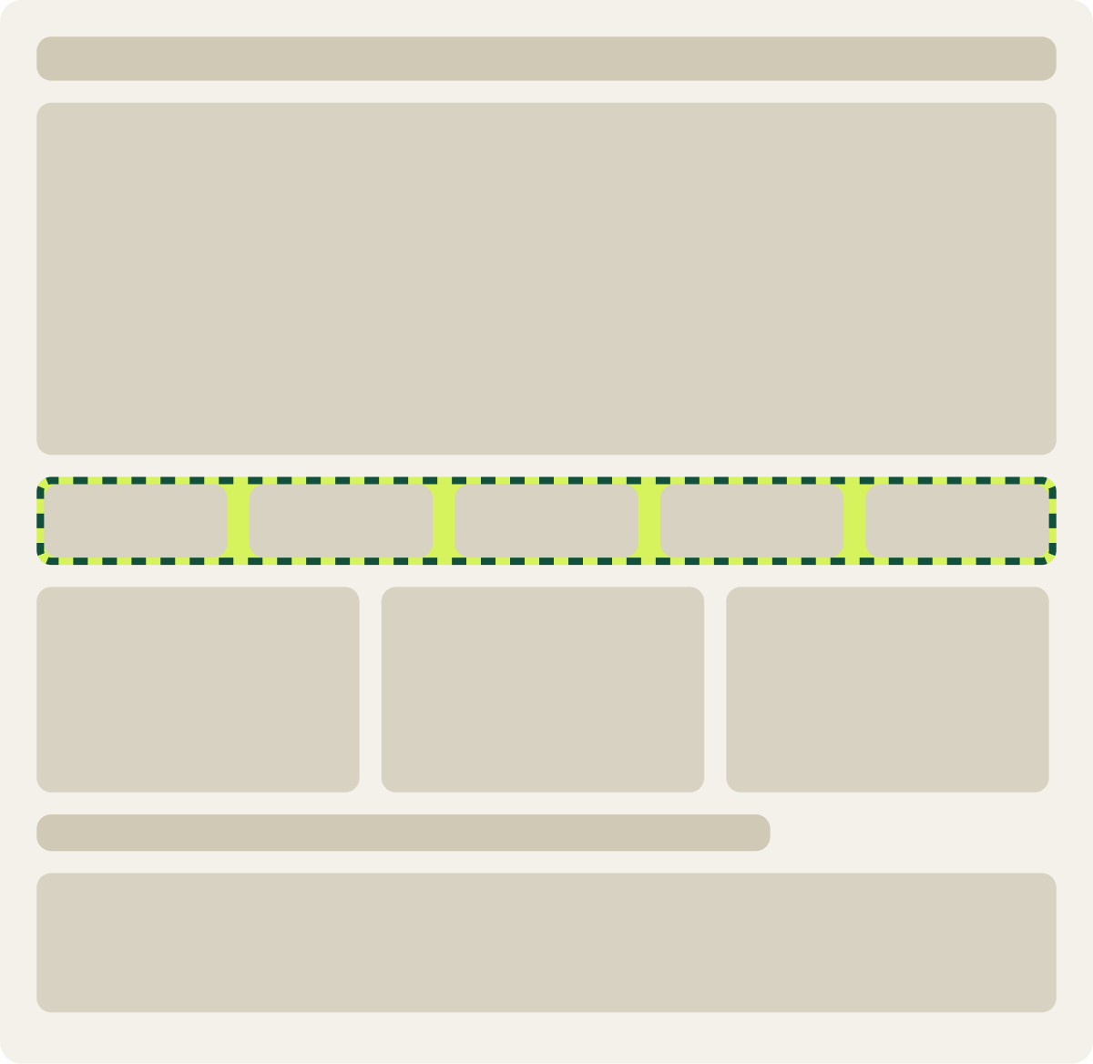
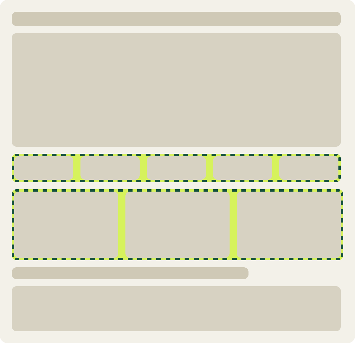
+51.5% conversion
Read the full testInternal names creep onto homepages over time: a collection named after a season, a campaign or a supplier. Shoppers do not know those words. Read your category labels as if you had never seen your store, and rename anything a new visitor would have to guess at.
A still banner and clearer category buttons lifted desktop sales 27.3%
A desktop homepage opened with an animated banner, with small category buttons under it and some labels that did not say what the products were. An earlier test on the same page had added more content, and conversion did not rise. So this test went the other way. We stopped the animation, made the category buttons larger and clearer, and added a stronger shop button. Conversion rose 27.3%, and we implemented the change.
Evidence · Homepage · Won
Does simpler homepage category navigation lift desktop sales?
9 days · desktop · We stopped the banner animation and enlarged and relabeled the category buttons.

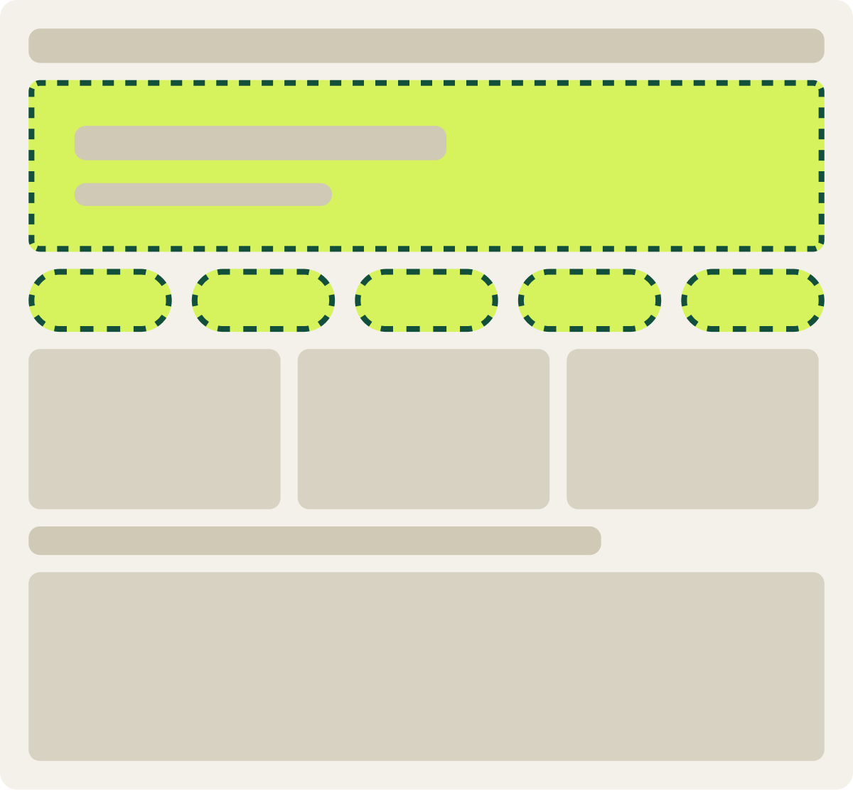
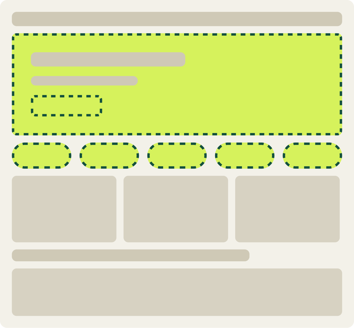
+27.3% conversion, +25.3% revenue per visitor
Read the full testMoving banners and carousels look lively to the team that built them. To shoppers they often look like ads, and anything on a slide that has already rotated away goes unseen. A still hero with 1 clear message gives shoppers 1 thing to read and 1 place to click.
1 hero image beat a split hero by 13.1%
Another desktop homepage split its hero into 2 images with a vertical line between them, so it was unclear where to look first. We tested 3 single image heroes in its place, each with the same headline and button. The winner paired a lifestyle photo with a product shot and lifted desktop conversion 13.1% over 18 days.
Evidence · Homepage · Won
Does a single hero image beat a split hero on the homepage?
18 days · desktop · We replaced the split hero with 1 of 3 single image heroes.
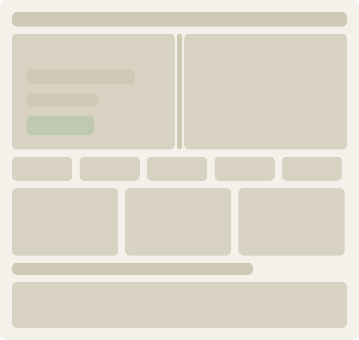
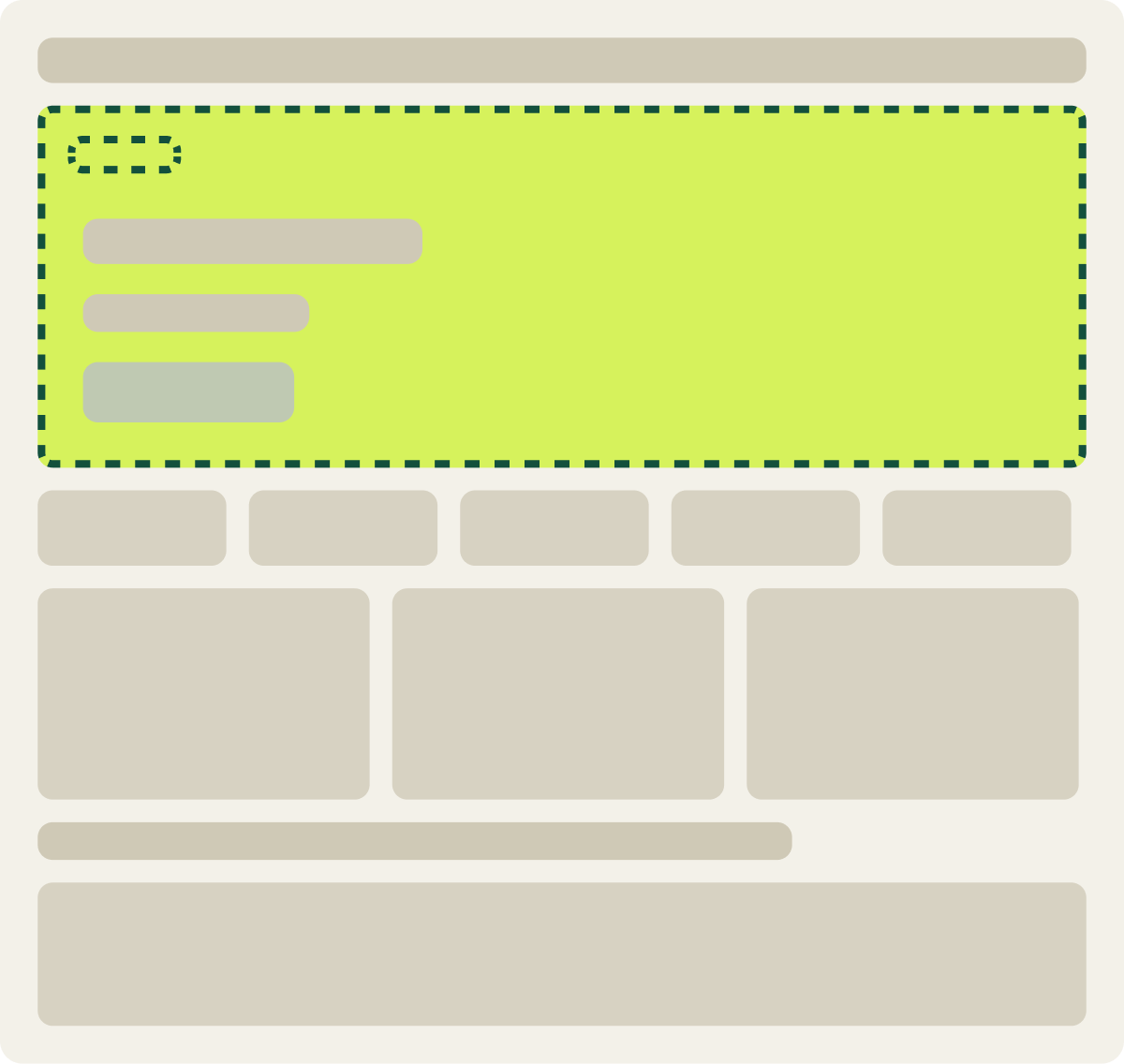
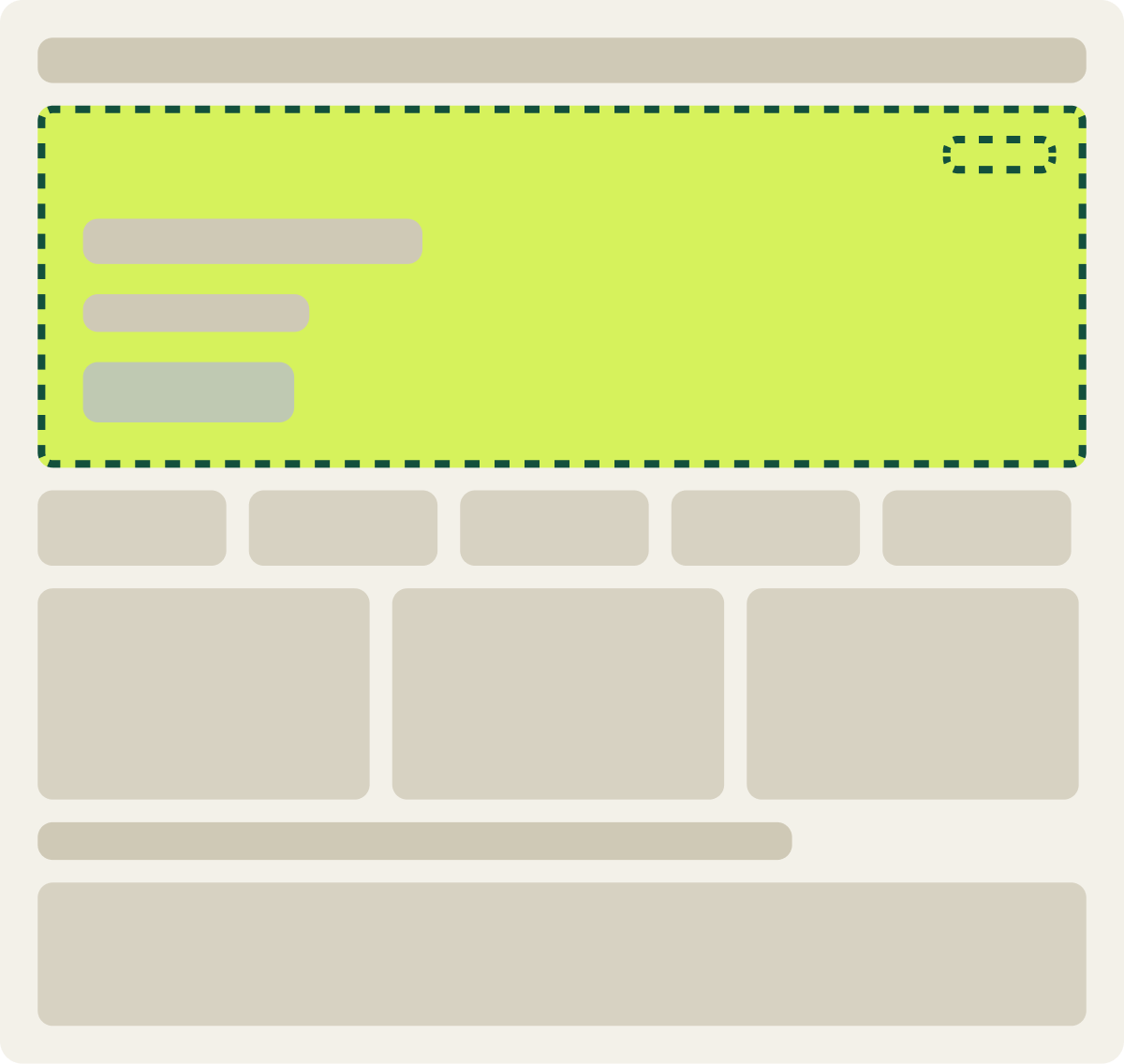
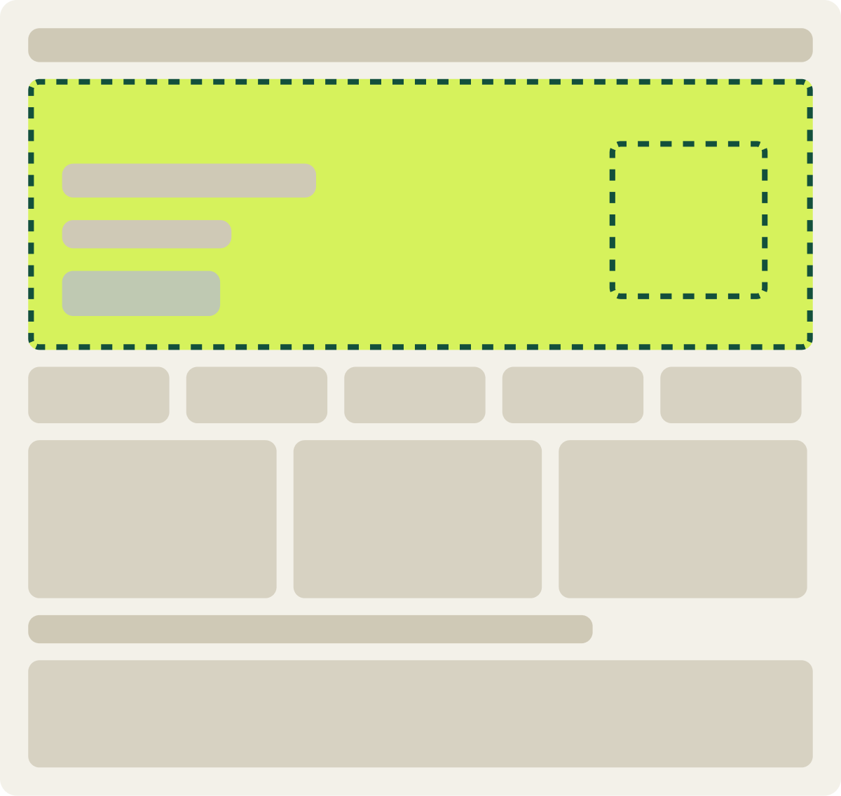
+13.1% conversion
Read the full testTesting 3 images instead of 1 also showed which kind of image shoppers respond to, and that guided the larger homepage redesign that came next. The winner was useful, and so was the pattern behind it.
Less hero copy and no heading lifted conversion 7.6%
Not every homepage leads to a category. On a homepage built around a form, the hero gave visitors a heading and a block of copy to read before they reached the form. We removed the heading and cut the copy down to clear instructions. Conversion rose 7.6% over 21 days, after the same change had already won on mobile. When visitors arrive knowing what they want, the homepage should get out of the way.
Desktop shoppers preferred the full navigation over a quick menu by 21.4%
A quick menu of 8 popular collections, with an icon for each, had helped shoppers on another site, so we tested it on a new homepage. On desktop, shoppers preferred the page without it: conversion and revenue per visitor both measured 21.4% higher on the original over 15 days. Mobile trended the other way. On desktop the full menu is always in view, so the shortcut only added another set of choices. On mobile, where the menu hides behind an icon, a visible shortcut can save a step.
Shoppers preferred the original search box in 3 tests
Shoppers who searched converted better than shoppers who browsed, so 1 store tried 3 times to get more people into search: a wider box with hint text, a wider box with an outline, and a wider box with more specific hint text. None lifted results. 2 lost and 1 was not significant.
The lesson is not that search does not matter. It is that searchers already find the search box. Making it bigger did not create new searchers. It took space and attention from browsing, which is how most shoppers used the homepage.
On homepages, clarity beats additions
Across the homepage tests I have run, the winners made something clearer or simpler: plainer names, 1 image, less copy. The tests that added a shortcut or a bigger element rarely beat what shoppers already had.
4 things to test first on your homepage
- Category names. Replace anything a first-time visitor would have to guess at, and add pictures that match.
- The hero. 1 still image, 1 message, 1 button.
- The path to products. Make the categories large, clear and visible without opening a menu.
- Anything you plan to add. Shortcuts and bigger search boxes did not beat what shoppers already had, so test before you add.
Our experimentation and testing work runs these tests on your real traffic. For the buttons on your homepage, see CTA best practices: what our A/B tests show. To find which part of your homepage loses the most visitors before you test, start with How to do a CRO audit.
A homepage wins by making the next click obvious, not by adding more to click.
Auto-rotating carousels cut how long each message is visible, and users tend to treat moving elements as ads. The recommendation is to change panels only when users ask.
Jakob Nielsen 2013 · www.nngroup.com ↗
Our still banner test matches: stopping the animation and clarifying the categories lifted desktop sales 27.3%.
Frequently asked questions
What should an ecommerce homepage include?
A hero with 1 focused image and message, category names shoppers recognize, and a visible path to products. In our tests, plain category names with pictures lifted conversion 51.5%.
Do homepage carousels hurt conversion?
They often do. In our test, stopping a homepage banner's animation and clarifying the category buttons lifted desktop sales 27.3%. Rotating slides also hide most of their messages most of the time.
Should the search bar be visible on the homepage?
Yes, in its usual place in the header. In 3 of our tests, making the search box bigger or more prominent did not lift conversion.
Where should the value proposition go on a homepage?
In the hero, as 1 short message. On a form-led homepage, cutting the hero copy down to clear instructions lifted conversion 7.6%.
Should a homepage have a quick menu of popular collections?
Test it by device. On desktop, shoppers preferred the page without one by 21.4%. On mobile, where the main menu is hidden, it trended up.
The evidence
The 3 tests this article leans on
Evidence · Homepage · Won
Do plain category names with visuals lift homepage conversion?
+51.5% conversion
Read the full testEvidence · Homepage · Won
Does simpler homepage category navigation lift desktop sales?
+27.3% conversion, +25.3% revenue per visitor
Read the full testEvidence · Homepage · Won
+13.1% conversion
Read the full test