
Do plain category names with visuals lift homepage conversion?
The homepage of an online marketplace used category labels that were not always clear. We tested plain category names, with and without visuals. Plain names with visuals lifted conversion 51.5% over 13 days.
Won Responsive 13 days Called at 90%
The hypothesis
By using clear, familiar category names and visuals, we will give visitors more confidence in choosing a category, resulting in more sales.
The navigation and category labels on the homepage did not always use the words shoppers used. A visitor who could not tell what a category held might leave instead of clicking.
We expected plain names, and pictures to match, to make the next click obvious.
What we changed
We replaced category labels with plain names and added visuals.
Variation A replaced the sub navigation with common category names. Variation B also used plain category names and added a visual for each main category. The change ran on the homepage and the category pages.

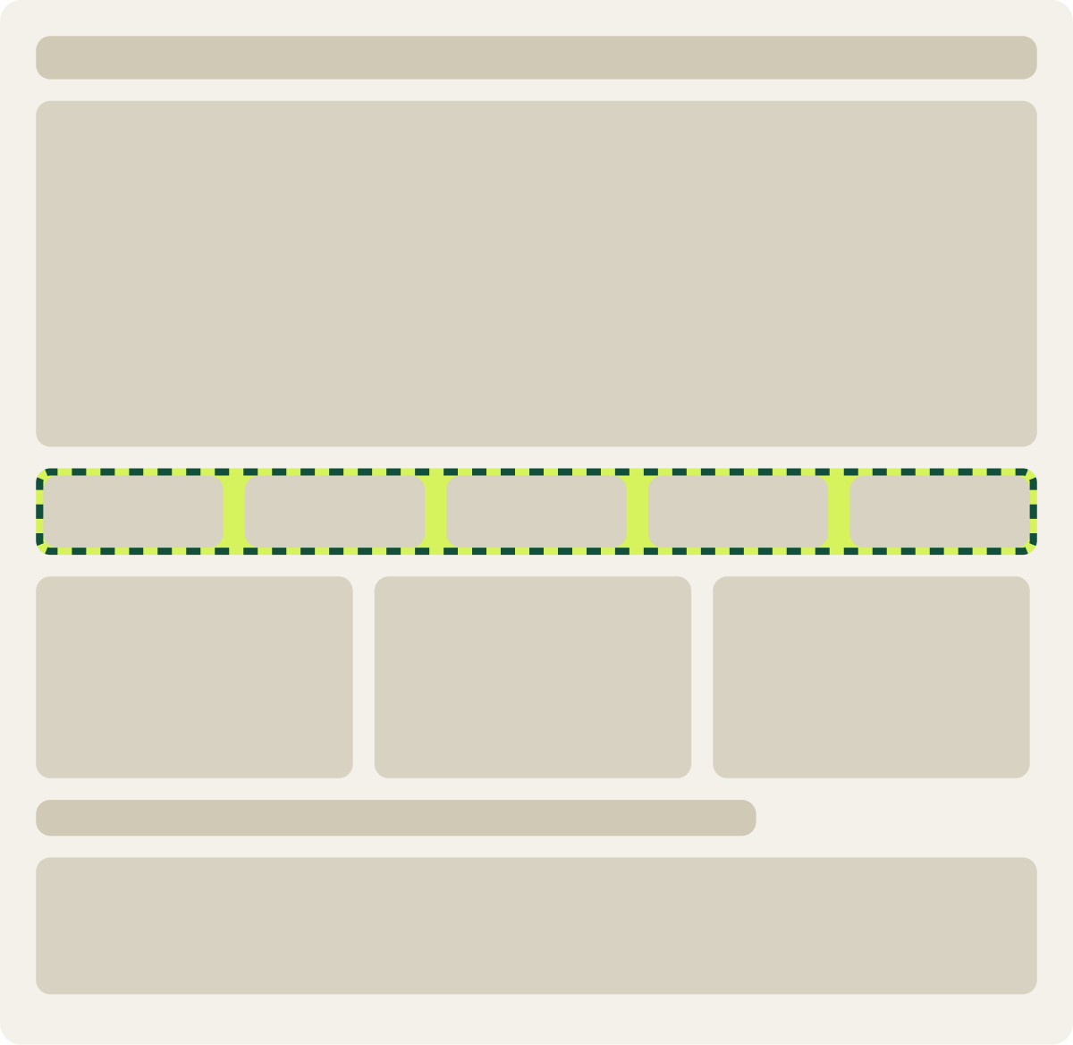
- Sub navigation replaced with common categories
- Plain category names
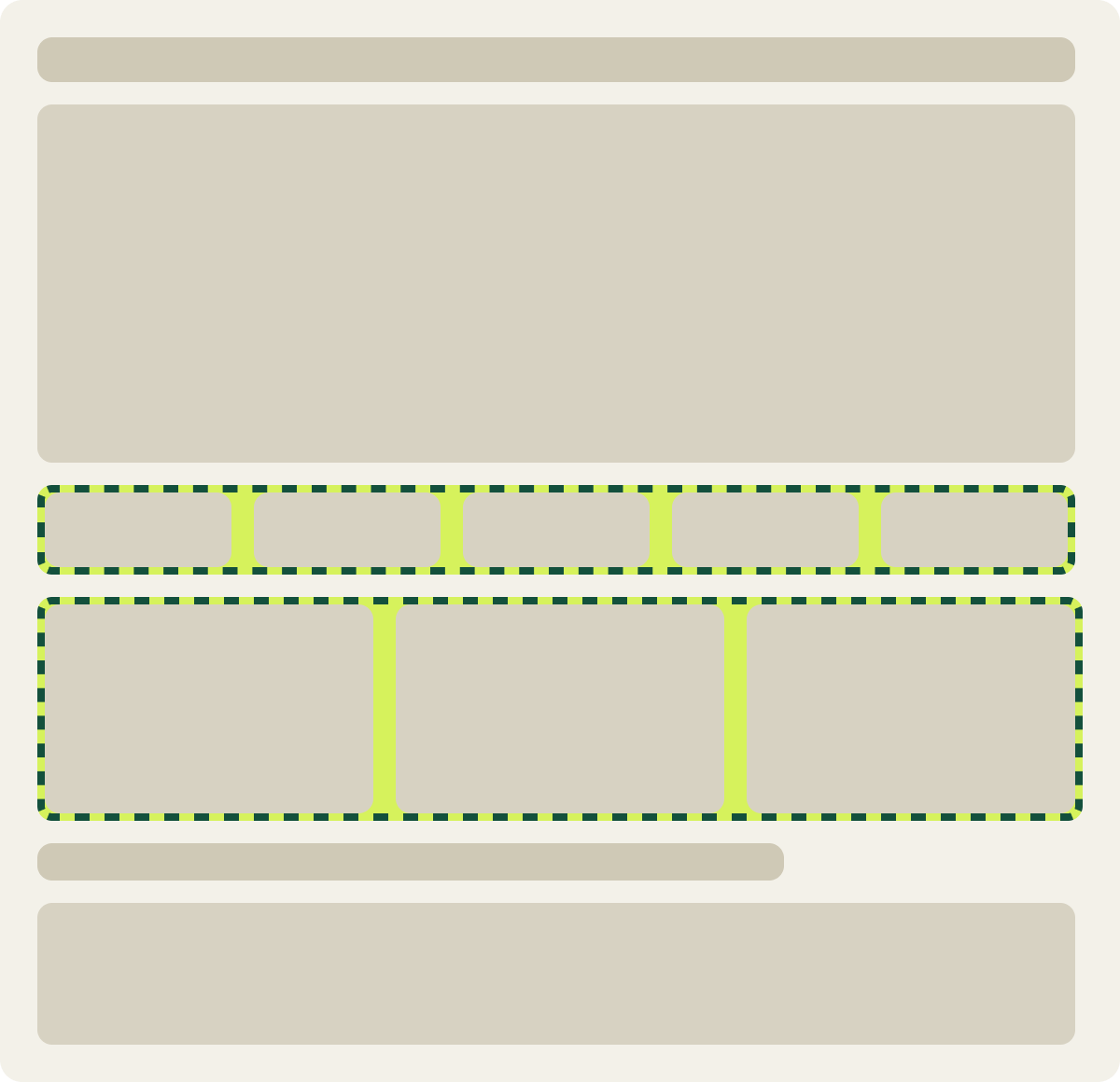
- Plain category names
- A visual for each main category
The result
Plain category names with visuals lifted conversion 51.5%.
Variation B, plain names with visuals, led on all 3 primary measures: bounce rate, exit rate and conversion. Conversion rose 51.5% over the 13 days we analyzed.
We did not judge this test on revenue per visitor. Because the change ran sitewide, revenue had too much random noise to read. We implemented Variation B.
What we took from it
Shoppers clicked more when categories used their own words.
On this marketplace, unclear labels made visitors guess what each category held. Plain names told them, and visuals confirmed it at a glance. The next homepage test built on these new categories.