
Does fixing homepage usability lift conversion?
The homepage had heavy padding, hard to read hero links and a cluttered product list. We tightened it up and added a buy now button to each product. Conversion rose 70.8% and revenue per visitor 80.9% over 24 days.
Won Responsive 24 days Called at 90%
The hypothesis
By cleaning up the homepage and adding a direct path to buy, we will make the page easier to use and build confidence, resulting in more engagement and sales.
The homepage had excess padding that pushed content down, underlined links in the hero that were hard to read, and favorite and sale labels on every product in the list. Each made the page slower to scan.
The product list also had no direct way to buy, only a path through each product.
What we changed
We tightened the homepage layout, cleaned up the product list and added buy now.
Variation A removed excess padding, removed the underlines from hero links, left-aligned the hero on desktop and updated the heading to call out savings. In the product list, it removed the favorite and sale labels, stacked reviews on mobile, added a buy now button linking to the product page, and showed 5 products per row on desktop instead of 6. Variation B added a green button to Variation A.
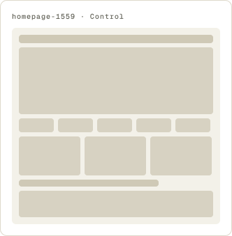
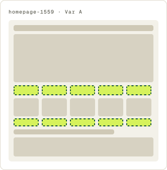
- Excess padding removed to pull content up
- Hero links readable, left aligned on desktop
- Heading updated to call out savings
- Favorite and sale labels removed from products
- Buy now button added, linking to product page
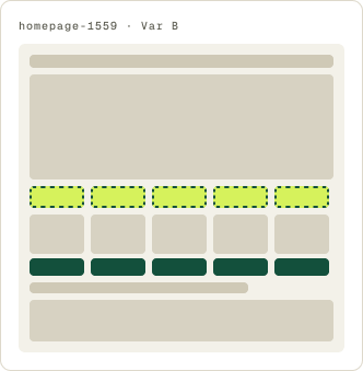
- Same changes as Variation A
- Main button color changed to green
The result
Variation A lifted conversion 70.8% and revenue per visitor 80.9%.
Variation A won over 24 days, with a consistent lift week over week. Conversion rose 70.8%, revenue per visitor 80.9% and average order value 5.9%. Far more visitors bought, and they spent a little more per order.
We paused Variation B partway through to send more traffic to Variation A, then implemented Variation A.
What we took from it
An easier page and a direct path to buy brought in more buyers.
Every change made the homepage quicker to scan or quicker to act on. The buy now button gave shoppers a direct path to a product page from the list. Order value held up as conversion rose, so the easier path brought in more buyers without shrinking their orders.