
Articles / Research and Testing
Usability testing for ecommerce: how to find what to fix
What we found
Usability testing finds the problems. A/B testing proves the fixes. Fixing homepage usability issues lifted conversion 70.8%, but a checkout cleanup that looked just as obvious cut orders 33.3%.
Your analytics can show that shoppers leave the cart. It cannot tell you why. Usability testing can. You watch real people try to shop your site, and they show you where they get stuck.
Analytics shows what visitors did. Usability testing shows why. I use both before we run a single A/B test.
How to run a usability test on your store
- Pick 1 or 2 tasks. For example: find a gift under $50 and get to checkout.
- Recruit 5 people who match your shoppers. Not your team, and not your friends.
- Ask them to think out loud. Don’t help them. Note where they pause, backtrack or guess.
- Look for patterns. 1 confused tester is a note. 3 confused testers is a finding.
- Turn each finding into a hypothesis, then A/B test it.
A study with 5 participants finds about 85% of a design's usability problems; run several small rounds instead of 1 big study.
Jakob Nielsen 2000 · www.nngroup.com ↗
We use small rounds to find problems, then A/B tests to prove which fixes pay.
Fixing homepage usability issues lifted conversion 70.8%
A homepage had heavy padding, hero links that were hard to read and a cluttered product list. We tightened it up and added a buy now button to each product. Conversion rose 70.8% and revenue per visitor rose 80.9% over 24 days.
Evidence · Homepage · Won
Does fixing homepage usability lift conversion?
24 days · responsive · We tightened the homepage layout, cleaned up the product list and added buy now.

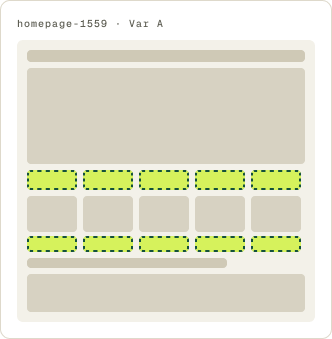
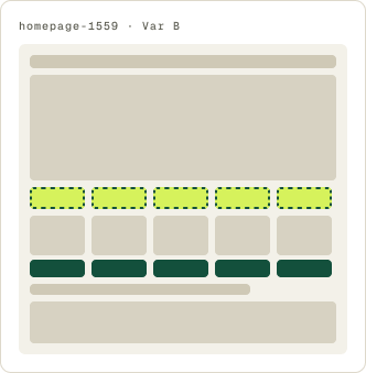
+70.8% conversion, +80.9% revenue per visitor
Read the full testNone of these problems were hidden. They are the kind of thing a team stops seeing after months on the same site, and a tester spots in the first minute.
The visitor’s own words lifted conversion 23.5%
A lead form used an industry term in its headline and button. We swapped in the plain phrase people actually search for. Conversion rose 23.5% in 9 days.
Evidence · Lead form · Won
Does plain language instead of industry terms lift lead conversion?
9 days · responsive · We changed the headline and button copy to say back taxes.
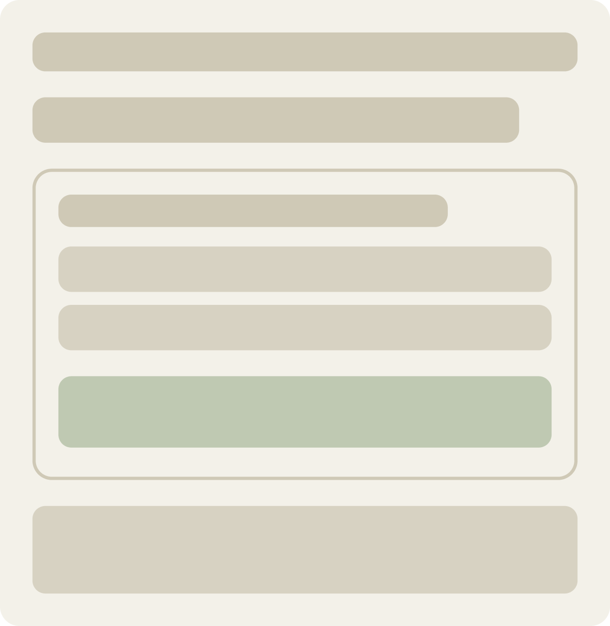
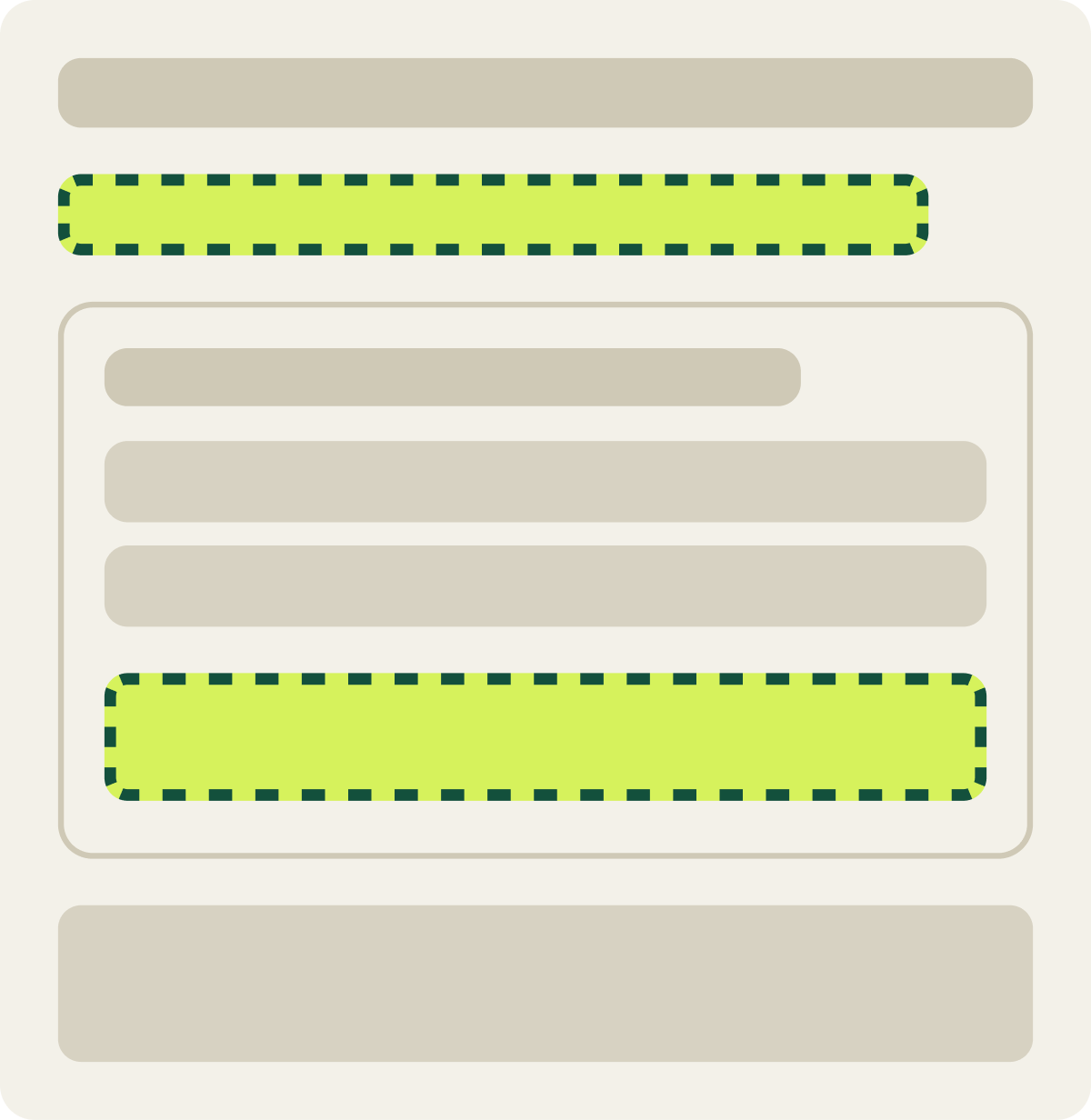
+23.5% conversion, +21.2% revenue per visitor
Read the full testWhen a tester reads your headline out loud and asks “what does that mean?”, you have found a test. Listen to the words they use instead.
Visitors preferred the original checkout by 33.3%
An offer checkout carried a warning near the form, a confusing captcha tab and a rewards widget. It looked like a clear case of clutter. We moved the warning, removed the clutter and added social proof. Visitors preferred the original: orders fell 33.3%, and we paused the test after 19 days.
Evidence · Checkout · Lost
Do fewer checkout distractions lift orders on an offer checkout?
19 days · responsive · We moved the warning, removed clutter and added social proof.

-33.3% conversion
Read the full testThis is why every finding goes through an A/B test. Something that looks like a problem can be doing a job you can’t see, like reassuring shoppers right before they pay.
A usability finding is a hypothesis, not an answer.
Testing shows why visitors struggle. The fix still has to win an A/B test. I write each finding as "By [change X], we will [affect Y], resulting in [Z]."
What to do with your findings
Rank them by how many testers hit the problem and how close it sits to the purchase. Test the top few first. Our user experience optimization work is built on this loop. For a worked example, see Usability testing a travel website: what testers told us. To pair it with analytics, see How to do a CRO audit.
Usability testing tells you where to look. A/B testing tells you what works.
Frequently asked questions
What is usability testing in ecommerce?
Watching real shoppers try to complete tasks on your store, like finding a product or checking out, to see where they get stuck.
How many users do you need for usability testing?
About 5 per round. Nielsen Norman Group found 5 users uncover about 85% of usability problems.
What is the difference between usability testing and A/B testing?
Usability testing shows why shoppers struggle. A/B testing proves which fix improves conversion.
How often should I run usability tests?
In small rounds, then fix and test again. Several rounds of 5 beat 1 big study.
Can usability testing increase conversion?
It finds what to fix. In our test, fixing homepage usability issues lifted conversion 70.8%.
The evidence
The 3 tests this article leans on
Evidence · Homepage · Won
+70.8% conversion, +80.9% revenue per visitor
Read the full testEvidence · Lead form · Won
Does plain language instead of industry terms lift lead conversion?
+23.5% conversion, +21.2% revenue per visitor
Read the full testEvidence · Checkout · Lost
Do fewer checkout distractions lift orders on an offer checkout?
-33.3% conversion
Read the full test