
Articles / Home Pages and Navigation
Ecommerce category page design: what our A/B tests show
What we found
Category pages win when shoppers can compare products quickly. Showing the full menu on mid-size screens lifted conversion 43.3%, and shoppers preferred 2 products per row on mobile and 4 on desktop.
Good ecommerce category page design comes down to 1 job: getting shoppers to the right product with the fewest decisions. In our A/B tests, the biggest win came from navigation, not layout. Giving mid-size screens the full desktop menu lifted conversion 43.3%. The losses were just as useful: shoppers preferred 2 products per row on mobile, 4 on desktop, and an add to cart button on every product card.
A category page and a product listing page do different jobs
A category page helps shoppers pick a path. It shows the subcategories inside a department. A product listing page helps them pick a product. It shows the items themselves, with filters and sorting. Shopify calls the second one a collection page. Many stores use a single page that does both, which works as long as the products appear quickly.
When I review a category page, I start with the numbers: how many visitors reach it, how many click a product, and how many leave. Analytics shows where shoppers drop off. Watching people use the page in a usability test shows why. The tests below came out of that kind of research.
Giving mid-size screens the desktop menu lifted conversion 43.3%
On 1 store, screens from 1024 to 1279 pixels wide, which includes many laptops and tablets held sideways, got the mobile menu: a menu icon with every category hidden behind it. Shoppers on those screens had to open the menu to see any categories. We lowered the breakpoint so those screens got the full desktop menu. Conversion rose 43.3% and revenue per visitor rose 35.3% over 19 days.
Evidence · Collection page · Won
Does a lower navigation breakpoint lift collection page conversion?
19 days · desktop · We moved the desktop menu breakpoint from 1280 down to 1024 pixels.

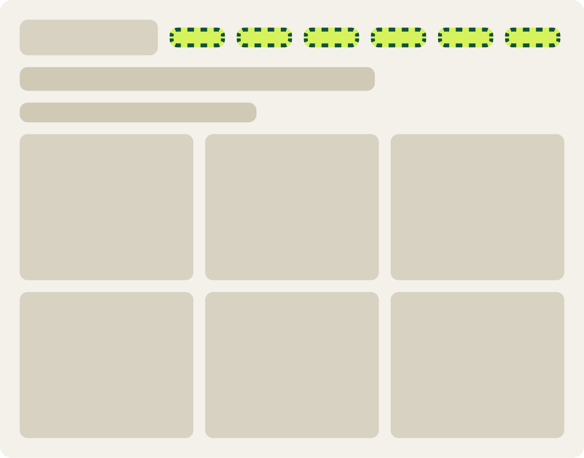
+43.3% conversion, +35.3% revenue per visitor
Read the full testHidden navigation is easy to miss in a design review, because designers check the page on a large monitor and on a phone. The screens in between get whatever the code decides. Check your own category pages at 1024 pixels wide and see which menu shows up.
Mobile shoppers preferred 2 products per row by 9.4%
Our mobile category pages showed products 2 to a row. We tested 1 product per row, with larger images, on 2 collections, including a long one. Shoppers preferred the 2-across grid: the single-row version measured 9.4% lower in conversion and 7.2% lower in revenue per visitor over 14 days, and we paused it.
Evidence · Collection page · Lost
Do single product rows lift mobile collection page sales?
14 days · mobile · We changed the mobile collection grid from 2 products per row to 1.

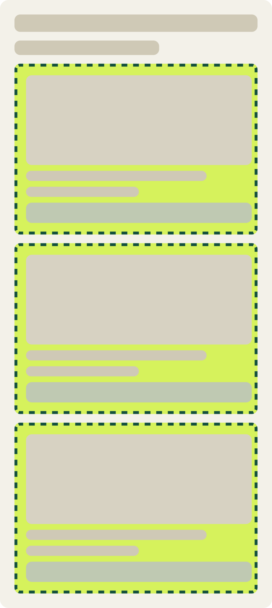
-9.4% conversion, -7.2% revenue per visitor
Read the full testBigger images looked better in the design file. In practice, 1 product per row doubled the scrolling, and shoppers saw half as many options per screen. On mobile, comparing options quickly mattered more than seeing each 1 larger.
Desktop shoppers preferred 4 products per row by 6.3%
On desktop, a different store tested 5 products per row instead of 4, along with a shorter hero image and a tighter toolbar. Shoppers preferred the 4-across original, which measured 6.3% higher in conversion and 10.7% higher in revenue per visitor. More products per row made each image smaller, and shoppers could no longer judge the products from the grid.
Because the hero and toolbar changed in the same test, the result tells us the package lost, not the column count alone. Together with the mobile test, it still points the same way: show enough products to compare, but keep each 1 large enough to judge.
Desktop shoppers preferred a button on every product card by 13.0%, but revenue told another story
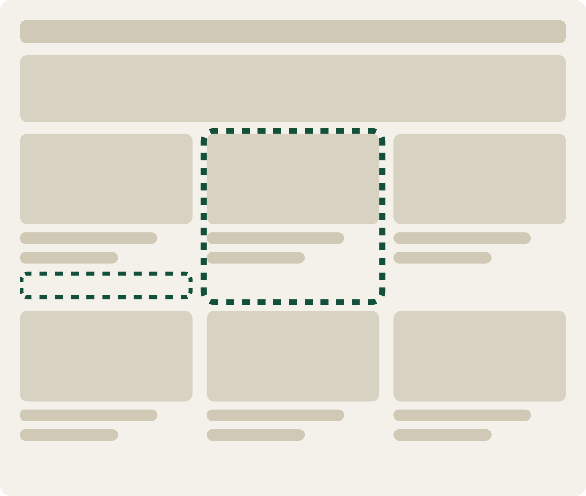
Every product card on 1 store’s category page had its own add to cart button. We tested removing it, so shoppers would click through to the product page first, and on desktop we also tried a hover outline instead. Desktop shoppers preferred the button on every card: conversion measured 13.0% higher with it over 16 days.
Revenue per visitor went the other way. It rose 14.2% without the button, so the shoppers who clicked through to product pages spent more. Conversion was this test’s primary metric, so it was called a loss. On a store that judges tests on revenue per visitor, the same data could have ended in a different call, which is why we decide the metric before a test starts.
Evidence · Collection page · Lost
Does removing the product card button lift collection page sales?
16 days · desktop · We removed the add to cart button from each product card.
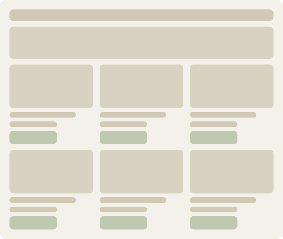
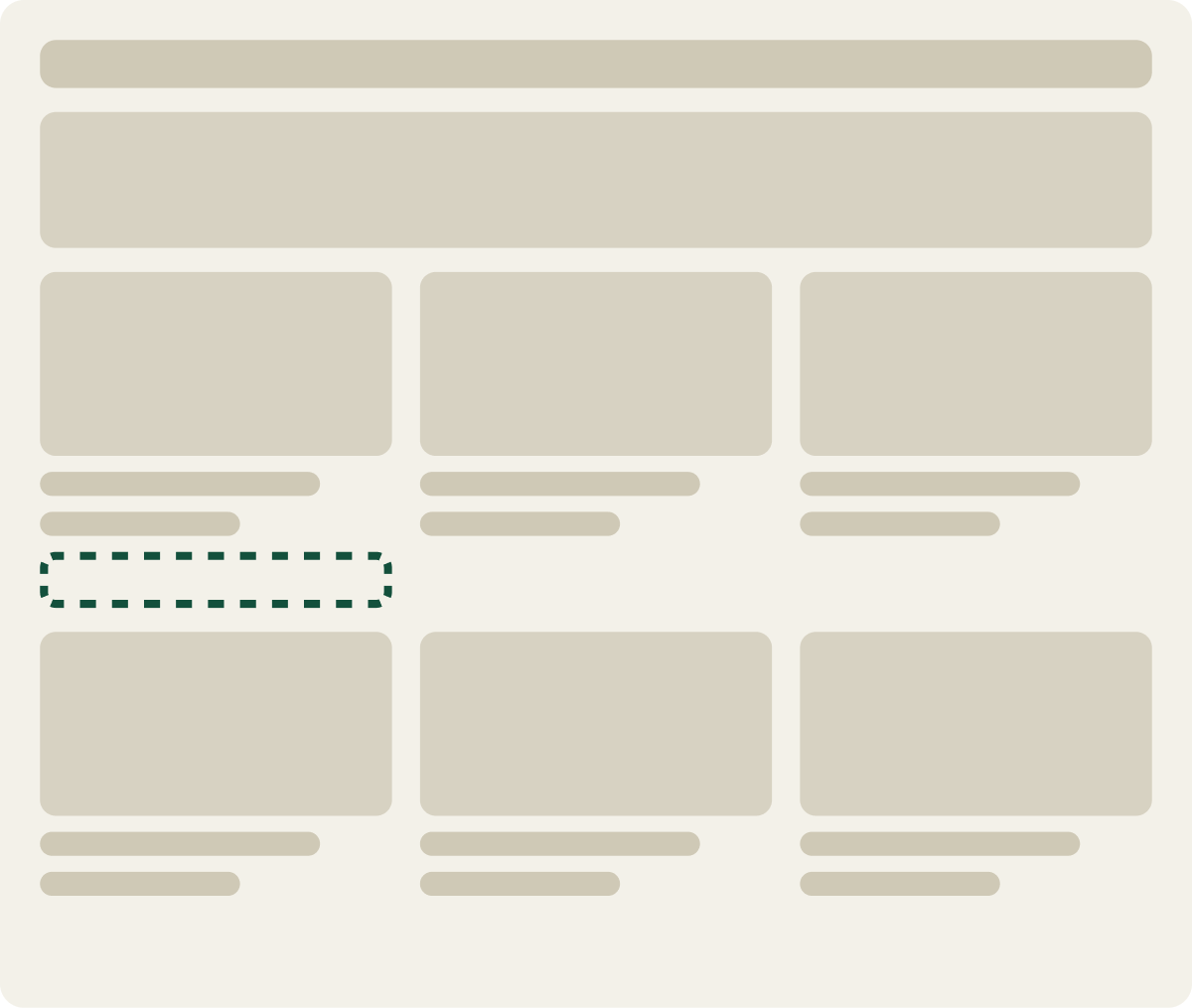
-13.0% conversion, +14.2% revenue per visitor
Read the full testFor products shoppers already know, such as reorders, refills and simple items, the product page is an extra step. A button on the card lets them buy from the grid. If your catalog is mostly first-time, considered purchases, the product page matters more, and a “View product” button may fit better. The color of that card button matters too, and we cover it in What is the best CTA button color?
A back to top button lifted mobile conversion 15.4%
Long mobile category pages give shoppers no quick way back to the filters and menu. We added a back to top button, together with changes that had already won in earlier tests on the same pages. Conversion rose 15.4% over 19 days. The earlier changes ran in the same variation, so the button did not do this alone, but it made a long page easier to use without getting in the way.
Category pages are for comparing, not admiring
Across the grid tests I have run, the versions that let shoppers see more products at a usable size won, and the versions that made each product bigger or hid the next step lost. A category page is a comparison tool first.
4 things to check on your category pages today
- The menu on mid-size screens. Load your category page at 1024 pixels wide. If categories hide behind an icon, test showing them.
- Products per row. 2 on mobile and 4 on desktop held up in our tests. Start there before you try bigger or smaller grids.
- A way to buy from the card when shoppers already know the product.
- A way back up on long mobile pages.
Then test the fix that matches your biggest drop-off. What is ecommerce conversion rate optimization? covers how to find it. If you want it researched and tested for you, that is what our ecommerce conversion rate optimization program does.
Shoppers come to a category page to compare. Every change should make comparing faster.
In a study of 179 participants across 6 sites, hiding global navigation made the experience worse on both desktop and mobile. Sites that combined visible and hidden navigation did best.
Kara Pernice and Raluca Budiu 2016 · www.nngroup.com ↗
Our breakpoint test shows the cost in sales: showing the full menu to mid-size screens lifted conversion 43.3%.
Frequently asked questions
What is an ecommerce category page?
A page that groups related products or subcategories so shoppers can narrow down what they want. It sits between the homepage and the product page.
What is the difference between a category page, a product listing page and a collection page?
A category page shows the subcategories in a department. A product listing page shows the products themselves, with filters and sorting. Collection page is Shopify's name for a product listing page. Many stores combine them on 1 page.
How many products per row should a category page show?
In our tests, mobile shoppers preferred 2 products per row over 1, and desktop shoppers preferred 4 over 5. Test on your own catalog, but those are good starting points.
Should category pages include descriptive content?
A short description can help shoppers and search engines understand the category. Keep it short enough that the first row of products still shows without scrolling.
What are the most common category page design mistakes?
Hiding the menu on mid-size screens, making grid images too small or too large to compare, and removing quick ways to buy or get back to the top.
The evidence
The 3 tests this article leans on
Evidence · Collection page · Won
Does a lower navigation breakpoint lift collection page conversion?
+43.3% conversion, +35.3% revenue per visitor
Read the full testEvidence · Collection page · Lost
-9.4% conversion, -7.2% revenue per visitor
Read the full testEvidence · Collection page · Lost
Does removing the product card button lift collection page sales?
-13.0% conversion, +14.2% revenue per visitor
Read the full test