
Articles / Product Pages and Offers
What makes an add to cart button convert?
What we found
A button that stands out from the rest of the page, says plainly what it does and stays in reach lifts sales. In our tests that meant +13.9% for a high-contrast button with the price inside, and +7.0% for a simple sticky bar on mobile.
An add to cart button converts when shoppers can find it without searching, understand it without thinking, and still reach it after they scroll. In our A/B tests, a button that stood out from the page with the price inside it lifted conversion 13.9%. A simple sticky bar on mobile lifted conversion 7.0%. The change that did not help pushed shoppers toward checkout faster than they wanted to go.
Below are the tests behind each point, what shoppers preferred when a test lost, and a short list of what to test first on your own product page.
A button that stood out, with the price inside, lifted conversion 13.9%
On a desktop product page, the add to cart button blended into the page around it. We made it yellow, a color nothing else on the page used, and put the price inside the button. Conversion rose 13.9% and revenue per visitor rose 16.9%.
Evidence · Product page · Won
Does a yellow add to cart button with price inside lift sales?
24 days · desktop · We made the add to cart button yellow and put the price inside it.
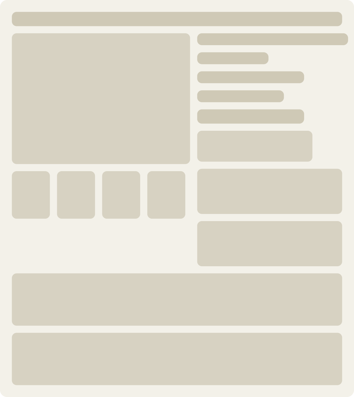
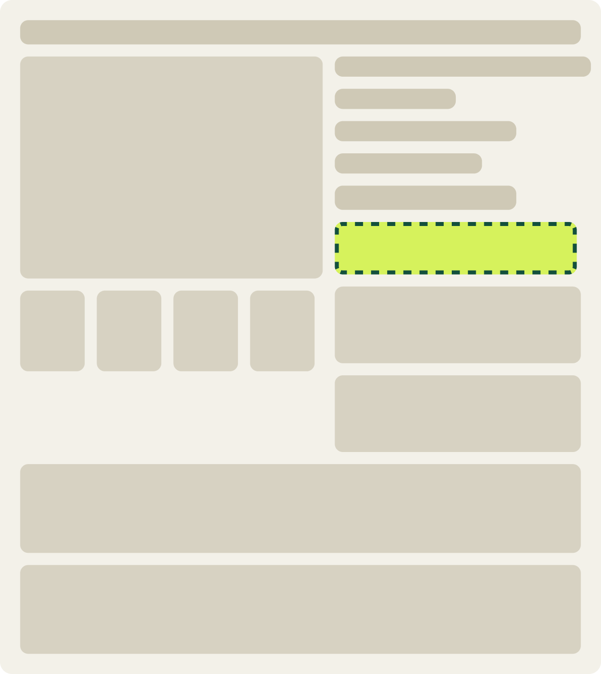
+13.9% conversion, +16.9% revenue per visitor
Read the full testThe color itself was not the point. Yellow worked because it was the only yellow on the page, so the eye went straight to it. The price inside the button answered the last question a shopper asks before clicking: what will this cost me?
If your button shares its color with your logo, your sale badges and your header, it is competing with all of them. Pick a color the rest of the page does not use, and save it for the 1 action you most want taken. We cover how to choose that color in What is the best CTA button color?
“Add to Cart” beat “Select Delivery Date” by 8.0%
One store’s product page button said “Select Delivery Date.” It made sense to the business, since every order needed a date. To shoppers it read like a form, not a purchase. We tested “Add to Cart,” with and without a delivery date field beside the button. “Add to Cart” with the date field won, lifting conversion 8.0%.
Shoppers did not mind giving a date. They minded not knowing what the button would do. Use the words shoppers expect on the main button, and put any extra step next to it, not in its label.
A simple sticky add to cart bar lifted mobile conversion 7.0%
On mobile, the add to cart button scrolls out of view as soon as shoppers start reading the description, the reviews or the size guide. To buy, they have to scroll back up. We tested 2 sticky add to cart bars that appeared once the main button left the screen. The simpler bar lifted conversion 7.0% and revenue per visitor 12.0% over 15 days.
Evidence · Product page · Won
Does a sticky add to cart bar lift mobile product page sales?
15 days · mobile · We added a sticky add to cart bar once the main button left the screen.



+7.0% conversion, +12.0% revenue per visitor
Read the full testA sticky bar is not an automatic win. On another store, a sticky bar ran for 18 days and moved conversion only 0.6%, too little to call. Long mobile pages, where shoppers read a lot before deciding, gain the most. Short pages, where the button rarely leaves the screen, gain little.
“Buy now” beat “shop now” by 59.3%, but 2 things changed at once
A product page used “shop now” on its button, with a second “shop now” link in the header. We tested a direct “buy now” button and removed the header link. Conversion rose 59.3%.
That is a big number with a caveat. The test changed the wording and removed a competing link in the same variation, so we cannot say how much came from each. What it does show is that 2 calls to action with the same words, pointing to different places, made shoppers hesitate.
A louder buy now button did not beat a balanced pair on desktop
Another desktop product page showed both an add to cart button and a buy now button. We tested giving buy now more visual weight while keeping add to cart on the page. The louder buy now version measured 5.3% lower in conversion and 5.9% lower in revenue per visitor after 9 days. That had not reached our confidence bar, and we paused it.
Evidence · Product page · Not significant
Does a stronger buy now button lift desktop product page sales?
9 days · desktop · We gave the buy now button more focus and kept add to cart.
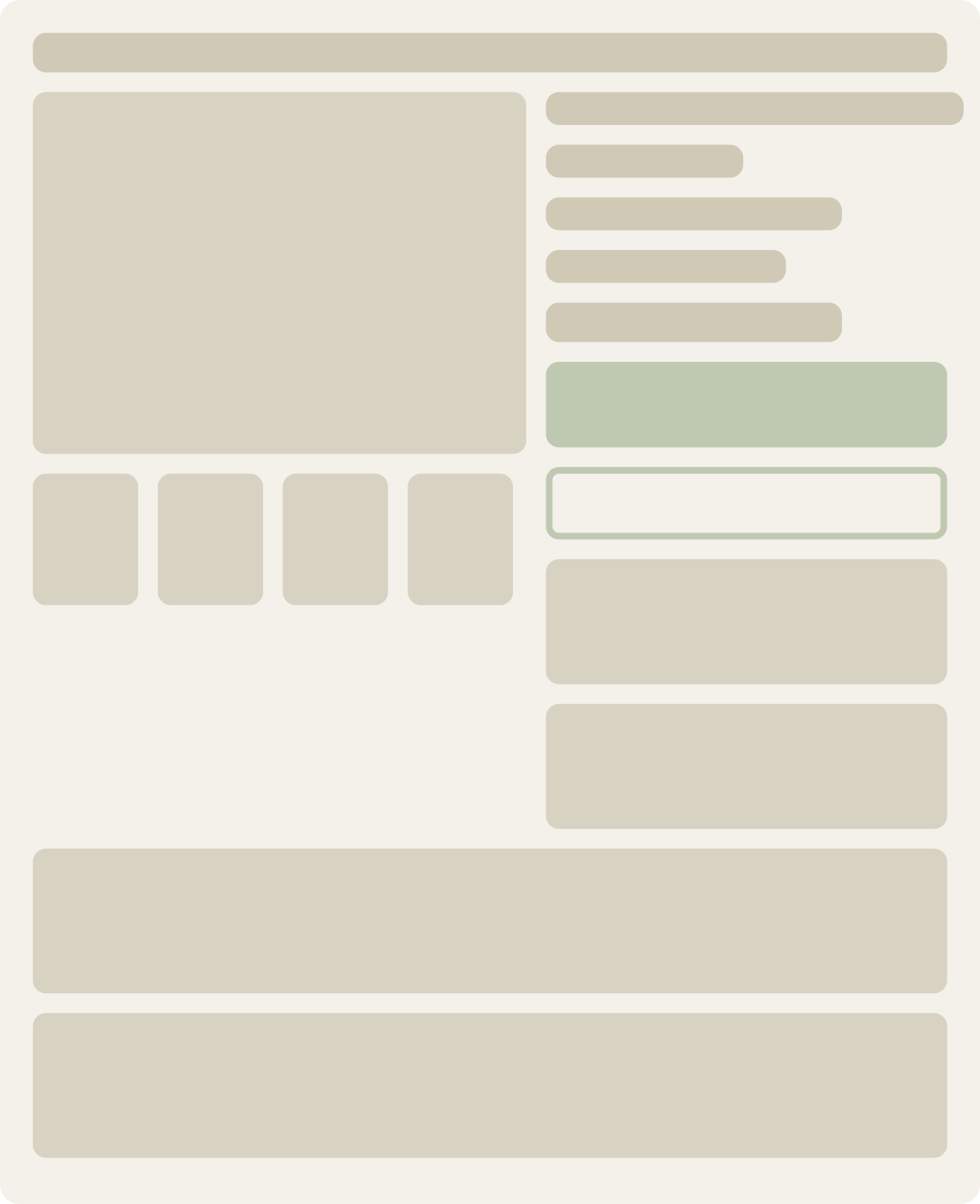
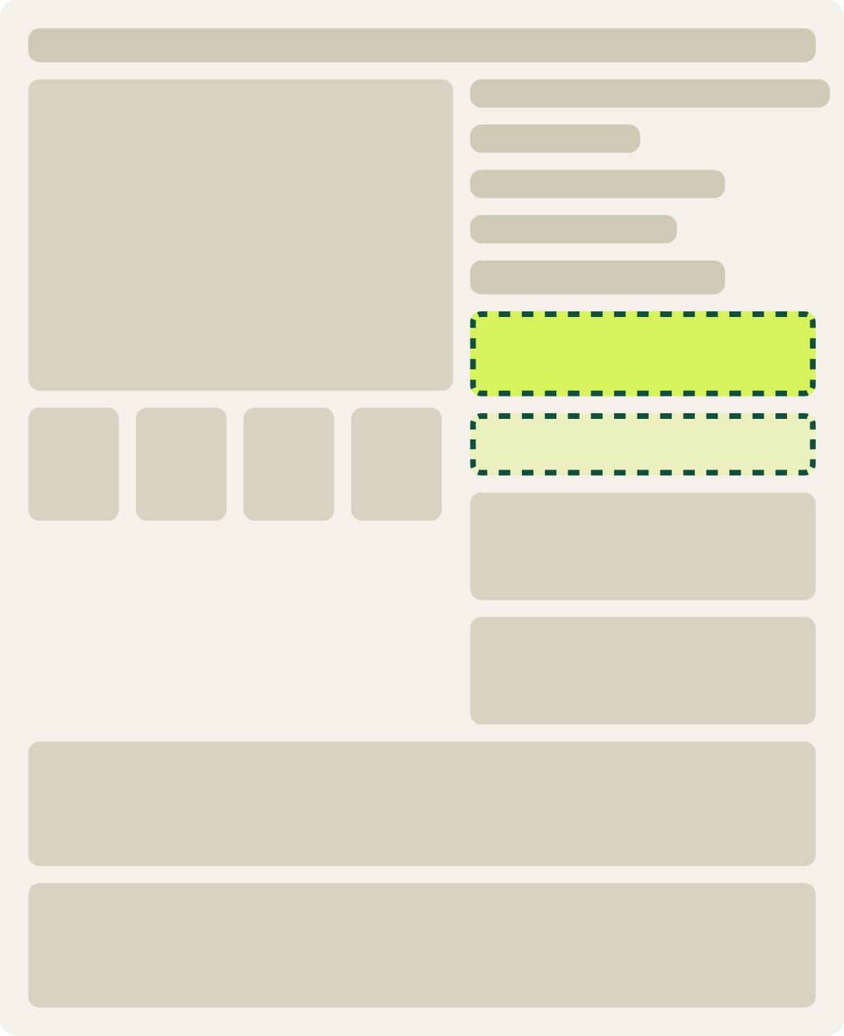
-5.3% conversion, -5.9% revenue per visitor
Read the full testDesktop shoppers often add more than 1 item, compare, and check out later. A button that pushes them straight to checkout skips the way they like to shop. Before you emphasize buy now, check how many of your desktop orders hold more than 1 item.
Contrast and plain wording carry the button
Across the button tests I have run, the winner is the button that stands out from everything around it and says plainly what happens next. The color name does not matter. What matters is that nothing else on the page looks like it.
4 things to test first on your add to cart button
- Contrast. Give the button a color nothing else on the page uses, and check it against the background with a contrast checker.
- Wording. Say what happens when shoppers click. “Add to Cart” beats a clever label.
- Price. Put the price in or right next to the button, so the answer sits where the decision happens.
- Reach on mobile. If shoppers scroll far down your product page, test a simple sticky bar.
Start with the product pages that get the most traffic, and give each test at least 2 full weeks before you call it. If you want the research and testing done for you, that is what our ecommerce conversion rate optimization program does. For the rest of the product page, see Shopify conversion rate optimization: what our tests show.
Shoppers click the button they can find, read and reach.
Baymard found 48% of ecommerce sites miss at least 1 of the elements that make a primary button stand out, and that shoppers rely on a button's color and position more than its label.
Christian Holst 2021 · baymard.com ↗
Our tests agree: the add to cart wins came from making the button the only thing in its color, and making a second button just as loud did not help.
Frequently asked questions
What color should an add to cart button be?
A color nothing else on the page uses, with strong contrast against the background. In our tests a yellow button won because it was the only yellow on the page, not because yellow is special.
Add to cart vs buy now: which converts better?
It depends on how people shop your store. On a desktop page where shoppers often bought several items, a louder buy now button did not beat the balanced pair. Where a page had 2 competing "shop now" links, a single "buy now" button won.
Where should the add to cart button go on a product page?
Next to the price and the option picker, where shoppers make the decision. On mobile, where the button scrolls away, a simple sticky bar can keep it in reach.
Does a sticky add to cart button increase conversions?
Sometimes. A simple sticky bar lifted mobile conversion 7.0% in 1 of our tests and moved it only 0.6% in another. It helps most on long pages where shoppers read before buying.
Should the price go on the add to cart button?
It is worth testing. Putting the price inside the button was part of a 13.9% conversion lift in our testing, because it answers the cost question right where shoppers decide.
The evidence
The 3 tests this article leans on
Evidence · Product page · Won
Does a yellow add to cart button with price inside lift sales?
+13.9% conversion, +16.9% revenue per visitor
Read the full testEvidence · Product page · Won
Does a sticky add to cart bar lift mobile product page sales?
+7.0% conversion, +12.0% revenue per visitor
Read the full testEvidence · Product page · Not significant
Does a stronger buy now button lift desktop product page sales?
-5.3% conversion, -5.9% revenue per visitor
Read the full test