
Articles / Mobile and UX Design
Micro interactions: which ones lift conversion?
What we found
Micro interactions that show progress helped. A progress bar with a percentage lifted completions 25.7%. Ones that added pressure or hid content lost: a desktop checkout timer cut conversion 8.7%.
A micro interaction is a small moment of feedback: a progress bar that fills, a button that confirms, a timer that counts down. Each is tiny. But it sits right where a shopper is deciding, so it can move conversion more than its size suggests.
A microinteraction is a trigger paired with feedback; they help most when they show system status or prevent errors; effects should be subtle, short and always serve a purpose.
Alita Kendrick 2018 · www.nngroup.com ↗
The micro interaction that won in our tests showed progress; the ones that lost added pressure or moved content out of the way.
Here are 3 of our tests: 1 micro interaction that won and 2 that visitors rejected.
A progress bar with a percentage lifted completions 25.7%
A multi-step form marked progress with small stepping stones. We tested 3 new progress displays. A progress bar showing the percentage complete won, lifting conversion 25.7% over 37 days.
Evidence · Lead form · Won
Does a progress bar with a percentage lift lead form completion?
37 days · responsive · We tested 3 new ways to show progress through the form.


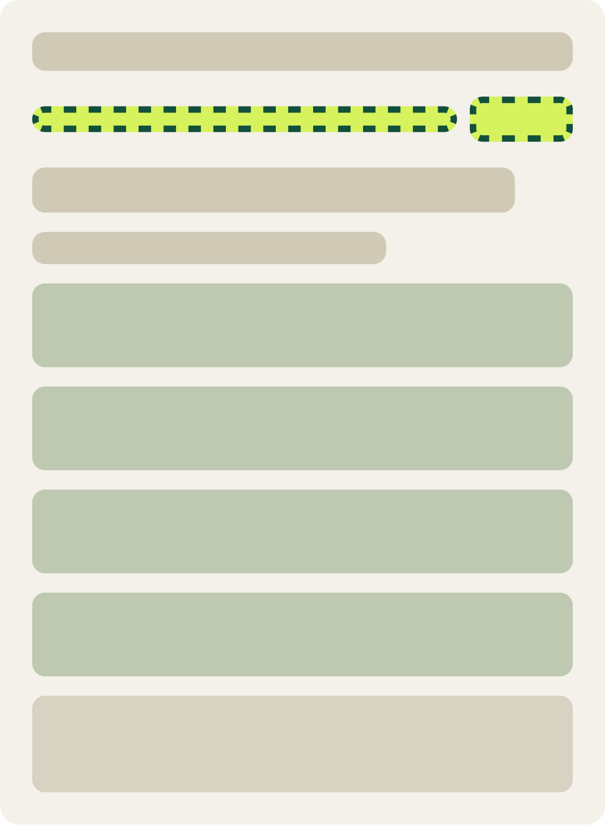

+25.7% conversion
Read the full testA percentage answers the question every multi-step flow raises: how much is left? The same idea applies to a checkout with several steps.
Visitors preferred product details on the page, not in a modal
Shoppers who read product details ended up far below the add to cart button. We tested showing the details in a modal, and a back to top button. Visitors preferred the original page: conversion fell 4.4% and revenue per visitor 8.7% over 17 days.
Evidence · Product page · Lost
Does a details modal or back to top button help product pages?
17 days · responsive · We tested a details modal and a back to top button on product pages.



-4.4% conversion, -8.7% revenue per visitor
Read the full testA modal hides content behind a click. Shoppers reading details are often close to deciding. Making them open and close a window likely added a step at the wrong time.
Visitors preferred desktop checkout without a countdown timer
Desktop checkout gave shoppers no reason to finish now. We added a subtle 15 minute countdown timer. Visitors preferred checkout without it: conversion fell 8.7% and revenue per visitor 17.1% over 14 days.
Evidence · Checkout · Lost
Does a checkout countdown timer lift desktop conversion?
14 days · desktop · We added a subtle 15 minute countdown timer to desktop checkout.
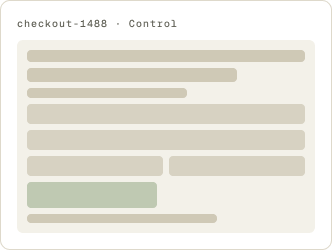
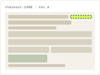
-8.7% conversion, -17.1% revenue per visitor
Read the full testA cart timer is not always wrong. On a different store’s mobile checkout, a timer showing how long the cart was held lifted conversion 8.0%. That test is in How to increase ecommerce conversion rate: 10 tips from our A/B tests. Same idea, different device and store, opposite result.
A losing test still tells you what shoppers notice.
When a small detail moves the number a lot in either direction, it matters to shoppers. The next test takes it in 2 different directions.
Which micro interactions to try first
- Progress indicators in any flow with more than 1 step.
- Clear confirmation when a shopper adds to cart or applies a code.
- Inline help only where testers actually got stuck.
- Timers and pressure cues only with a real reason behind them, and test them on each device.
A comprehensive website audit is a good way to find where small feedback would help. For the bigger picture, see Ecommerce UX best practices: what our A/B tests show.
A good micro interaction answers a question. A bad one adds a new one.
Frequently asked questions
What are micro interactions?
Small moments of feedback in an interface, like a progress bar filling or a button confirming an action.
Do micro interactions improve conversion?
Some do. A progress bar with a percentage lifted completions 25.7% in our test, while a checkout timer cut conversion 8.7%.
What are examples of micro interactions in ecommerce?
Add to cart confirmations, progress bars in checkout, quantity steppers, hover previews and saved cart timers.
Do countdown timers work at checkout?
It depends. A mobile cart timer lifted conversion 8.0% in 1 of our tests, but a desktop checkout timer cut it 8.7% in another.
How do I test micro interactions?
A/B test 1 at a time on the page where it appears, and track revenue per visitor as well as conversion.
The evidence
The 3 tests this article leans on
Evidence · Lead form · Won
Does a progress bar with a percentage lift lead form completion?
+25.7% conversion
Read the full testEvidence · Product page · Lost
Does a details modal or back to top button help product pages?
-4.4% conversion, -8.7% revenue per visitor
Read the full testEvidence · Checkout · Lost
-8.7% conversion, -17.1% revenue per visitor
Read the full test