
Test archive / Collection page
Do price filter buttons lift collection page conversion?
Shoppers had to open the filter menu to narrow a collection by price. We added price range buttons to collection pages. Conversion rose 16.8% and revenue per visitor 16.7% over 37 days.
Won Responsive 37 days Called at 80%
The hypothesis
By adding quick price filter buttons to collection pages, we will help shoppers on a budget find products in their range faster, resulting in more add to cart clicks and higher revenue per visitor.
Many shoppers on this site plan a purchase around a set budget, and price is among the first things they check while browsing. Filtering by price took several taps in the full filter menu.
We wanted a faster way in: 1 tap to see only the products in a shopper's range.
What we changed
We added price range buttons to collection pages.
Mobile showed 3 buttons: under $100, $100 to $200, and over $200. Desktop had room for 4: under $100, $100 to $200, $200 to $300, and over $300. Each button filtered the collection to that price range.
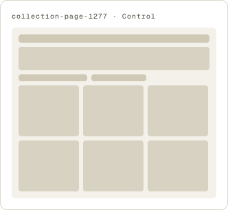
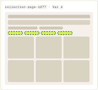
- 3 price buttons on mobile
- 4 price buttons on desktop
- Ranges in $100 steps
- Each button filters the collection
The result
Conversion rose 16.8% and revenue per visitor 16.7% over 37 days.
Conversion rose 16.8% and revenue per visitor 16.7%, so order value held about steady. More shoppers bought, at about the same spend.
Desktop drove most of the lift. The test ran 37 days to build enough orders on both devices, and we implemented the buttons on all devices.
What we took from it
A 1 tap price filter matched how these shoppers browse.
Shoppers here often start with a budget, not a product. The buttons let them see only what fit their range without opening the filter menu, so they spent less time on products they would not buy. Order value held steady, so the buttons did not push shoppers toward cheaper items.