
Test archive / Collection page
Does a single button per product card lift collection page conversion?
Each product card on the collection page had 2 buttons. We tested 1 "Shop now" button that led to the product page. On desktop, conversion fell 21.5% and revenue per visitor 20.0% over 12 days.
Lost Desktop 12 days Called at 90% Reviewed
The hypothesis
By giving each product card a single button that leads to the product page, we will make the next step clear and low commitment, resulting in more product page visits and higher revenue per visitor.
Each product card offered 2 buttons, which split the shopper's attention at the moment of choosing. A single button that promised more detail would feel informative, not like a commitment.
We expected more shoppers to click through to the product page, where they could learn more before buying.
What we changed
We replaced the 2 buttons on each product card with 1 Shop now button.
The variation replaced both buttons on every product card with a single "Shop now" button that took shoppers to the product page. The test ran on all devices, and we read desktop and mobile separately.
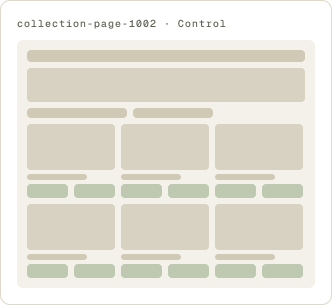
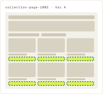
- 2 buttons replaced with 1 Shop now button
- Button goes to the product page
The result
On desktop, conversion fell 21.5% and revenue per visitor 20.0%.
Desktop lost by enough to pull the overall result down, so we paused it there after 12 days rather than let the loss grow.
Mobile moved the other way at first, so we sent the test to mobile only. With more mobile traffic, it did not reach our confidence bar, and we paused it.
What we took from it
Fewer choices on the card cost desktop orders.
On desktop, removing a button took away a path shoppers were using, and conversion and revenue both fell. On mobile, the single button looked promising early but did not hold. The page did better with both buttons in place.