
Test archive / Collection page
Do high contrast buttons or a reordered product card lift conversion?
Yellow buttons had already won on this site's homepage and product pages. We tested them on collection pages, along with a reordered product card. After 28 days, conversion was up 1.1% and the result was not conclusive.
Not significant Responsive 28 days Not called
The hypothesis
By making the collection page buttons high contrast, we will match the lift seen on the homepage and product pages, resulting in more engagement and conversions.
Yellow, bold buttons had won on this site's homepage and product pages, and the collection page was next in line.
We also tested a second idea on the same page: reordering the product card so the details shoppers use to choose came first.
What we changed
We tested yellow buttons and a reordered product card on collection pages.
Variation A changed the main button on each product card to yellow, with capitalized, bold text. Variation B kept the button as it was and reordered the card: title, price, reviews, then item number, with font sizes adjusted to match. Variation A was paused partway through the run.
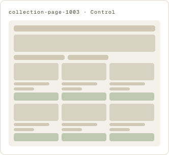
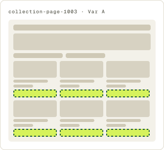
- Main card button changed to yellow
- Button text capitalized and bold
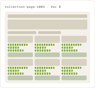
- Card order: title, price, reviews, item number
- Font sizes adjusted to the new order
The result
Conversion was up 1.1% and revenue per visitor down 3.6% after 28 days.
Results trended down early. After we moved the start date to cut out early noise, they improved week over week, then flattened out. Neither variation reached our confidence bar, and we paused the test after 28 days.
What we would do next
Keep yellow for the buttons that move shoppers to the next step.
Yellow buttons won on the homepage and product pages, where the button moves a shopper forward. On the collection page they made no clear difference. The next step is to use yellow on transitional buttons, such as add to cart, rather than on every button on the site.