
Test archive / Collection page
Does a row layout without the promo bar lift collection page sales?
Our mobile collection pages showed a product grid and the same promo in 2 places. We tested rows with less promo. Conversion moved -2.4% in 15 days, short of our confidence bar.
Not significant Mobile 15 days Not called Reviewed
The hypothesis
By combining a row layout for products with removing the repeated promo bar, we will make products easier to compare with less noise, resulting in more mobile orders from the collection page.
2 earlier collection page tests each showed a lift that did not reach our confidence bar. The first switched the product grid to a row layout so shoppers could compare items. The second removed a duplicate promo bar, since the same coupon code showed in more than 1 place.
We combined the 2 changes to see if together they would add up to a larger, clearer result.
What we changed
We combined a row product layout with removing the promo bar.
The control showed a product grid with a promo bar at the top and a promo banner partway down. Both variations switched the grid to rows and removed the promo bar. Var A kept the promo banner at the top of the list. Var B kept the promo banner partway down the list. The test ran on 2 collection pages, on mobile, and needed an active promo to run.

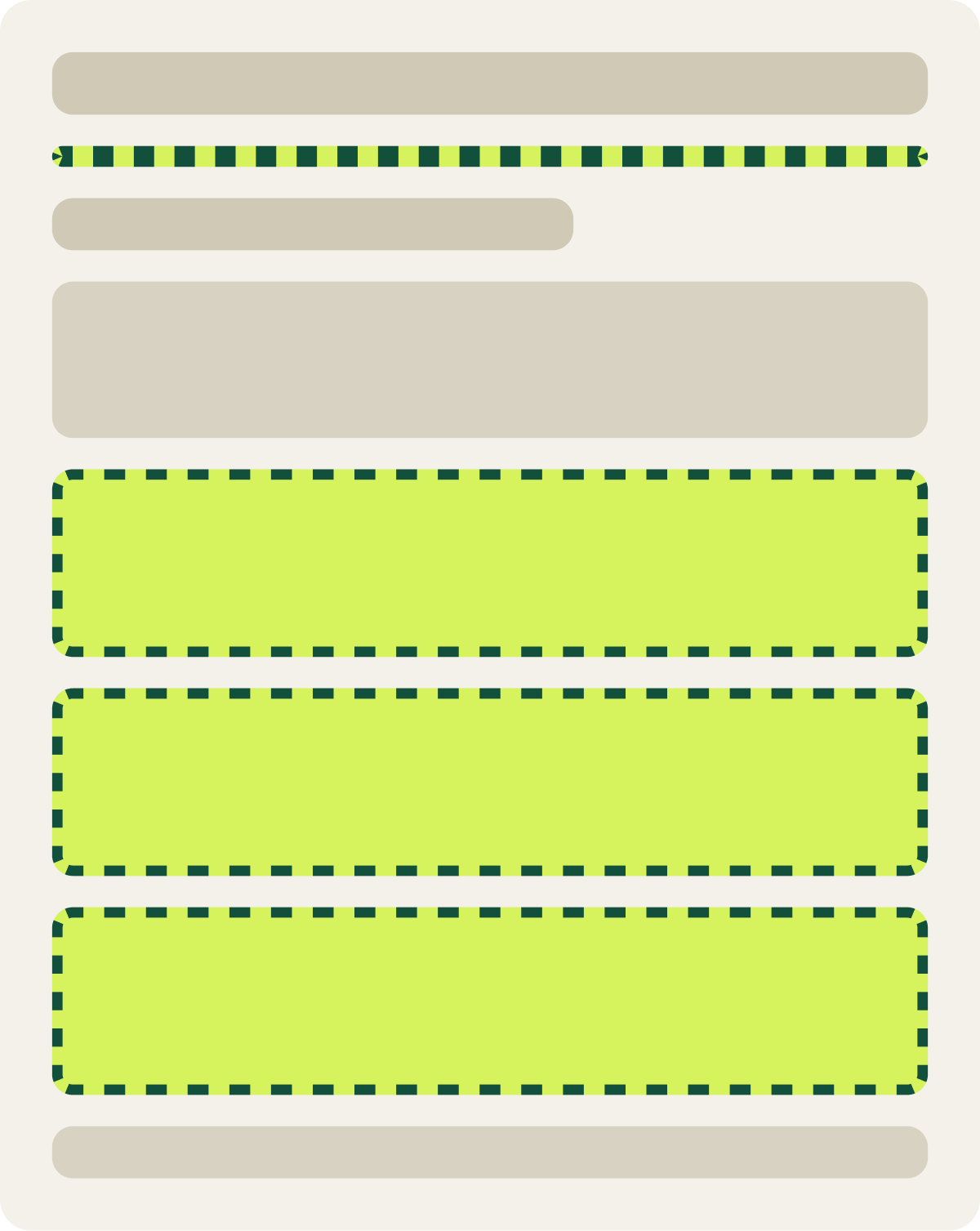
- Grid changed to a row layout
- Promo bar removed
- Promo banner kept at top of list
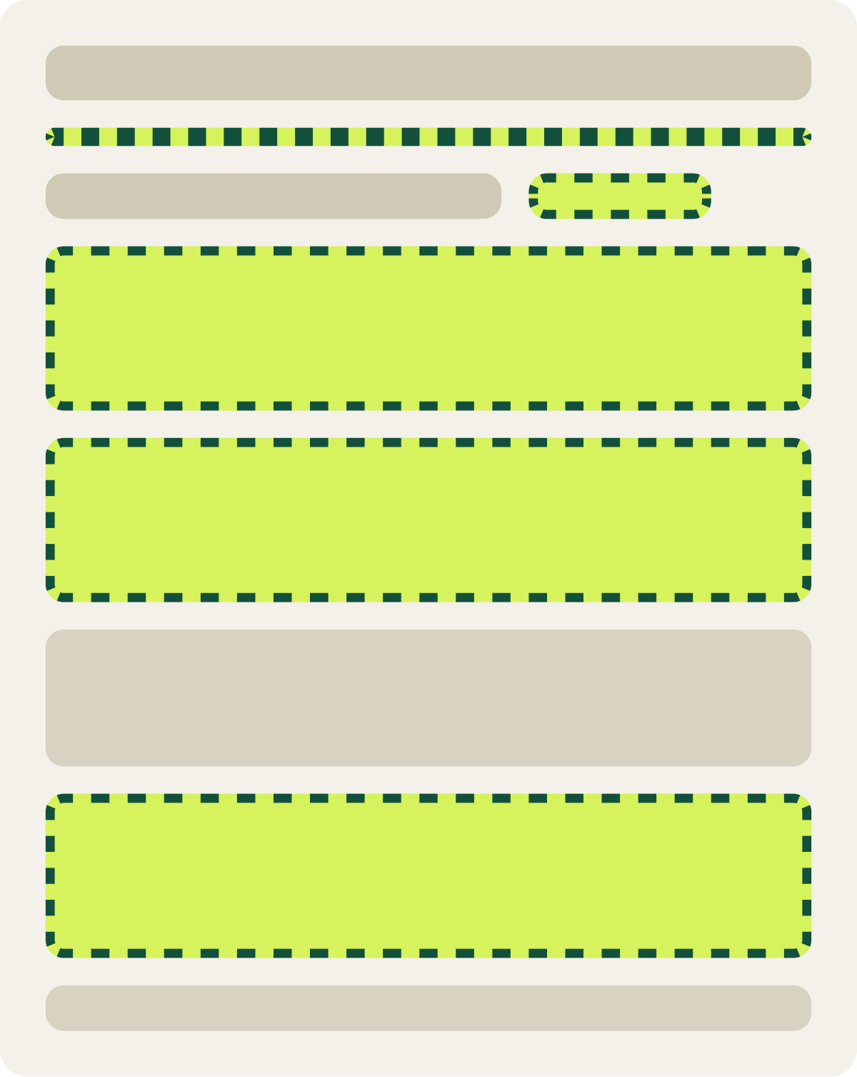
- Grid changed to a row layout
- Promo bar removed
- Promo banner kept partway down
The result
Conversion moved -2.4% in 15 days, not enough to call either way.
Conversion fell 2.4% and revenue per visitor rose 2.6%, and neither cleared our confidence bar. Average order value was up about 5%.
Combining the 2 earlier changes did not stack into a bigger lift. After a full run we paused the test and moved to the next idea: showing 1 product per row.
What we would do next
Try 1 product per row instead of the combined layout.
Each change looked promising alone, but together the result was flat. The row layout may help shoppers compare, while moving the promo changes how they find the deal, and the 2 may cancel out. Our next test isolated the layout further, with a single product per row.