
Does reducing visual contrast on a desktop product page lift sales?
Our desktop product page used bold type, strong colors and a busy header that competed with the purchase options. We tested a calmer, lower contrast version. Over 15 days, conversion fell 12.4% and revenue per visitor fell 18.4%.
Lost Desktop 15 days Called at 90%
The hypothesis
By reducing visual contrast on the product page and putting the focus on the purchase options, we will cut distraction, resulting in more purchases.
A prominent header, bold labels and colorful social links pulled the eye away from choosing a product and adding it to the cart. We expected a quieter page to keep shoppers focused on buying.
What we changed
A lower contrast page with a restyled product selector
Var A restyled the product selector for clarity, made the header less prominent, moved the promotion, and muted the social share links. The bold product copy from the original stayed in place.

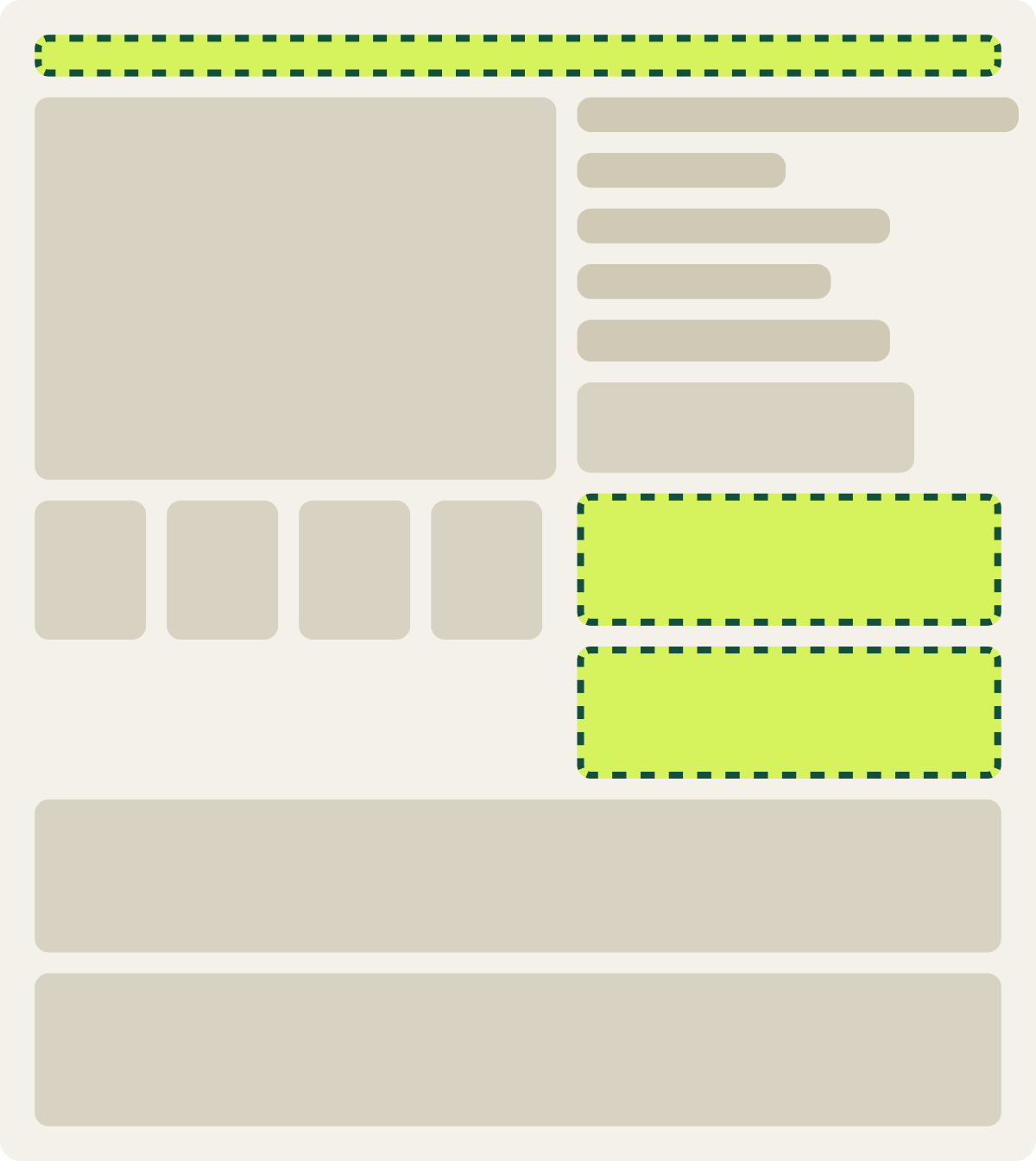
- Product selector restyled for clarity
- Header made less prominent
- Promotion moved
- Social share links muted
The result
Conversion fell 12.4% with the lower contrast page
Over 15 days, the lower contrast page converted 12.4% worse than the original, and revenue per visitor was 18.4% lower. The loss cleared our confidence bar, and a mobile test with a similar selector change also lost, so we paused it.
What we took from it
Users preferred the original, higher contrast product page
The restyled selector grayed out options in a way that may have confused shoppers, the same pattern we saw on mobile. Muting the page also took emphasis away from the choices shoppers needed to make.
Read next
Where this test fits
What belongs above the fold on a product detail page?
The first screen of a product detail page has 3 jobs. 3 A/B tests on price placement, gallery size and info order show what…
Read the article →Conversion Rate Optimization
We research, build and run product page tests like this one inside your team.
See the service →