
Does less visual noise lift product page conversion?
The product page had several elements competing with the buy button. We moved the stars, removed the availability line and toned down the selector and subscription copy. Conversion rose 5.8% over 14 days, short of our confidence bar.
Not significant Responsive 14 days Not called Reviewed
The hypothesis
By reducing visual noise on the product page, we will draw more focus to the call to action, resulting in more shoppers moving to purchase.
Stars, an availability line, a bold option selector and long subscription copy all sat near the add to cart button. Each pulled the eye away from the action we wanted shoppers to take.
We kept every element shoppers needed and made the rest quieter.
What we changed
We cut visual noise around the add to cart button.
The variation moved the star rating below the product title and removed the availability line. It toned down the option selector, shortened the subscription copy, put the plan in a box and rounded the buttons. The test ran on all devices.

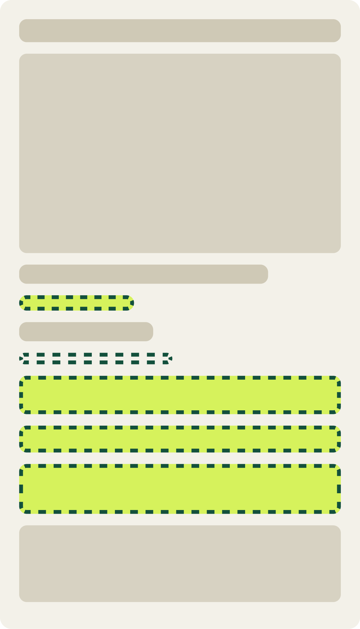
- Stars moved below the product title
- Availability line removed
- Option selector toned down
- Subscription copy shortened, plan boxed
- Buttons rounded
The result
Conversion rose 5.8% and revenue per visitor 5.3% over 14 days.
The cleaner page trended up from the first week. Conversion rose 5.8% and revenue per visitor 5.3%, but the gap was not large enough to reach our confidence bar, so we paused it after 14 days.
The next test kept this version and made the stars orange. That follow-up won.
What we would do next
Build on the cleaner page with a bolder change.
The direction was right but the effect was small. Keeping the cleanup and adding 1 stronger cue gave the next test a better chance to move shoppers. That follow-up, with orange stars, lifted conversion enough to call.