
Does an app like layout lift lead form conversion?
Our tax relief lead form sat on a busy page background with answer buttons. We removed the background, switched buttons to dropdowns and added white space so the form stood alone. Conversion rose 12.7% over 13 days.
Won Responsive 13 days Called at 90%
The hypothesis
By removing the background and other distractions around the lead form, we will cut the effort of each step, resulting in more visitors finishing the funnel.
Competing tax relief funnels kept the form front and center with little around it. Ours placed the form on a full page background, which pulled attention away from the questions.
We wanted each step to feel like a simple app screen, where the only thing to do is answer.
What we changed
We removed the background and focused the page on the form.
The variation removed the page background so the form felt like an app screen. Answer buttons became dropdowns, and we added white space around each question to reduce distraction and help visitors focus on the form.

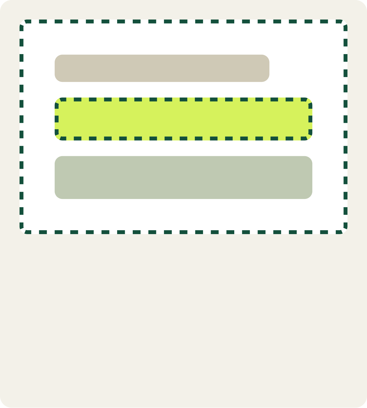
- Removed the page background
- Answer buttons changed to dropdowns
- More white space around the form
The result
Conversion rose 12.7% over 13 days with the focused form.
The focused layout beat the control over 13 days. We called it a win and updated the live funnel with the variation.
What we took from it
Less around the form meant more visitors finished it.
With the background gone, each step showed only the question and its answers. That made the form quicker to scan and answer on this funnel, and it became the starting point for later redesigns of our other tax relief forms.