
Does 1 consistent design across the funnel lift form conversion?
Our desktop registration form and checkout used 2 different visual styles. We tested restyling both to share 1 consistent look. Conversion rose 22.7% in 8 days but did not reach our confidence bar.
Not significant Desktop 8 days Not called
The hypothesis
By giving the form page and the checkout 1 consistent design, we will remove the jolt between pages, resulting in more people finishing their renewal.
Earlier redesigns of single pages in this funnel did not perform as expected. Our read was that each new page looked different from the next, and that change caused people to drop off between steps.
A previous test that gave the form a clear line from the first question to the button pulled more people into the funnel. This test carried that same layout through to checkout.
What we changed
We restyled the form page and checkout to share 1 design.
The control kept the existing form page and checkout, which looked different from each other. The variation rebuilt the form page with a clear line from the first question down to the button, then styled the checkout to match it, so both pages used the same fields, spacing and button style.

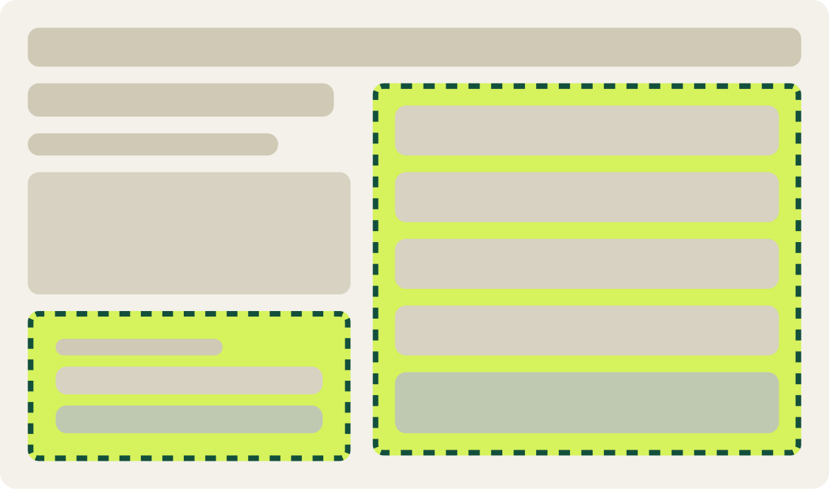
- Form page rebuilt with a clear line to the button
- Checkout restyled to match the form page
- Same field and button style on both pages
The result
1 consistent funnel design lifted conversion 22.7% in 8 days.
Conversion was 22.7% higher than the control after 8 days, but the result had not reached our confidence bar. We stopped early on purpose: with 2 pages changed at once, we could not tell which page drove the gain.
We paused it and set up a test of the restyled form page on its own.
What we would do next
Test the restyled first page alone to see if the lift holds.
A change that spans the whole funnel makes it hard to know which page did the work. The next step is to keep the old checkout and test only the restyled form page, so any gain can be traced to 1 place before we commit to rebuilding both.