
Do clearer service tiles lift mobile registration form conversion?
Our mobile registration page showed vehicle service tiles that looked like buttons. We redrew them to read as information and added a link that jumps to the form. Conversion fell 2.2% over 15 days, so we paused it.
Lost Mobile 15 days Called at 90%
The hypothesis
By redrawing the service tiles so they read as information and adding a jump link to the form, we will reduce confusion, resulting in more visitors completing the form.
The registration page used tiles to show the types of vehicles we handle. They looked a lot like buttons, so visitors could mistake them for the place to start.
We expected tiles that clearly read as information, plus a link that takes visitors straight to the form, to cut that confusion and move the form higher on the page.
What we changed
We redrew the service tiles as information and added a jump link to the form.
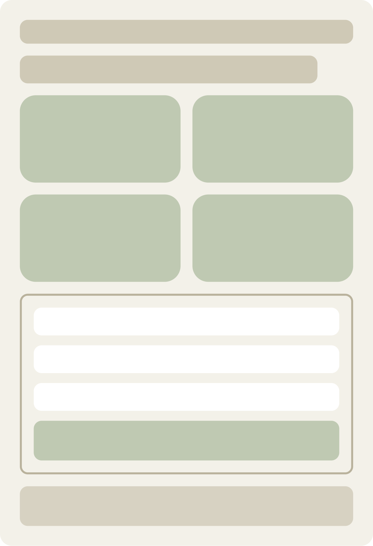
The control showed a set of vehicle tiles styled like buttons. The variation redrew them in a smaller, flatter style that read as a list of services, so the form sat higher, and added an anchor link that jumps visitors down to the form. The form itself did not change.
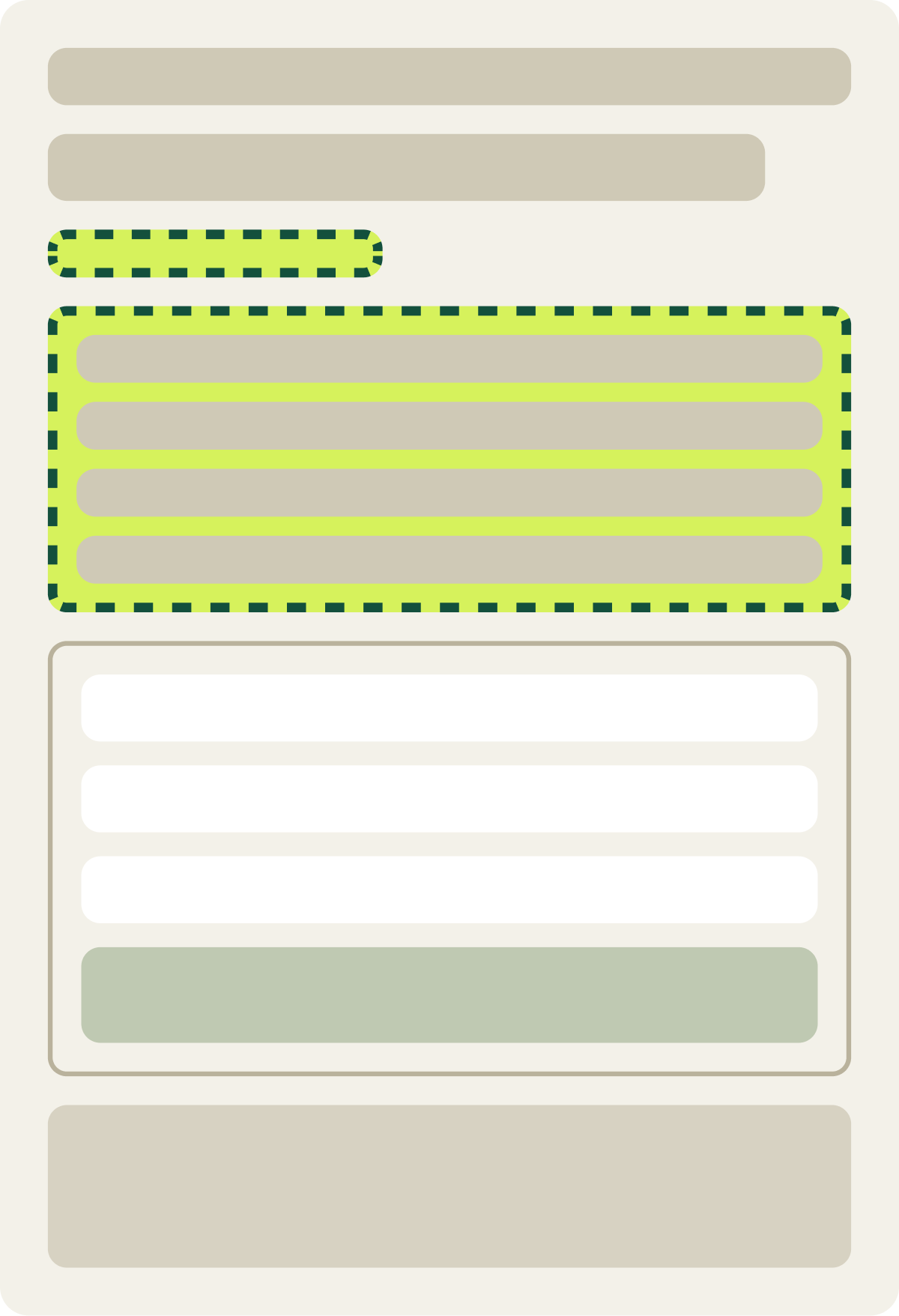
- Tiles redrawn to read as information
- Smaller tiles so the form sits higher
- Anchor link added that jumps to the form
The result
The new tiles cut mobile conversion by 2.2% in 15 days.
Conversion was 2.2% lower than the control over 15 days. Revenue moved by the same amount, since every order is the same price.
We paused the test and moved mobile traffic to the next round of tests on this page.
What we took from it
The tiles were not the confusion point we expected.
If the tiles had been stopping visitors, a clearer design and a direct path to the form should have helped. Conversion went the other way, which suggests visitors were not getting stuck on the tiles. The original tiles may also have helped visitors check that the service covered their vehicle before they started.