
Test archive / Collection page
Do bordered product cards lift collection page conversion?
Products on the collection page ran together with no clear edges. We added borders, a Most popular callout and a desktop hover state. Conversion rose 8.2% and revenue per visitor 8.0% over 12 days.
Won Responsive 12 days Called at 90% Reviewed
The hypothesis
By adding clear visual separation between products, we will make each product easier to read, resulting in more confident choices and a higher conversion rate.
The collection grid had no borders between products, so images, names and prices blended together. Shoppers had to work to see where each product ended and the next began.
The first run of this test was cut short by a testing tool issue, so we relaunched it with clean targeting.
What we changed
We added borders, a Most popular callout and a hover state to cards.
The variation put a border around each product card. The first product got a green Most popular callout with a green border. On desktop, cards gained a hover state. The rest of the page stayed the same.

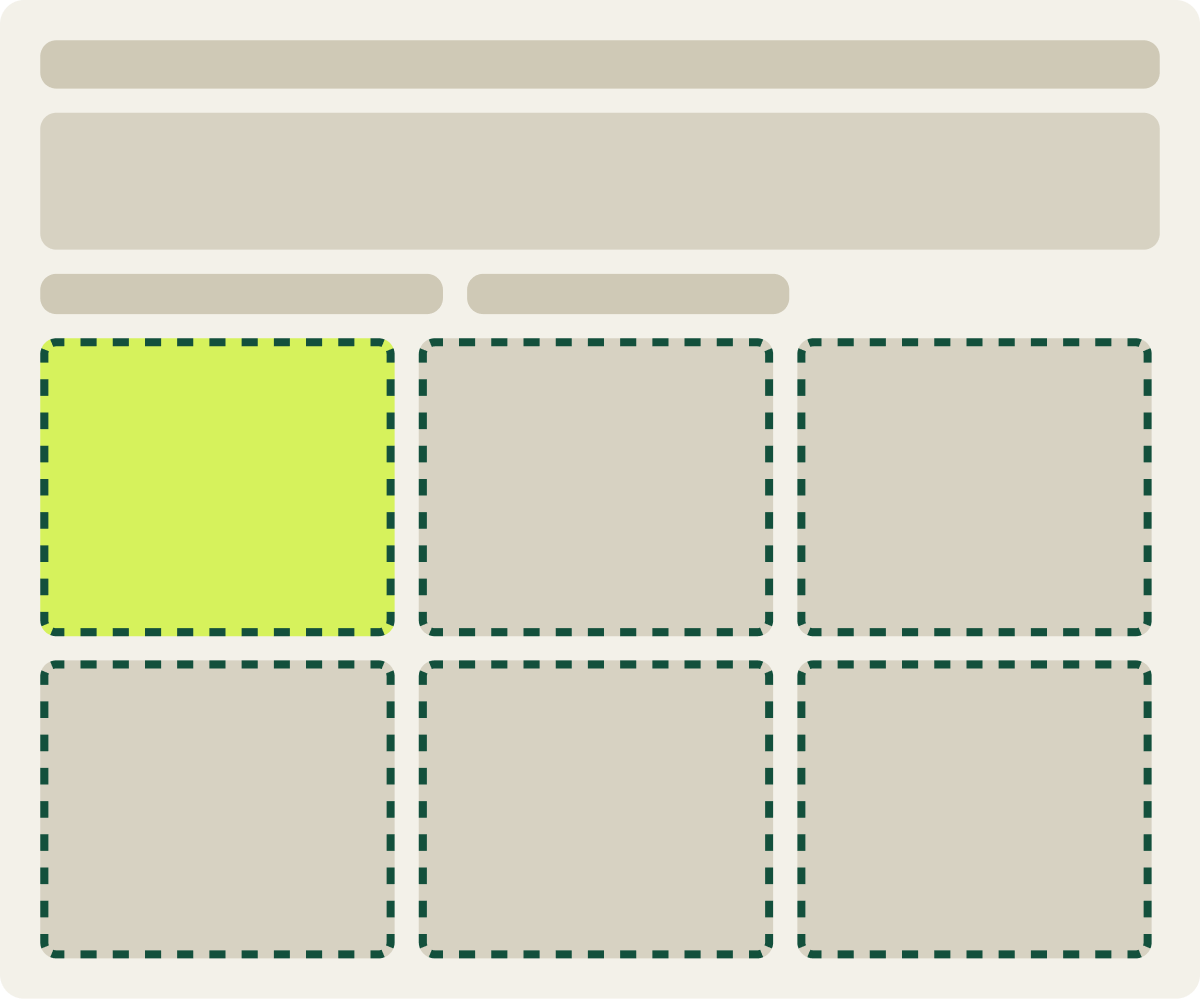
- Border added to each product card
- Most popular callout on the first product
- Hover state added on desktop
The result
Conversion rose 8.2% and revenue per visitor 8.0% over 12 days.
The bordered cards won after 12 days of the relaunched test. Conversion rose 8.2% and revenue per visitor 8.0%, so order value held steady.
The control page changed a few times during the run, and the new cards still came out ahead. We implemented them and carried them into the next round of tests.
What we took from it
Clear edges made each product easier to read and choose.
Without borders, the grid read as 1 block of images and text. Framing each product made the grid easy to scan, and the callout gave shoppers a place to start. Order value held steady, so the lift came from more shoppers buying.