When optimizing your e-commerce website for mobile, the layout of your collection pages can significantly impact user experience and conversion rates. One key decision is whether to use a one-column or two-column layout. Both formats have their benefits, but choosing the right one depends on your product catalog size, user behavior, and how your audience interacts with your site. Through testing, we’ve found that layout choices can influence everything from product visibility to sales distribution. This article explores the pros and cons of each layout and provides insights from our own tests to help you determine which approach is best for your mobile collection pages.
Key benefits of a Single Column Layout
Improved Focus:
A single-column layout highlights one product at a time, helping users focus on individual items without distractions.
Better Readability:
Larger product images and descriptions make content easier to read, eliminating the need to zoom in on smaller screens.
Natural Scrolling Behavior:
This layout aligns with vertical scrolling, which feels intuitive for mobile users, making navigation smoother.
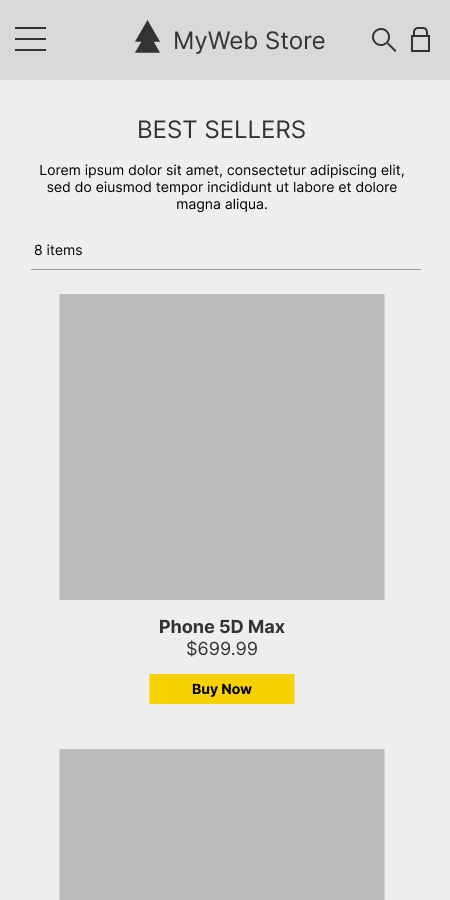
For e-commerce sites with fewer than 10 to 20 products per collection page, a single-column layout can be highly effective. It allows each product to occupy the full screen width, providing larger images and easier-to-read descriptions. This setup works particularly well when your sales are driven by one or two top products. With a single column, users can focus on individual listings without the distraction of comparing multiple items at once.
In one of our recent tests, we worked with a client that had a very passionate, product-loyal audience. Their product catalog was small, with fewer than 20 items, and over half of their sales came from a singular top-selling product. When we switched from a two-column to a single-column layout, it placed more focus on that best-selling product. Users could quickly locate it without excessive scrolling or comparison. The result? Not only did we simplify the user experience, but we also saw a notable improvement in the client’s conversion rates. Focusing on the top-selling product with a single column reduced the effort needed to find it, which streamlined the purchasing process for users.
Efficient Use of Space:
A two-column layout allows more products to be visible on the screen at once, reducing the amount of scrolling needed. This makes browsing faster and more efficient, especially for users familiar with the product offerings.
Faster Product Comparison:
Displaying two products side by side makes it easier for users to compare options quickly. This layout is ideal for sites with larger product inventories where users want to assess multiple items simultaneously.
Increased Visual Engagement:
A two-column layout can create a more dynamic and visually engaging experience by filling the screen with product images and information. This can make the site feel more lively and appealing to users.
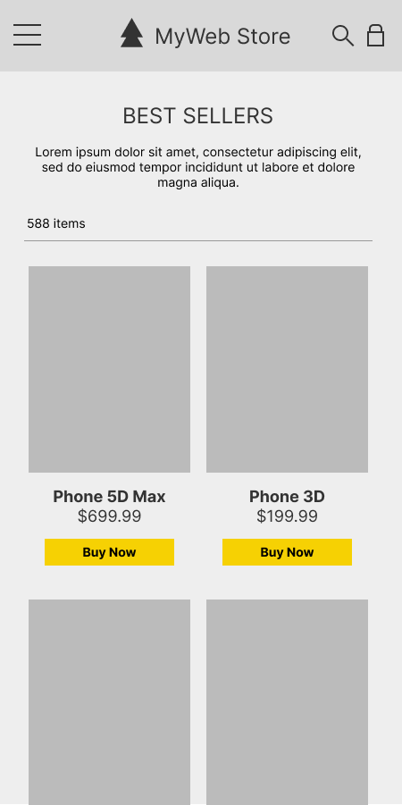
For websites with larger product inventories, a two-column layout provides an efficient browsing experience. It allows users to see multiple products at a glance, reducing the need for extensive scrolling. This is especially useful for users who prefer to compare products quickly and make decisions faster. With more products visible on the screen, users can assess multiple options without feeling overwhelmed by too much information.
We ran a similar test for another client, this time for a website with a much more distributed product catalog. Unlike the previous client, this site had a broader range of products, with sales spread out across various items. When we switched to a two-column layout, we saw a 12% increase in conversion rates. The dual-column display improved the visibility of more products, making it easier for users to compare and find what they were looking for. As a result, not only did conversion rates rise, but the distribution of sales across more products improved as well. The two-column layout enhanced product findability, encouraging users to explore more options before making a purchase.
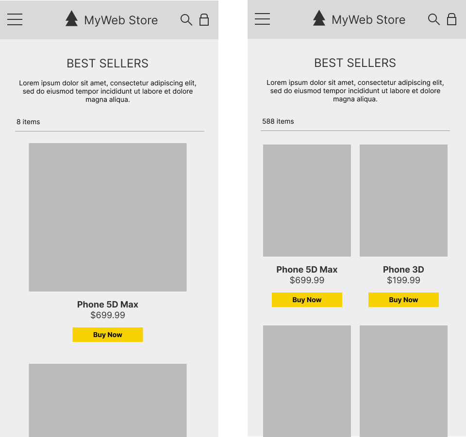
Through extensive testing across various e-commerce websites, we’ve found that the choice between one and two columns depends largely on product inventory size and user behavior. For websites with smaller catalogs, the one-column layout often performs better by directing attention to key products, especially when sales are concentrated around a few items. On the other hand, websites with larger inventories benefit more from a two-column layout, where users can scan and compare a greater number of products more quickly.
One important factor that influences the success of either layout is the vertical height of the product listing. Regardless of whether you’re using a one- or two-column format, ensuring that the next product preview is visible as users scroll down the page is critical. This visual cue keeps users engaged, encouraging them to keep browsing. In both layouts, the next product doesn’t need to be fully visible, but it should give users enough information to prompt continued exploration.
Our findings with one-column vs. two-column layouts don’t just apply to product collection pages—they also extend to home pages, particularly when listing products lower on the page. When you present product recommendations, popular items, or new arrivals on the home page, using a two-column layout allows users to see more products without scrolling too far down. This can be particularly useful on mobile devices where the homepage’s top section may already be filled with banners or featured products. By switching to a two-column layout further down the page, you can display more products efficiently while maintaining a clean and engaging design. Conversely, a single-column layout for home pages can work well if the focus is on a few high-priority items or if the goal is to guide users to specific actions or product highlights.
Ultimately, the best way to determine which layout works for your website is through A/B testing. We recommend running tests with different layouts to measure user engagement, product interaction, and conversion rates. Through testing, you can determine which layout drives the most conversions based on your audience’s behavior. Additionally, testing variations in product height and visibility will help you optimize the browsing experience for your specific user base.
For example, if your audience shows signs of purchase fatigue with longer scrolling times, a two-column layout may help them browse more efficiently. Alternatively, for niche products with strong loyalty, a single-column layout could better highlight top-selling items. Testing these elements ensures that your e-commerce site provides the best possible experience for your users.
Not sure which layout will boost conversions on your mobile site? Let repeatGROWTH help! With our free website evaluation, we’ll test different layouts and provide insights to optimize your e-commerce collection pages.
Get a Free Website Evaluation and start optimizing your site for better user engagement and higher sales today!
