
Test archive / Collection page
Does a button on each listing lift collection page conversion?
Listings on the desktop collection page had no clear cue to click. We tested a text link and a button on each listing. The button lifted conversion 6.3% over 28 days.
Won Desktop 28 days Called at 80% Reviewed
The hypothesis
By adding a clear call to action to each listing, we will make it obvious the listing can be clicked, resulting in more engagement on collection pages and a higher conversion rate.
On the desktop collection page, each listing showed an image, a name and a price, with nothing that invited a click. Shoppers had to guess that the whole listing was a link.
We tested 2 ways to make that clear: a text link and a button.
What we changed
We added a clear call to action to every listing on the collection page.
Variation A added a text link under each listing that invited shoppers to explore the product. Variation B added a button in the same place. Both went to the product page. We paused Variation A partway through after it fell behind.
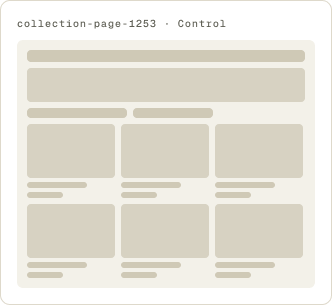
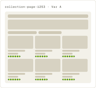
- Text link added under each listing
- Link invites shoppers to explore
- Goes to the product page
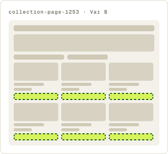
- Button added under each listing
- Goes to the product page
The result
The button on each listing lifted conversion 6.3% over 28 days.
Variation B, the button, won. Conversion rose 6.3%, and the button stayed ahead of the control and the text link for most of the test. Results flipped early on, which is why we let it run 28 days.
Variation A, the text link, fell behind and was paused partway through. We implemented the button.
What we took from it
A button made it clear each listing led somewhere.
Without a call to action, a listing on this page looked like something to view, not something to click. A button is the most familiar sign of an action, and it beat a text link that did the same job. It gave shoppers a clear next step toward the product page.