
Test archive / Collection page
Do orange stars and buttons lift collection page conversion?
Collection page star ratings and buttons blended into the page. We turned both orange so they stood out. Conversion rose 17.9% and revenue per visitor 8.4% over 23 days.
Won Responsive 23 days Called at 90% Reviewed
The hypothesis
By making the star ratings and buttons on collection pages orange, we will draw more attention to them, resulting in more conversions.
Earlier tests on the product page pointed to orange buttons and star ratings as a way to pull shoppers toward the next step.
On the collection page, the ratings and buttons did not stand out from the product cards, so shoppers had less to guide them from browsing to a product.
What we changed
We changed the star ratings and buttons on collection pages to orange.
The variation changed the star rating color to orange and the buttons to orange, on both mobile and desktop collection pages. The product cards, copy and layout stayed the same.
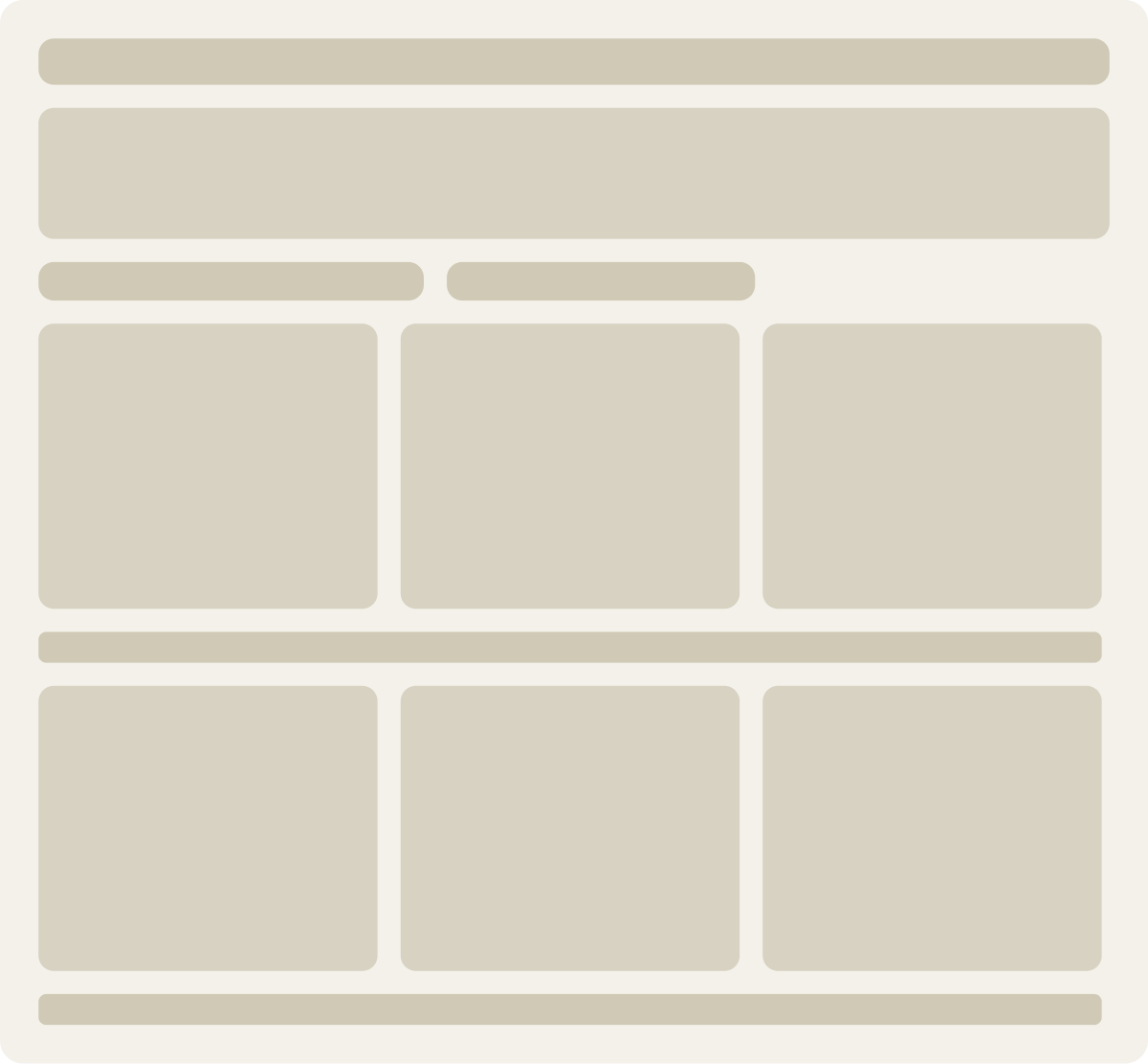
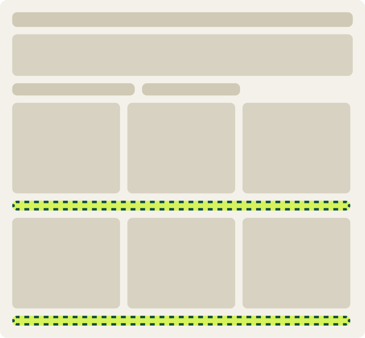
- Star ratings changed to orange
- Buttons changed to orange
- Mobile and desktop
The result
Conversion rose 17.9% and revenue per visitor 8.4% over 23 days.
Conversion rose 17.9% and revenue per visitor 8.4%. Order value fell by about 8%, so the gain came from more shoppers buying rather than larger orders.
We implemented the change together with an orange button win on the homepage.
What we took from it
High contrast stars and buttons moved shoppers to the next step.
Orange stood out against the product cards and made the ratings and buttons easy to spot. Shoppers could see at a glance which products others rated well and where to click. More of them went on to buy, even though their orders were slightly smaller.