
Do star ratings in checkout lift desktop conversion?
The desktop checkout used a different header from the rest of the site and showed no reviews. We tested 3 ways to build trust there: less clutter, a matched header and star ratings. Adding star ratings lifted conversion +22.3% over 16 days.
Won Desktop 16 days Called at 90% Reviewed
The hypothesis
By simplifying checkout and repeating familiar elements from earlier in the funnel, such as star ratings, we will reduce anxiety, resulting in a higher conversion rate.
Our first win on this store came from showing star ratings more clearly on the product page. Carrying that trust signal into checkout could keep shoppers confident at the moment they pay.
We also tested 2 simpler ideas. Checkout showed items shoppers could not interact with, which pulled focus from the contact and shipping steps. And the header changed between the cart and checkout, which can make shoppers wonder if they are still on the same site.
What we changed
We tested 3 checkout changes: less clutter, a matched header, stars.
Var A removed the items on the first checkout step that shoppers could not click, so the contact and shipping fields stood alone. Var B matched the checkout header to the rest of the site so the 3 step process looked familiar. Var C kept the layout and added the product star rating to the checkout summary.

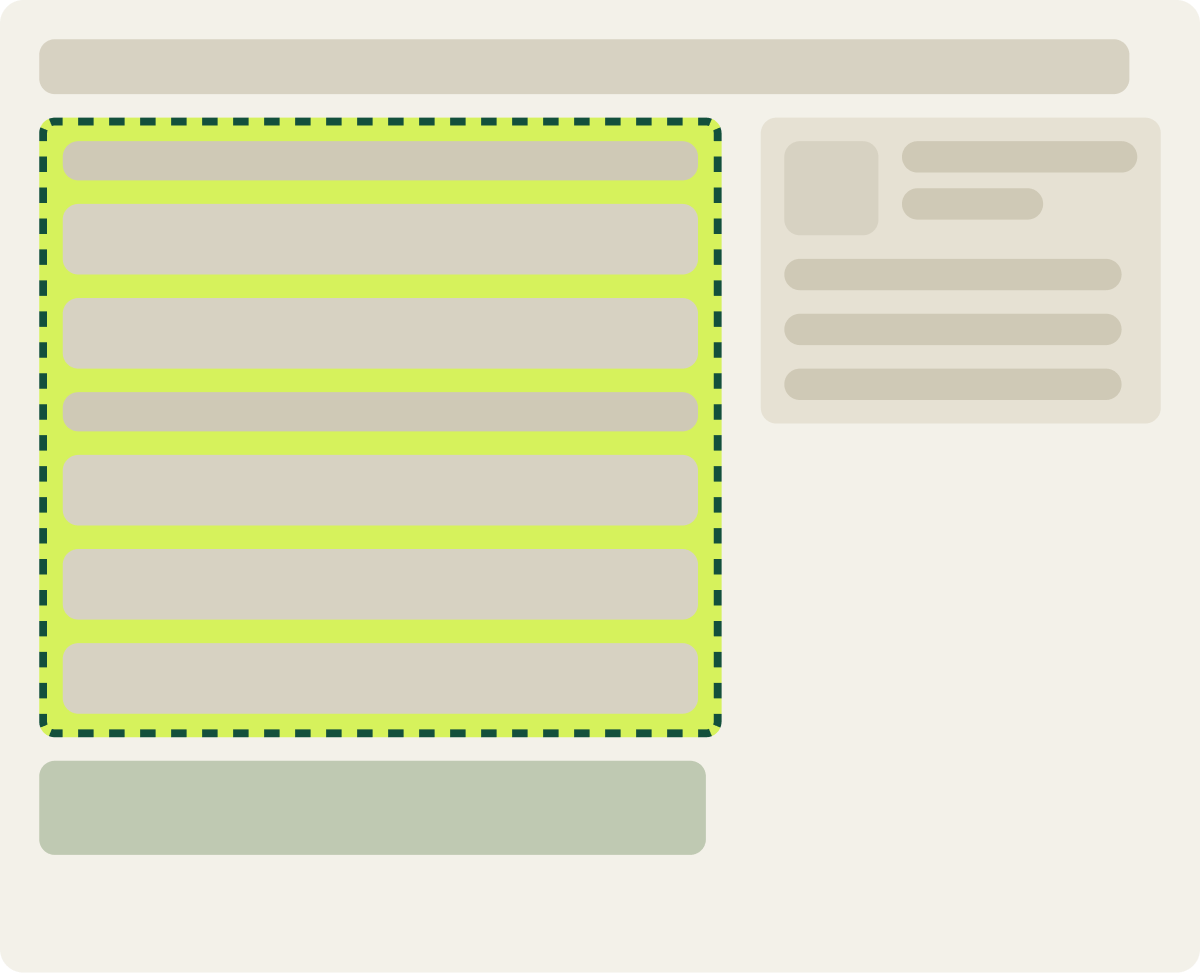
- Non interactive items removed
- Focus kept on contact and shipping fields
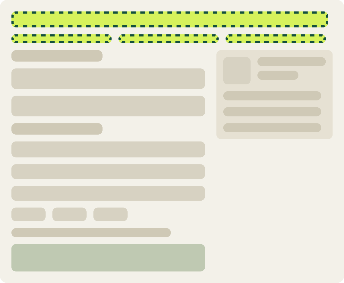
- Checkout header matched to the site header
- 3 step progress made easier to see
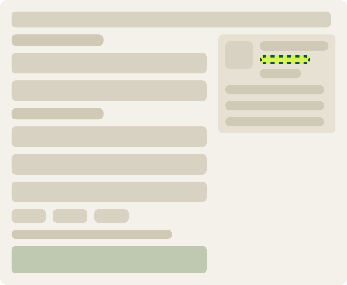
- Product star rating added to the order summary
The result
Star ratings in checkout lifted conversion +22.3% in 16 days.
We paused Var A and Var B partway through and kept the control and Var C running. Var C ran the full 16 days on desktop and finished with a +22.3% lift in conversion rate over the control. The store implemented the star ratings for all desktop traffic.
What we took from it
The trust signal that won on the product page also won in checkout.
Shoppers had already seen strong star ratings on the product page. Showing them again in checkout reminded shoppers why they chose the product right when doubt is highest. Cutting clutter and matching the header did not do as much, which suggests the issue at this step was confidence, not layout.