Want a quick boost to your conversion rate? A simple tweak might make all the difference—contrast. In one study, changing a CTA button’s color from green to red increased conversions by 21%! Why? Contrast grabs attention. It’s not just about flashy colors; it’s about guiding users’ eyes and decisions through visual hierarchy. When done right, contrast ensures your CTAs, forms, and product features stand out where it matters most
The trick is finding the balance. Too much contrast can feel overwhelming, and too little might leave users lost. Through A/B testing, you can determine the right contrast to optimize performance without losing sight of your brand. Let’s dive into how this works—and how it can work for you.
Consistency is key when it comes to brand recognition. Colors and contrasts are critical parts of your identity, but they shouldn’t exist just for the sake of aesthetics. Each color should serve a specific function. Use a primary color to draw attention to the most important elements, like CTAs or key information. Use secondary colors for support—subtle but noticeable accents that guide users without overwhelming them.
But don’t feel boxed in by traditional choices. We’ve used everything from traditional green, red and blue CTAs to unique brand colors such as yellow and pink for CTA buttons with fantastic results. As long as the contrast between your background and foreground elements is high, you’re on the right track.

(Follow the Yellow Brick Road)
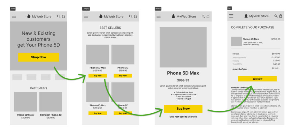
Think of your website as a journey. You want users to follow a clearly defined path toward conversion, with as little distraction as possible. This is where contrast becomes your most powerful tool—one singular, high-contrast color can serve as the guide.
Humans are wired to notice contrast. Our eyes are naturally drawn to areas where colors, shapes, or brightness sharply differ. This is why elements like bright CTA buttons against a neutral background instantly grab attention. It’s a psychological response—when something visually “pops,” our brains perceive it as important or urgent, and we’re more likely to interact with it.
Just like the Yellow Brick Road led Dorothy to the Emerald City, your defined conversion path color should lead users effortlessly to your CTA buttons. Everything else should complement, but not compete, with this visual guide. Too many competing colors can dilute the message and confuse users. Instead, choose one contrast color that stands out across all your touchpoints.
Maintaining consistency with your brand while using a high-contrast path can be tricky. You want a conversion path that stands out, but it also has to feel cohesive with your brand’s overall look. This is where the balance between branding and functionality comes into play.
For instance, a luxury brand might prefer understated elegance, so a bright orange CTA may not align with their style. However, you can still create contrast with subtler differences, like using a deep black against a lighter tone. The goal is to be consistent with your brand while still drawing attention to conversion elements. This delicate balance requires some experimentation, which is why A/B testing is crucial to get it just right.
You won’t know how effective your contrast choices are until you test them. A/B testing is your best friend when it comes to fine-tuning contrast on your site. Test variations of CTA colors, background contrasts, and even text elements to see what resonates with your audience.
Testing isn’t just about picking a pretty color. It’s about understanding how different user segments react to certain contrasts. What works for one audience might not work for another, and A/B testing can reveal these insights.
Pro tip: Make sure to run tests with accessibility in mind. High contrast improves readability for everyone, especially those with visual impairments.
Not sure where to start with conversion optimization on your eCommerce or lead generation website? repeatGROWTH can help! Whether it’s optimizing your CTAs, adjusting your site’s color contrast, or running A/B tests to see what resonates with your audience, our team provides a free website evaluation to identify areas for improvement.
How does contrast improve conversion rates?
Contrast makes key elements on a website, like CTA buttons, stand out by guiding users’ eyes. It reduces friction in the decision-making process, making it easier for visitors to take action.
What is the best color for a CTA button?
There isn’t a single “best” color—it depends on your brand and the context of the site. What matters more is contrast. A high-contrast color that stands out from the rest of the site is typically most effective. Leverage secondary or even tertiary colors to encourage deeper exploration and discovery but not to hurt the primary conversion journey.
Can contrast affect user experience on mobile devices?
Absolutely. High-contrast elements are especially crucial on mobile, where small screens and outdoor glare make it harder for users to see details. Proper contrast improves readability and user engagement.
How often should I A/B test different color contrasts?
It’s good practice to continuously test color contrasts, particularly when you make major updates to your site design or see changes in user behavior. You should also test seasonally to account for shifts in user preferences.
Does contrast only apply to color?
Not at all. Contrast can also be achieved through font size, spacing, or texture. Anything that helps distinguish key elements on your site can drive conversions.