
Does a familiar checkout design lift desktop checkout conversion?
Our desktop checkout used its own custom design. We tested a version styled like a standard online store checkout. Conversion dipped 2.6% over 29 days, which did not reach our confidence bar.
Not significant Desktop 29 days Not called Reviewed
The hypothesis
By rebuilding the checkout to look and flow like a standard online store checkout, we will make it feel familiar, resulting in more visitors trusting it enough to finish their order.
Most shoppers have checked out on standard online stores many times, so that layout is something they already know. We expected a checkout that followed the same pattern to feel more trustworthy and easier to complete.
This was our second try at the idea. A year earlier, a multi-step checkout built on the same pattern lowered conversion. This time we restyled the checkout itself to match that pattern.
What we changed
We redesigned the checkout to match a standard online store checkout.
The control was our existing custom checkout design. The variation restyled the checkout to follow the layout and visual style shoppers see on most online store checkouts. We ran the same design on mobile at the same time as a separate test.

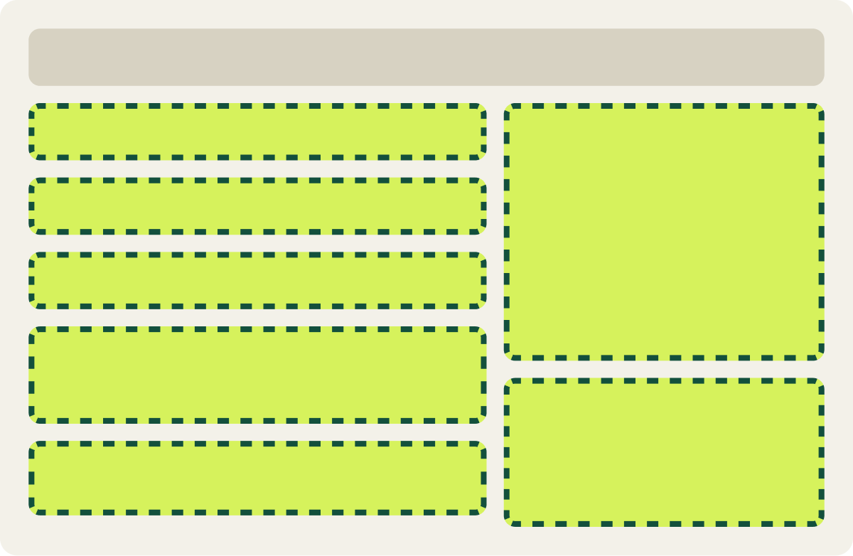
- Checkout restyled to a standard store layout
- Visual style matched common store checkouts
The result
Desktop conversion dipped 2.6% in 29 days, short of our confidence bar.
Desktop conversion came in 2.6% below the control over 29 days. The mobile version of the same design ran at the same time and came in 2.4% below its control. Results swung from week to week, so we ran both for a full month to rule out timing around registration due dates. Neither reached our confidence bar, so we paused both and moved on.
What we would do next
Test the checkout as part of a full funnel, not on its own.
Looking familiar was not enough to move this checkout. Visitors reach it from a homepage form with its own look, so a restyled checkout on its own changes the feel partway through. Our next step was to pair this design with matching earlier pages in a full funnel test. We also noted a renew now message as a way to cut the noise from due dates.