
Does a checkout trust statement in place of navigation lift orders?
Our desktop checkout kept the full site menu and footer links. We removed them and put a trust statement in the header, with a licensed provider line in a second version. Conversion moved 0.8% over 8 days, so we did not call it.
Not significant Desktop 8 days Not called Reviewed
The hypothesis
By removing exit points from the checkout and replacing them with trust statements, we will keep visitors focused and confident, resulting in more completed orders.
The checkout carried the same header menu and footer links as the rest of the site. Each link is a way out at the last step, right where we want visitors to stay.
We also wanted to use that space to answer a common doubt: whether this service can be trusted with a registration. We tested a general trust statement and a version that said the service is licensed.
What we changed
We removed checkout navigation and added a trust statement in its place.
Both variations removed the header menu, the tagline under the logo and the footer links. Var A put a short statement in the menu space calling the service the most trusted registration service. Var B used the same layout with a line saying the service is licensed by the government agency.
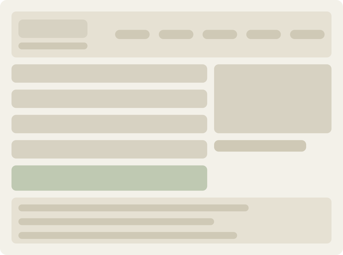
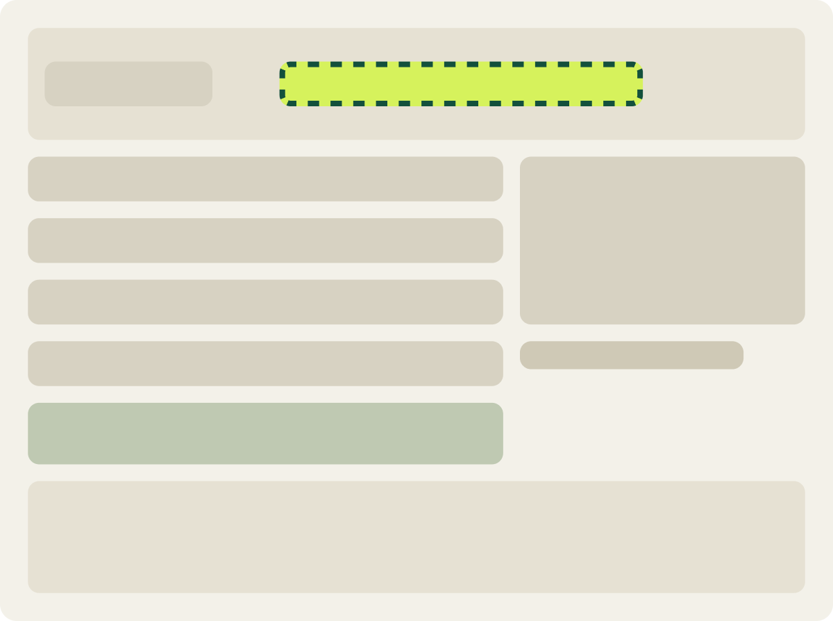
- Header menu removed
- Tagline under the logo removed
- Most trusted statement in the menu space
- Footer links removed
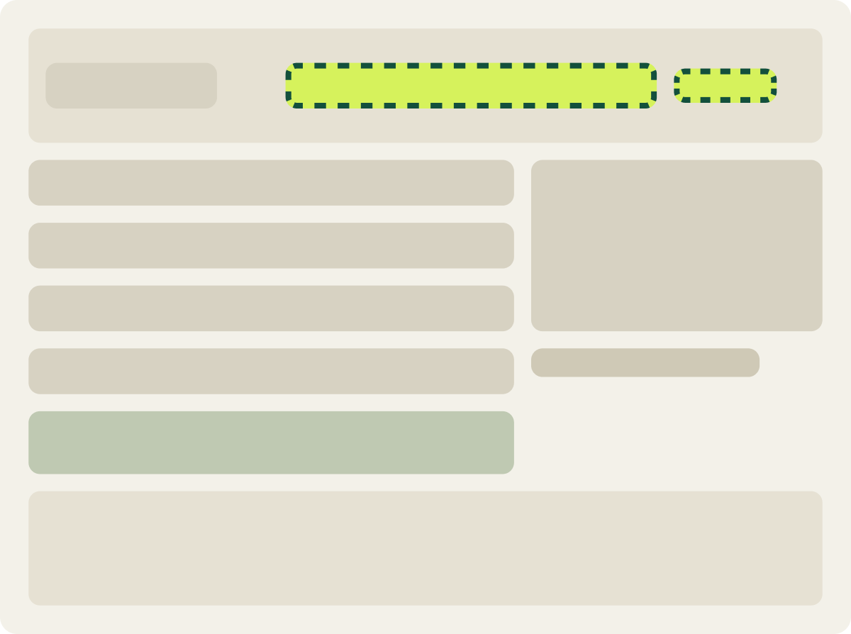
- Same changes as Var A
- Licensed provider line in the menu space
The result
Removing checkout navigation moved conversion just 0.8% in 8 days.
Conversion was 0.8% lower than the control over 8 days, a gap far too small to reach our confidence bar. Neither trust message moved visitors in a clear direction.
We paused the test after 8 days to free up desktop traffic for the next round of tests, since a longer run was unlikely to change the picture.
What we would do next
Look past the header for what stops visitors at checkout.
Removing the menu and footer did not change how many visitors finished, so those links were not a major leak on this page. Next we would look at the form and payment step itself, where visitors spend most of their time, for the friction that header changes could not reach.