
Test archive / Collection page
Do richer product cards lift collection page conversion?
Product cards on the collection page showed little to compare. We added product line badges, pack sizes, a from price and a best seller outline. Conversion fell 16.5% and revenue per visitor 9.5% over 33 days.
Lost Responsive 33 days Called at 90%
The hypothesis
By adding the details shoppers need to compare products to each card, we will speed up selection, resulting in a higher collection to cart conversion rate.
Many products cost the same and differed only by flavor, but the cards left out pack size, product line and best seller status. Shoppers had to open product pages to compare them.
All of that information already existed, so putting it on the cards would let shoppers choose from the grid.
What we changed
We added badges, pack sizes and a from price to every product card.
The variation added a badge naming the product line, listed pack sizes under the product name and added "From" to the price. It outlined the real best seller, expanded the intro copy and heading, and changed the button to Shop Now.

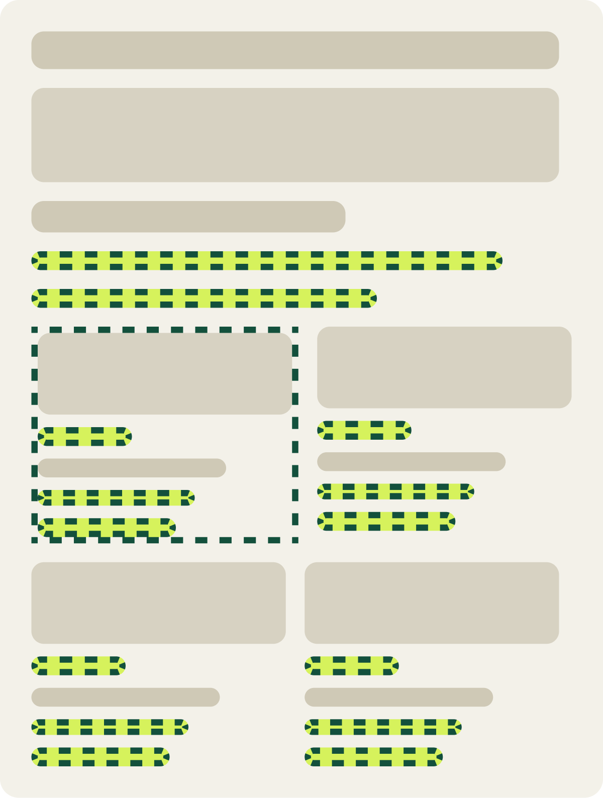
- Product line badge on each card
- Pack sizes under the product name
- "From" added to the price
- Outline on the real best seller
- Longer intro, Shop Now button
The result
Conversion fell 16.5% and revenue per visitor 9.5% over 33 days.
Results were mixed early on, then dropped week over week, and we paused the test. Conversion fell 16.5% and revenue per visitor 9.5%. Average order value rose about 8%, so shoppers who bought spent more, but fewer of them bought.
Mobile shoppers and new visitors drove the drop. Returning visitors leaned slightly toward the new cards.
What we took from it
More detail on each card slowed new shoppers down.
The extra details helped returning shoppers and pushed order value up, but most traffic was new and on mobile. For them, busier cards and a longer intro added more to read before choosing. Fewer orders outweighed the bigger baskets.