
Test archive / Collection page
Does a quieter category heading lift collection page conversion?
The collection page heading sat on a colored background above tall breadcrumbs. We removed the background, changed the text color and shrank the breadcrumbs. Conversion rose 4.9% and revenue per visitor 3.0% over 15 days.
Won Responsive 15 days Called at 80%
The hypothesis
By making the category heading and breadcrumbs quieter, we will draw the eye to the promo bar and products, resulting in a higher conversion rate from collection pages.
The top of the collection page carried a heading with its own background color and a full-height row of breadcrumbs. Both took space and attention before shoppers reached the promo bar and the products.
Lowering their weight would move the products up and let the offer stand out.
What we changed
We removed the heading background and shrank the breadcrumbs.
The variation removed the background behind the collection heading and updated its text color. It also reduced the height of the breadcrumbs and softened their color. The promo bar and product grid moved up the page as a result. The test ran on all devices.

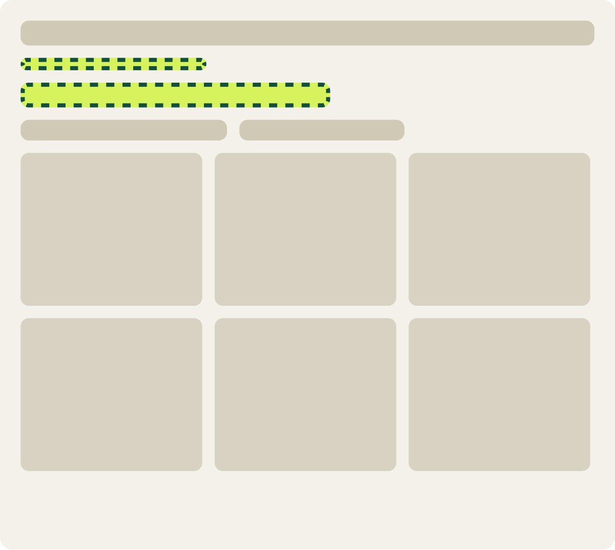
- Heading background removed
- Heading text color updated
- Breadcrumbs shorter and lighter
The result
Conversion rose 4.9% and revenue per visitor 3.0% over 15 days.
The quieter heading won over 15 days. Conversion rose 4.9% and revenue per visitor 3.0%, and the lift grew steadily through the run.
We implemented the change.
What we took from it
Less weight at the top of the page moved shoppers to the products.
The heading and breadcrumbs looked important but did little for shoppers. Quieting them pulled the promo bar and the first row of products higher, so shoppers reached what they came for sooner. The gain was modest but steady.