
Does a quick navigation menu of top collections lift conversion?
We added a quick menu of the most popular collections to the homepage. On desktop, conversion and revenue per visitor both fell 21.4% over 15 days, while mobile trended up.
Lost Desktop 15 days Called at 90% Reviewed
The hypothesis
By adding a quick menu of the most popular collections to the homepage, we will let shoppers pick their own path, resulting in more conversions.
A quick menu of popular collections had helped shoppers find their way before, so we tested it on this homepage.
On mobile, the main menu sits behind the hamburger icon, so a visible shortcut could save a step. On desktop, the full navigation is always in view.
What we changed
We added a quick menu of the most popular collections to the homepage.
The menu showed an icon for each of 8 popular collections near the top of the homepage. On mobile, 4 showed at a time. We read desktop and mobile results separately.

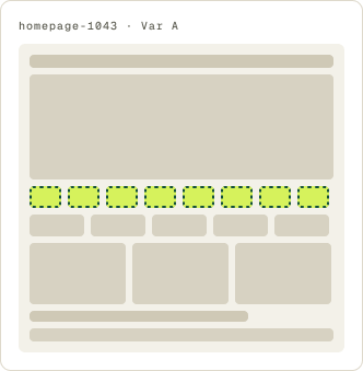
- Quick menu of 8 popular collections added
- Icon for each collection
- 4 collections shown at a time on mobile
The result
On desktop, conversion and revenue per visitor both fell 21.4%.
Desktop lost. Conversion and revenue per visitor both fell 21.4% over 15 days, and we paused it.
Mobile moved the other way. Conversion rose 8.7% over 22 days. It did not reach our confidence bar, but it beat the control week after week, so we implemented it on mobile.
What we took from it
The menu helped where navigation was hidden and hurt where it was not.
On desktop, the main navigation already listed the same collections, so the quick menu repeated it and added clutter at the top of the page. On mobile, the main menu sits behind the hamburger icon, and the quick menu gave shoppers a visible path into the catalog.