
Does a single purchase button lift product page conversion?
The desktop product page offered 2 buttons: add to cart and buy now. We tested showing only add to cart, and only buy now. Conversion rate moved 0.8% over 15 days, too small to call.
Not significant Desktop 15 days Not called
The hypothesis
By showing a single purchase button in place of 2, we will focus the shopper on a clear next step, resulting in more conversions.
2 buttons side by side ask the shopper to make an extra choice: keep shopping or check out now. Too many options at the moment of purchase can slow people down.
About half of desktop orders held a single item, so a direct buy now path suited many shoppers. Add to cart alone, with the cart flyout, could instead raise items per order.
What we changed
We showed a single purchase button in place of 2 on the product page.
In the control, the desktop product page showed both an add to cart button and a buy now button. Variation A kept only add to cart, which opened the cart flyout and let shoppers keep browsing. Variation B kept only buy now, which skipped the flyout and moved shoppers toward checkout. The test ran on a small set of product pages.

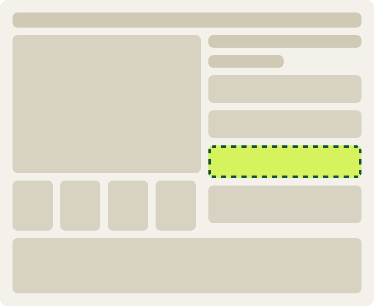
- Buy now button removed
- Add to cart opens the cart flyout
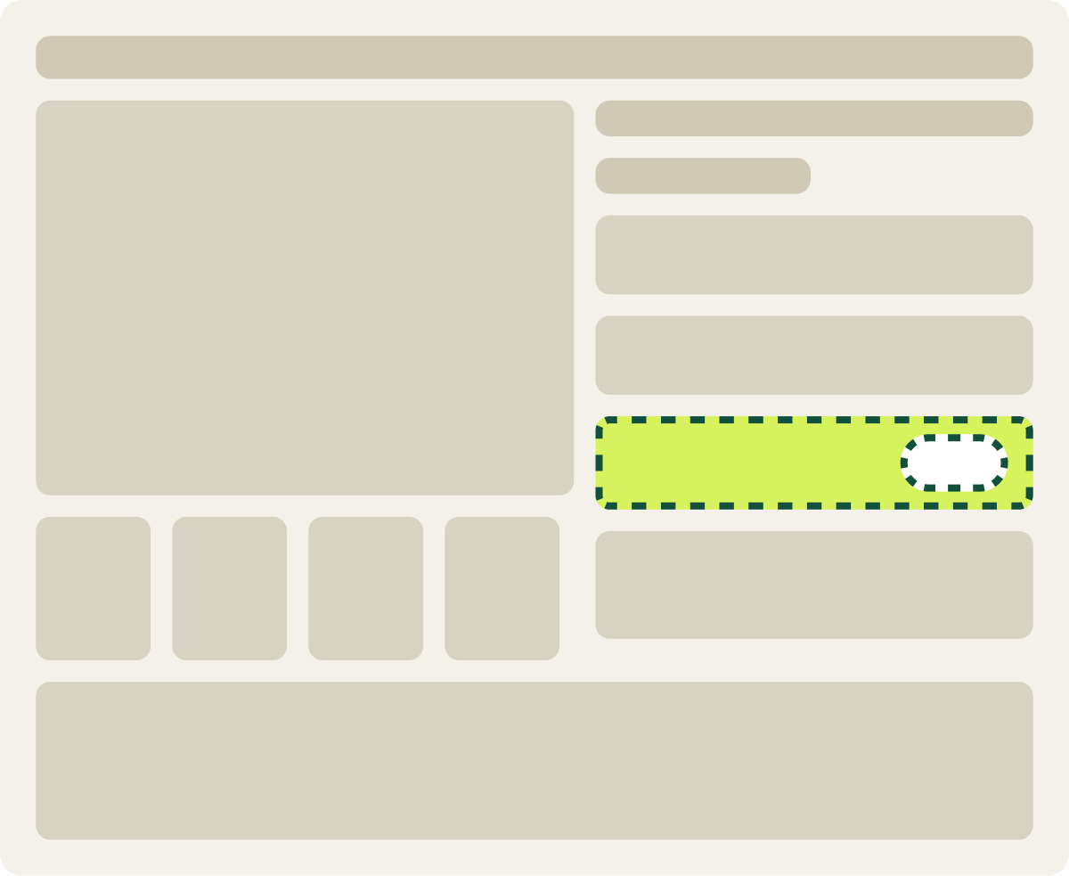
- Add to cart button removed
- Buy now moves the shopper toward checkout
The result
Conversion rate moved 0.8% with a single purchase button.
Over 15 days on desktop, the leading result moved conversion rate 0.8% and revenue per visitor 5.5%. Early weeks looked strong, but the results shifted the following week, and the gap did not reach our 90% confidence bar.
The pages in this test had low desktop traffic, so we paused it and flagged the idea for a larger validation test.
What we would do next
Cutting to a single button did not clearly change desktop buying.
On these desktop pages, shoppers did not seem held back by having 2 buttons. The early lift faded as more data came in. The next step would be a validation test across more products, so there is enough traffic to see whether either button on its own makes a real difference.