
Test archive / Collection page
Does card button color lift collection page conversion?
Product cards on the desktop collection pages had a plain add to cart button. We tested a bright orange button, and removing the button. The orange button raised conversion rate 10.1% and revenue per visitor 19.9% over 22 days.
Won Desktop 22 days Called at 90%
The hypothesis
By changing the product card button to a high-contrast orange, we will draw the eye to the add to cart step, resulting in more shoppers buying from the collection page.
On average, only 7% of shoppers went from a collection page straight to the cart. Most clicked through to a product page first. A brighter button could pull more of them into adding directly from the grid.
The opposite idea was also worth testing. With no button, every shopper would land on the product page, which has more detail and value props, and that might convert better.
What we changed
We made the card button orange in Var A and removed it in Var B.
In the control, each product card on desktop collection pages had a plain add to cart button. Variation A changed that button to a high-contrast orange. Variation B removed the button, so shoppers had to open the product page to buy. Everything else on the cards stayed the same.


- Card button changed to high-contrast orange
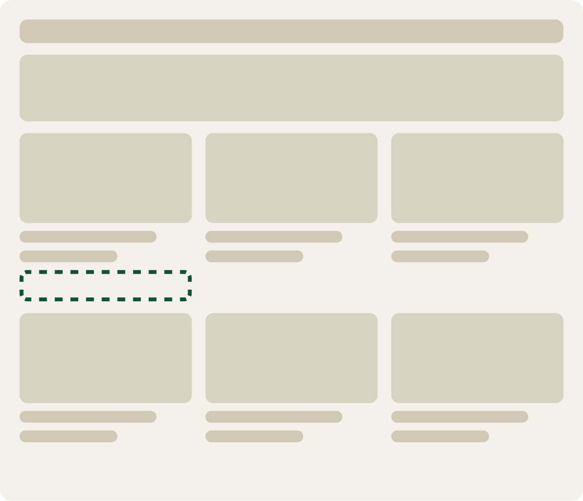
- Add to cart button removed from cards
- Card links to the product page
The result
Conversion rate rose 10.1% with an orange product card button.
Over 22 days on desktop, Variation A, the orange button, raised conversion rate 10.1% and revenue per visitor 19.9%. It led from the first weeks of the test.
Variation B, with no button, drew a very high average order value but trailed Variation A. We paused it partway through to send more traffic to Variation A.
What we took from it
A button that stood out pulled more shoppers into buying.
On these pages most shoppers skipped the card button and clicked through to the product page. Making the button stand out gave them a clear shortcut, and more took it. Removing the button sent everyone the long way, which raised order size but did not keep up. We implemented the orange button on desktop.