
Does simpler homepage category navigation lift desktop sales?
Our desktop homepage had an animated banner and small category buttons. We stopped the animation and made the buttons larger and clearer. Conversion rose 27.3% in 9 days, and we implemented it.
Won Desktop 9 days Called at 90%
The hypothesis
By removing the banner animation, making category buttons larger and clearer, and adding a stronger shop button, we will help shoppers reach their product faster, resulting in more orders from the desktop homepage.
A prior homepage test added more content and found it pulled attention away from shopping. Conversion did not rise. So this test went the other way and cut what shoppers had to process.
The homepage banner was animated, and the category buttons under it were small, with some labels that were not clear about the product type. We expected a still banner and larger, clearer category buttons to get shoppers into the right category faster.
What we changed
We stopped the banner animation and enlarged and relabeled the category buttons.
The control had an animated banner with small category buttons under it. Var A stopped the animation, made the category buttons larger, renamed 1 category so the product type was clear, and dropped 1 category group. Var B kept all of Var A and added an orange shop now button to the banner.

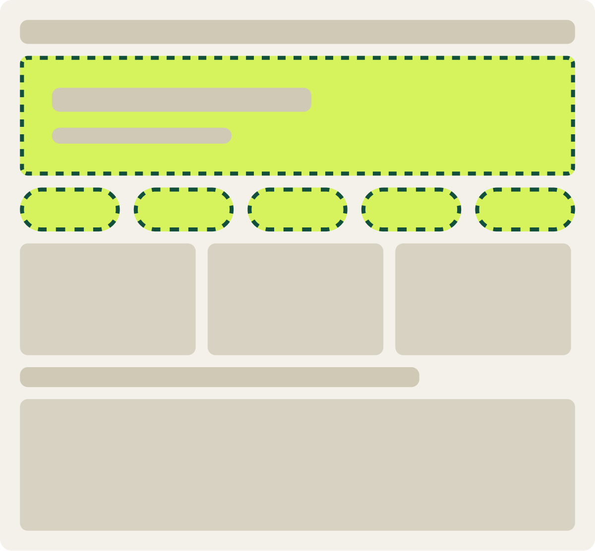
- Banner animation removed
- Category buttons made larger
- 1 category label renamed for clarity
- 1 category group removed
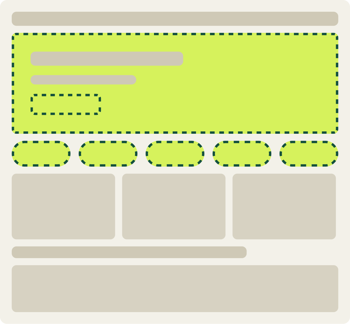
- Same changes as Var A
- Orange shop now button added to banner
The result
Conversion rose 27.3% in 9 days on the desktop homepage.
Var B, the still banner with clearer category buttons and an orange shop now button, lifted conversion 27.3% and revenue per visitor 25.3%. Average order value was about flat.
Both conversion and revenue per visitor cleared our confidence bar, and the lift held steady from the start. That let us call the test in 9 days instead of the usual 2 weeks. We implemented it ahead of any other homepage test.
What we took from it
Less motion and clearer category buttons got shoppers moving.
The earlier test showed that adding to this homepage hurt. Taking away the animation and making each category easy to read and click gave shoppers a short, clear path into the store. The orange button gave the banner 1 obvious action. We later rebuilt this design for mobile as its own test.