
Does a short value statement under the button lift clicks?
Our buying guide showed each pick with a name and a button. We added a short value statement under each button. Clicks fell while conversion ended 0.8% above the control over 12 days.
Not significant Responsive 12 days Not called
The hypothesis
By adding each product's main value statement under its button, we will make it clearer what the product does, resulting in a higher click-through rate.
Readers scanning the picks saw a product name and a button, but not always what the product was for. A short line under the button could answer that without making them read the full review.
What we changed
We added a 1 line value statement under each product button.
The control showed each pick with its name and button. Var A added a short line under the button that stated the product's main benefit, taken from the review. Nothing else on the page changed.
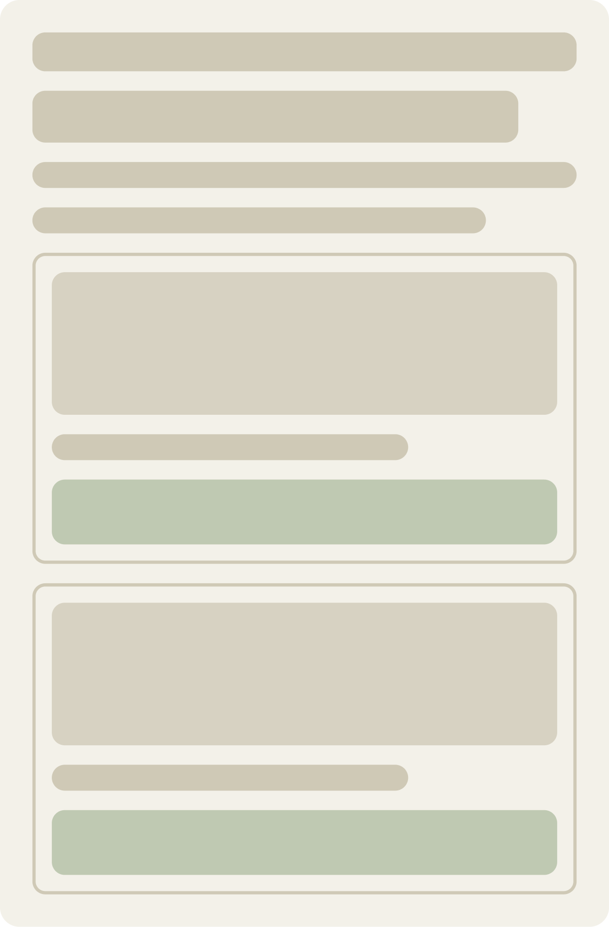

- Main benefit line under each button
The result
Conversion rose 0.8% in 12 days while clicks fell.
In the first week, click-through to the retailer was down while conversion was up. That suggested the line helped readers who clicked know what they were getting. By day 12, neither measure was performing and conversion was only 0.8% above the control, so we paused the test.
What we would do next
A value line under the button did not lift clicks.
Readers who saw the line clicked less, and conversion gained only 0.8%. The line may have set clearer expectations for those who did click, but on this guide it did not give more readers a reason to click through.