
Do product links above the fold lift mobile review article clicks?
On mobile, our review article opened with the author section and review copy before the product links. We tested 2 layouts that moved the links above the fold. Click-through fell 9.0%, and we paused the test after 11 days.
Lost Mobile 11 days Called at 90%
The hypothesis
By moving product links higher on the mobile page, we will put the picks in front of visitors sooner, resulting in more clicks and more affiliate revenue.
Earlier rounds on this page showed that moving the product links up the page helped. This round pushed further, putting the links in the first screen on mobile.
The control was the winner of an earlier round, so both variations were tested against the best layout we had.
What we changed
Product links moved above the fold, in 2 different layouts
Var A put a quick list of 5 picks in the first screen. It moved the review copy and the sponsored copy below the quick list and reduced font sizes so more fit on screen. Var B turned the picks into a bulleted list. It removed the product headings and images and used each product title as the link text.

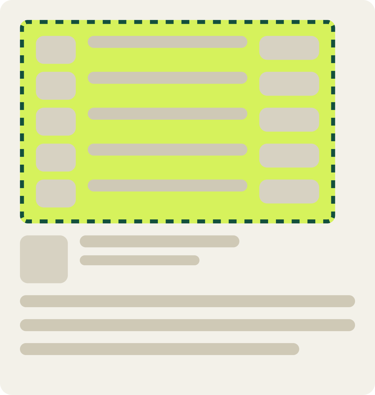
- Quick list of 5 picks in the first screen
- Review copy moved below the quick list
- Sponsored copy moved below the quick list
- Smaller font sizes
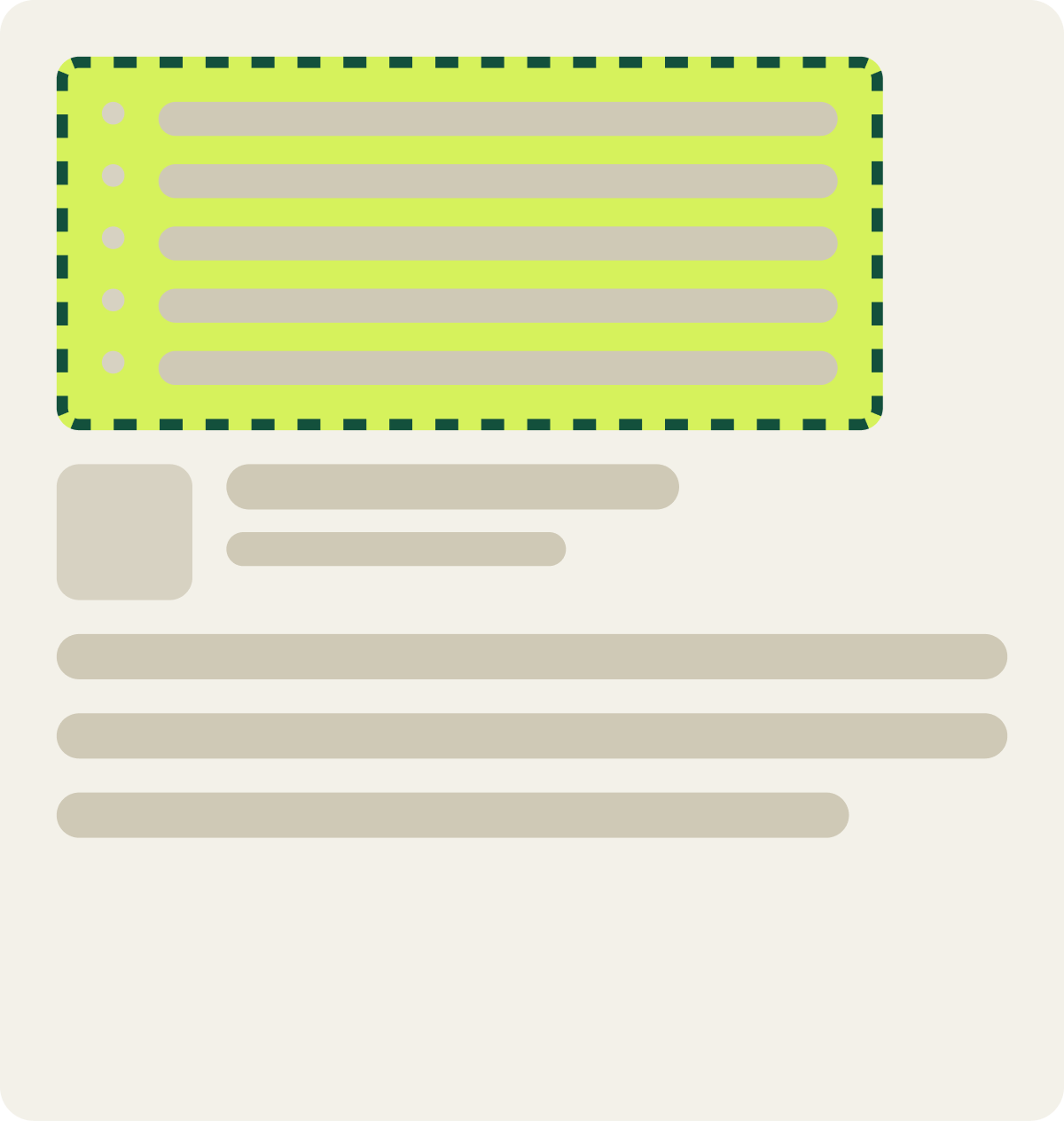
- Picks shown as a bulleted list
- Product headings and images removed
- Product title used as the link text
The result
Visitors preferred the original layout, by 9.0% in click-through
Click-through to the retailer fell 9.0% with Var A, the quick list of 5 picks above the fold. The primary metric for this test was click-through.
We paused the test at 11 days because the drop was clear and costly. Moving the author section away from the top of the page hurt click-through, as it had in an earlier test on a similar page.
What we took from it
The author section at the top earned clicks on this page
Visitors on this page wanted to see who wrote the review before they looked at the picks. Pushing the author section down took that reassurance away. The new first screen also packed a lot in at once, which likely added to the drop. We paused both variations and kept the original layout.