
Which CTA button color gets more clicks on a blog post?
Our blog posts carried a call to action button that did not use the new brand colors. We tested 3 versions built from the site banner: blue, green and a blue outline. The green button lifted click-through 141.7% over 16 days, and we implemented it.
Won Responsive 16 days Called at 80%
The hypothesis
By updating the blog call to action to match the new brand banner colors, we will make it stand out more, resulting in more readers clicking through to the lead form.
Earlier tests moved the call to action out of the right rail and higher on the post, which lifted clicks. The next question was color.
The site had new brand colors in its banner. We built 3 treatments from that banner: a solid blue button, a solid green button and a blue outline on white.
What we changed
We tested blue, green and blue outline call to action buttons.
The control kept the existing call to action styling. Var A matched the blue of the site banner. Var B matched the green of the banner. Var C used a blue outline on a white background.
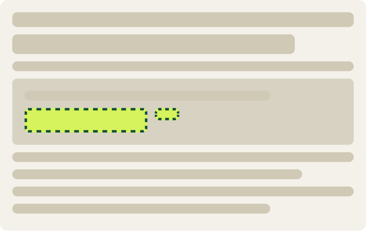
- Button matched the blue site banner
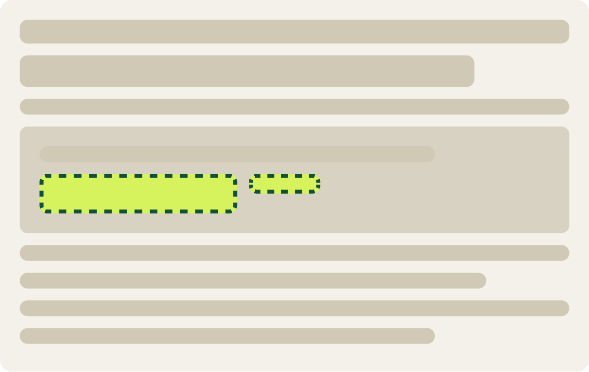
- Button matched the green site banner
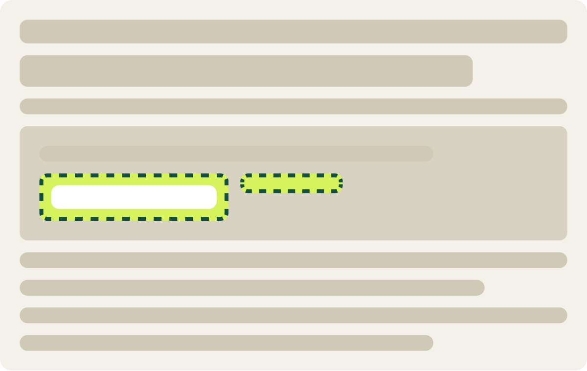
- Blue outline button
- White button background
The result
The green button lifted click-through 141.7% in 16 days.
Var B, the green button, lifted click-through 141.7% over 16 days, the biggest gain of the 3 versions. We implemented it after the test.
The blue button and the blue outline both trailed green.
What we took from it
Green stood out most against the content of these posts.
All 3 versions used brand colors, but the green had the strongest contrast with the rest of the post. That likely made the call to action easier to spot as readers scrolled, without new copy or a new spot on the page.