
Does a yellow View Cart button in the mini cart lift sales?
The mini cart for adaptive clothing showed View Cart and Checkout buttons with no clear lead. We made 1 of them yellow in each variation. The yellow View Cart button lifted conversion 20.0% and revenue per visitor 12.8% over 21 days.
Won Responsive 21 days Called at 80% Reviewed
The hypothesis
By keeping both mini cart buttons but making 1 the primary option, we will learn whether the cart page or direct checkout works better, resulting in a better balance of upsells and conversion.
A previous test removed the Checkout button so every shopper went through the cart page. It added a click on the way to checkout, and the cart page was long, with its checkout button below the fold. Conversion dropped on mobile and desktop.
This round kept both buttons and only changed which button stood out.
What we changed
We made 1 mini cart button yellow: View Cart or Checkout.
Variation A gave the View Cart button a yellow background with black text. Variation B did the same for the Checkout button. In both, the other button stayed visible as before.
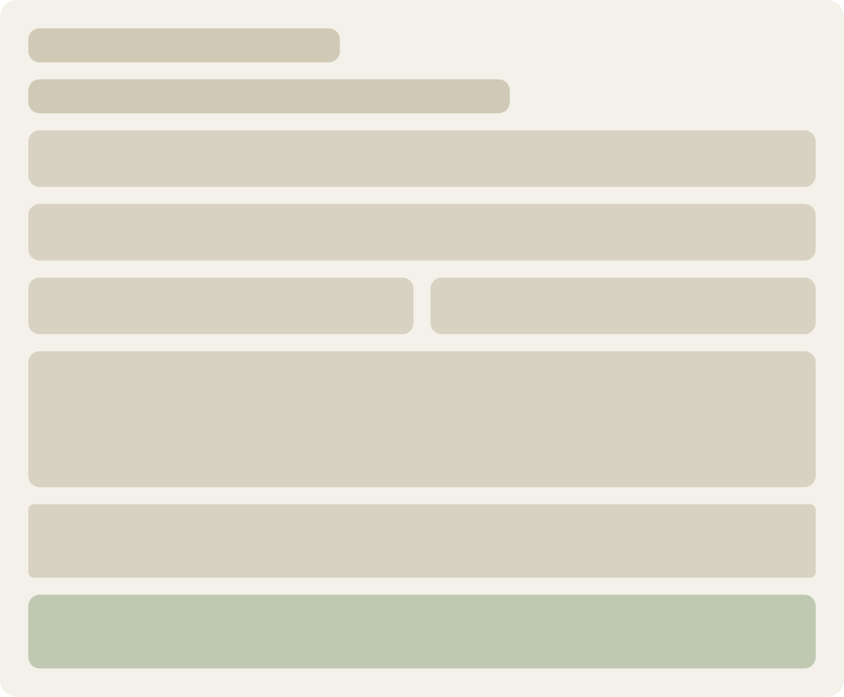
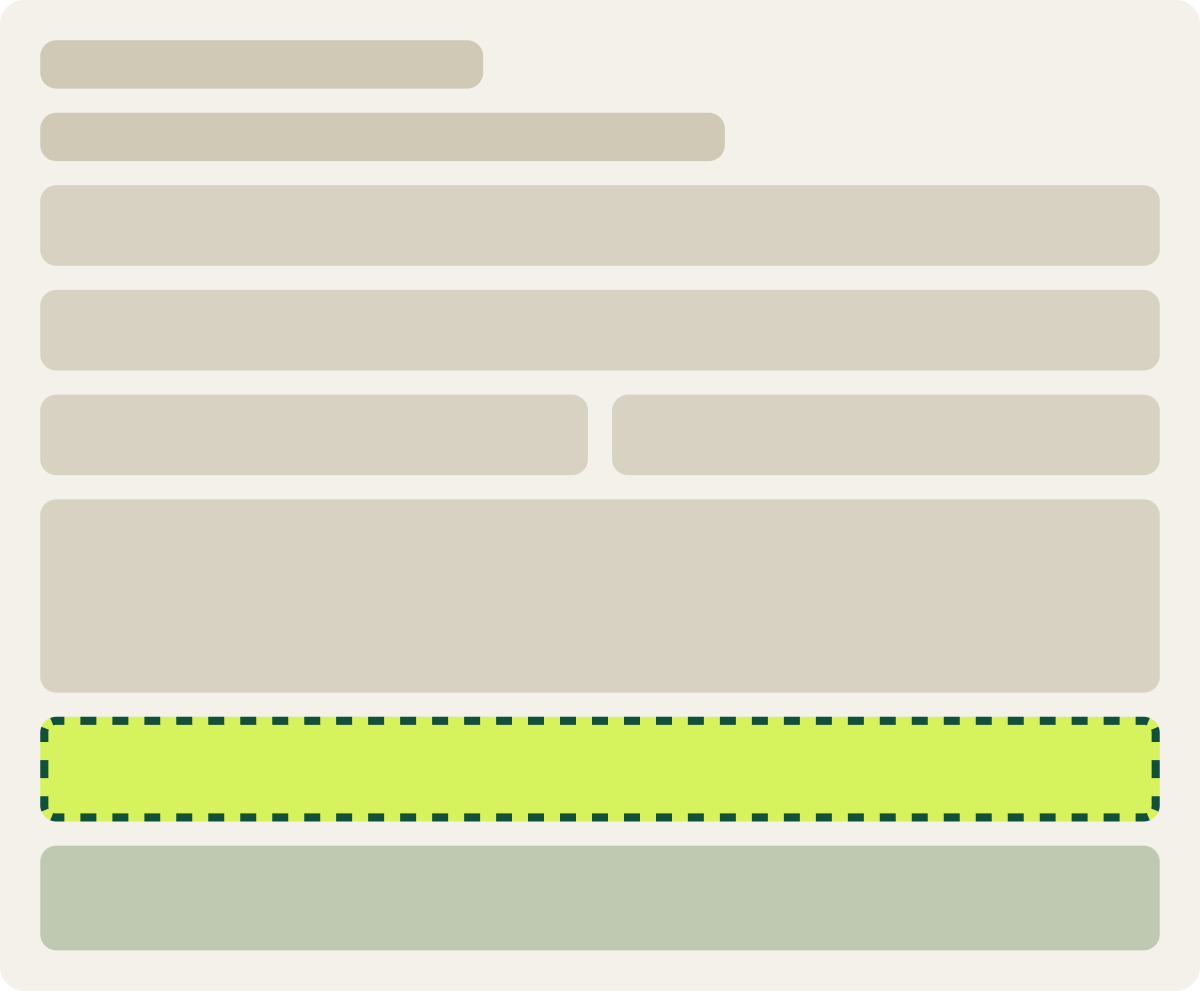
- View Cart button made yellow
- Black text on the yellow button
- Checkout button still visible
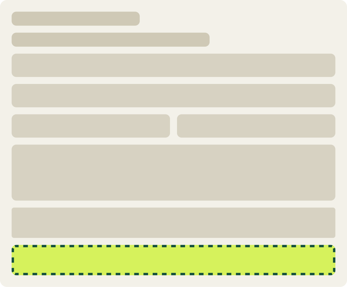
- Checkout button made yellow
- Black text on the yellow button
- View Cart button still visible
The result
The yellow View Cart button lifted conversion 20.0% in 21 days.
Variation A led the control from the start. After 21 days, conversion was up 20.0% and revenue per visitor up 12.8%, and average order value leveled out. Variation B performed poorly and we paused it partway through.
We called the test at 80% confidence and implemented Variation A.
What we took from it
Guiding shoppers to the cart beat pushing them straight to checkout.
In this store, the cart page gave shoppers a chance to review items and see other products. Pointing them there, while keeping the Checkout button in view, helped more than forcing it or skipping it. The earlier test showed that removing the Checkout button went too far.